
Analytics gives users a flexible workspace for exploring Yarken data across spend, assets, consumers, budgets, forecasts, consumption, recommendations, chargeback, license usage, and custom reporting.
Most Analytics pages use the same reporting layout. Once you understand the common workspace, you can move between Analytics items with the same basic pattern: select fields, choose a visualization, apply filters, and save the report for reuse.
Use this page to understand the shared Analytics experience before working with individual Analytics pages.
Getting started
Analytics uses a consistent workflow: choose fields, select a visualization, apply filters, review the output, and save the report when it is ready for reuse.
What Analytics is used for
Use Analytics to answer questions across technology spend, planning, FinOps, TBM, chargeback, and operational data.
Analytics helps teams:
-
Explore spend across financial, operational, and TBM dimensions
-
Compare budget, forecast, and actual values
-
Review asset cost and total cost of ownership
-
Analyze consumer-level cost accountability
-
Investigate cloud consumption and FOCUS-based cost data
-
Review recommendations and potential savings
-
Build custom views for finance, technology, and business stakeholders
-
Save recurring reports for review cycles
-
Apply trend lines and forecasting to supported timeline-based column charts
Analytics works best when master data, spend data, planning data, and reporting structures are already configured.
Analytics menu items
The Analytics menu includes reporting areas for different data domains.
Available Analytics items include:
-
Spend
-
Consumer Spend
-
Asset TCO
-
Budgets & Forecasts
-
Consumption Data
-
Companion Metrics
-
Recommendations
-
Business Case
-
Forecasts
-
Chargeback
-
License Usage
-
Multi Cube
-
Custom Dashboards
Each item opens a reporting workspace with a common layout. The available fields change based on the selected Analytics area.
Custom Dashboards has a different layout, unlike the rest.
Layout exception
Custom Dashboards uses a different layout from the other Analytics items.
Common Analytics layout
Most Analytics pages are organized into the same core areas:
-
Fields
-
Visualization
-
Filters
-
Report canvas
-
Report actions
This common structure helps users move between Analytics pages without learning a new workflow each time.
Reusable workflow
The common structure lets you move between Analytics pages without learning a new workflow each time.
Fields panel
The Fields panel contains the measures and dimensions available for the selected Analytics item.
Use the search box to find fields quickly, then drag fields into the report builder.
Field groups vary by Analytics page. Examples include:
-
Metrics
-
Spend
-
Planning
-
FOCUS Metrics
-
Recommendations
-
Companion Metrics
-
TBM Taxonomy
-
Solution Offering
-
Consumers
-
Cost Centers
-
Vendors
-
Entities
-
Timeline
The fields available in each Analytics item depend on the cube or dataset behind that page.
Field availability
The available fields depend on the cube or dataset behind the selected Analytics item.
Measures and dimensions
Analytics fields generally fall into two groups.
-
Measures are numeric values used for analysis. Examples include spend, budget, forecast, variance, asset count, potential savings, realized savings, billed cost, and consumed quantity.
-
Dimensions describe how measures are grouped, filtered, or compared. Examples include time, vendor, account, cost center, consumer, entity, asset, provider, service, and TBM taxonomy.
A useful report usually combines both: one or more measures, plus dimensions that explain where those values belong.
Report design tip
Combine one or more measures with dimensions that explain where those values belong.
Visualization panel
The Visualization panel controls how results are displayed.
The default view is usually Data Table. Data tables are useful when users need detailed rows, column-level analysis, and clear financial review outputs.
Depending on the Analytics item and available configuration, users may also build other visual views.
The Visualization panel includes drop zones such as:
-
Values (X and Y-axis)
-
Break down by
-
Sort Order
-
Prioritize by
Drag fields into these areas to define what the report displays, how the results are grouped or ordered, and which dimension values are prioritized.
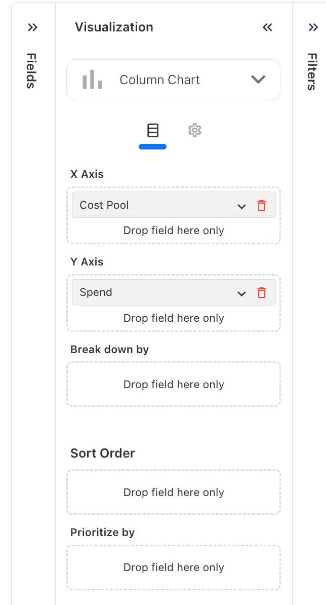
Prioritize values in a chart
Use Prioritize by to focus a chart on the most relevant values from a dimension. You can automatically prioritize the top values or select specific values to display.
Note: Prioritize by is available only for supported chart types. The option may not be available for every visualization.
You can also combine the remaining values into a single category to keep charts with many dimension values easier to review.
The prioritization options become available only after you add a field to Prioritize by.
Configure Prioritize by
To prioritize values:
-
Configure the required fields for your chart.
-
Drag the dimension you want to prioritize into Prioritize by.
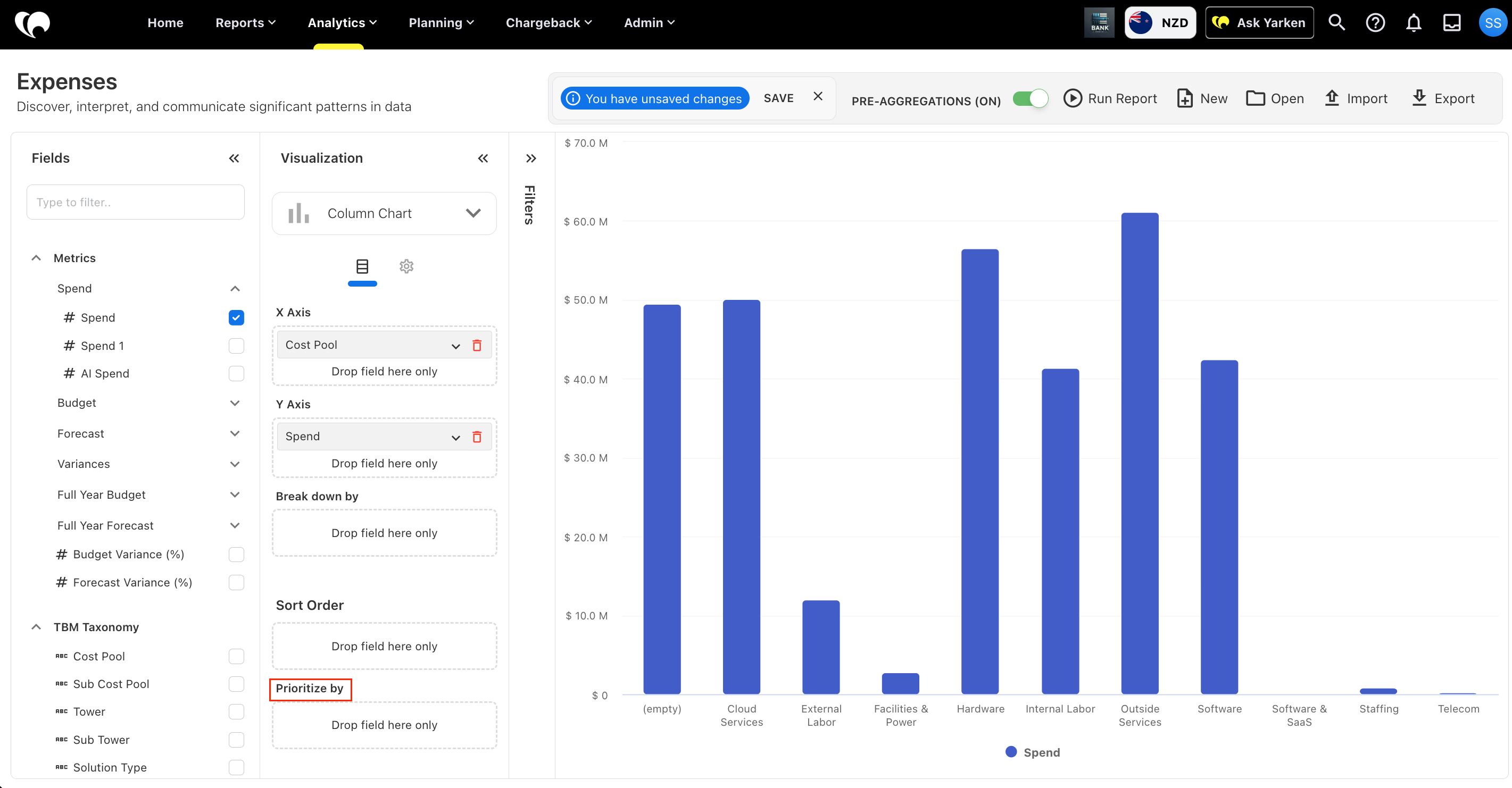
-
Expand the field under Prioritize by.
-
Choose Top N or Select value.
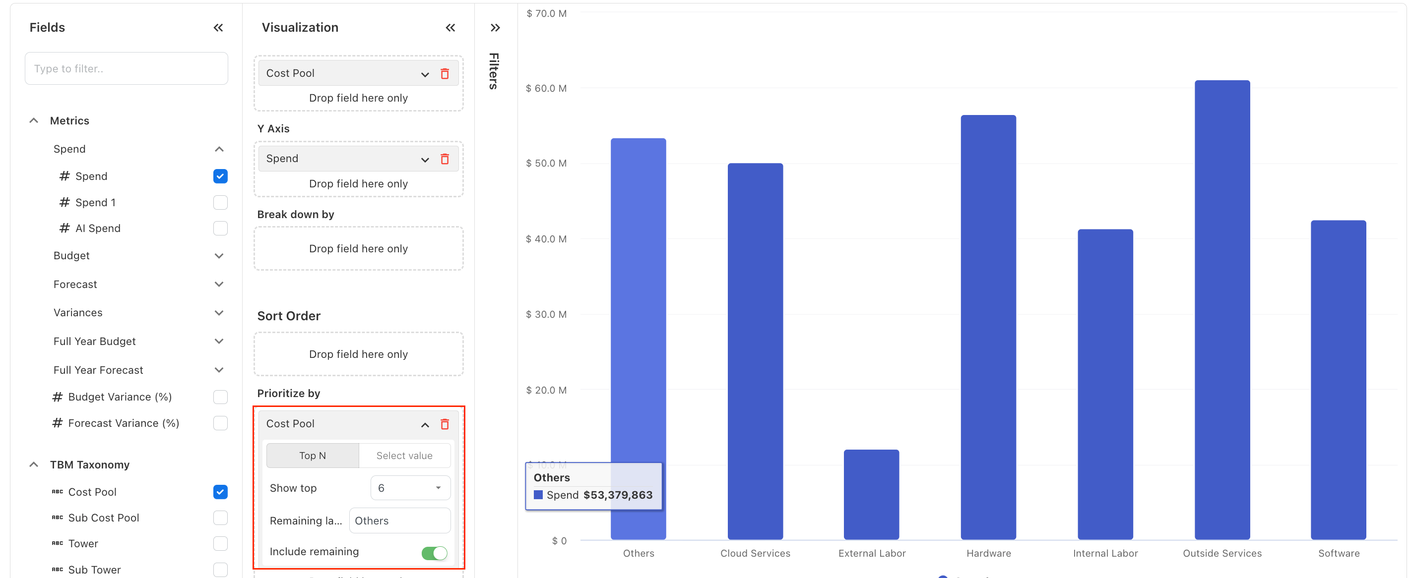
-
Configure the values you want to prioritize.
-
Choose whether to include the remaining values.
-
Run the report and review the results.
Prioritize the top values
Select Top N to let Yarken prioritize the highest values based on the chart data.
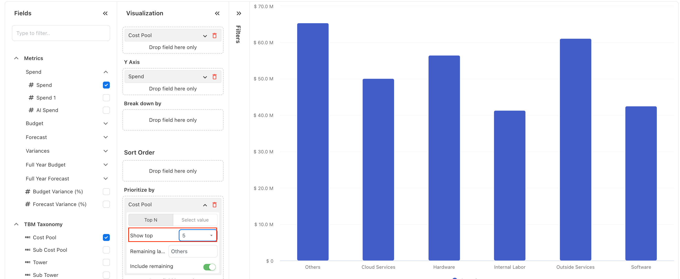
Under Show top, select the number of values you want to display individually.
For example, when Cost Pool is added to Prioritize by, you can configure the chart to display the top cost pools individually.
Prioritize specific values
Select Select value when you want to choose which dimension values appear individually.
Under Values, select the values you want to prioritize.
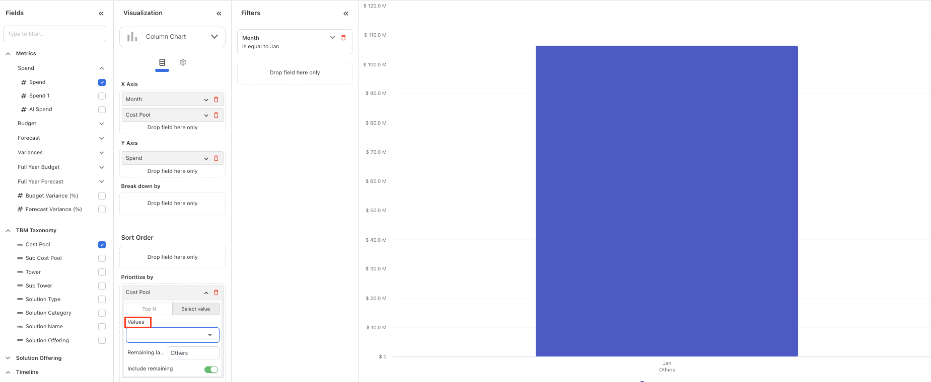
Use this option when you already know which categories are important to your analysis instead of using a Top N calculation.
Group the remaining values
Turn on Include remaining to combine values outside the prioritized selection into a single category.
Use Remaining label to customize the name of the grouped category.
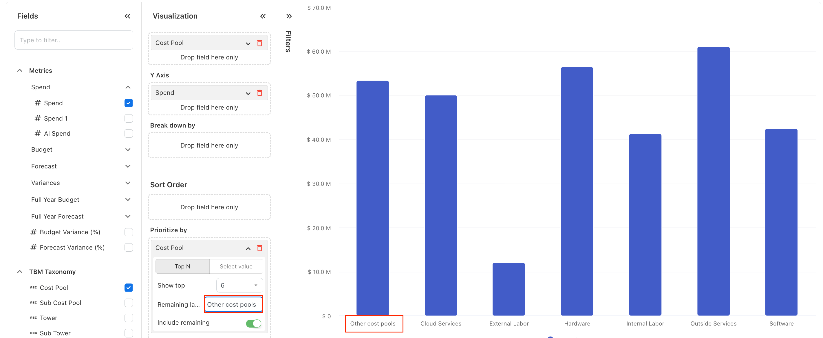
For example, you can display the highest cost pools individually and group all remaining cost pools under Others.
Turn off Include remaining when you do not want the remaining values included in the chart.
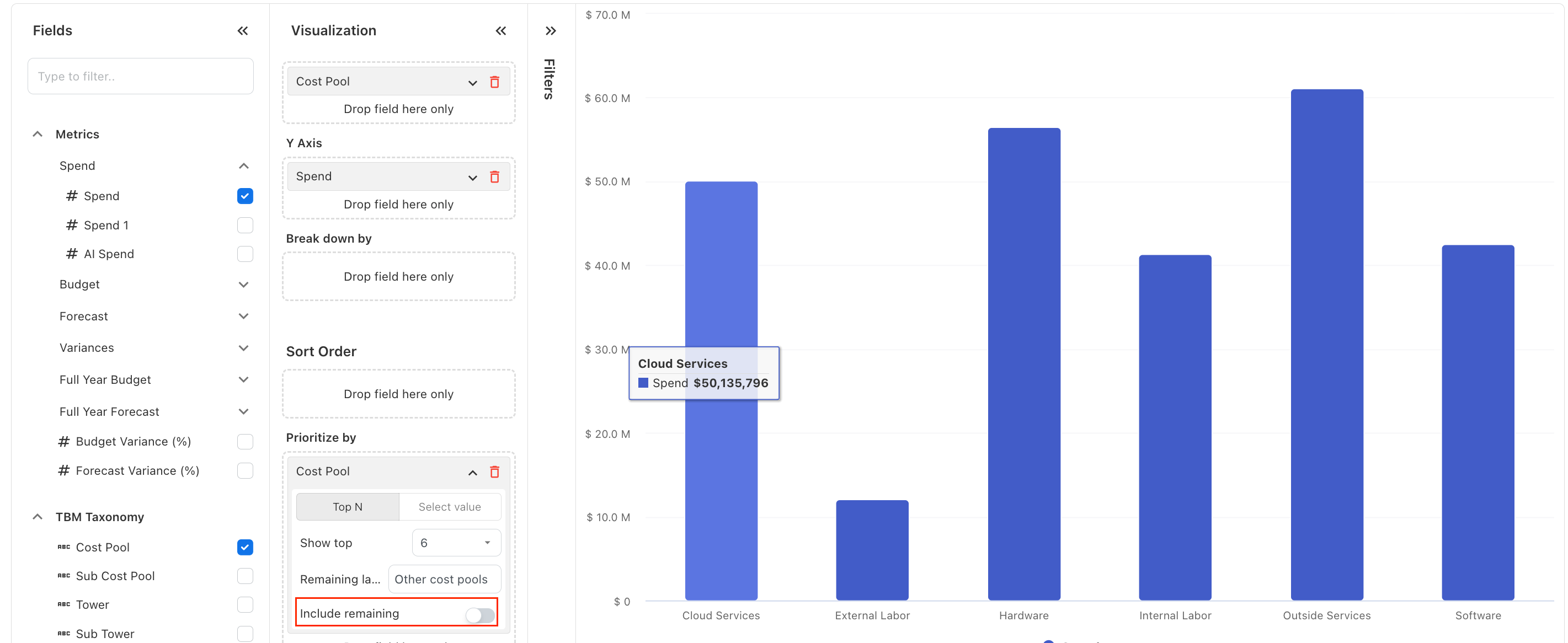
Filters panel
The Filters panel limits the report to the data needed for a specific question.
Many Analytics pages include a default Month filter set to the current month.
Filters can be used to narrow reports by:
-
Month
-
Year
-
Entity
-
Vendor
-
Cost Center
-
Account
-
Consumer
-
Asset
-
Provider
-
Service
-
TBM Taxonomy
-
Status
Good filters reduce noise and keep reports aligned to the decision being made.
Filtering tip
Good filters reduce noise and keep reports aligned to the decision being made.
Report canvas
The report canvas displays the output of the selected fields, visualization, and filters.
When no fields have been added, the canvas prompts users to drag and drop fields from the Fields panel.
After fields are added, the canvas updates to show the report output.
Use the canvas to review results, validate the report structure, and adjust fields or filters before saving.
Report actions
Analytics pages include common report actions in the top right of the workspace.
Common actions include:
-
Save to keep the current report configuration. When saving a report, select who can View the report and who can Edit it.
-
New to start a new report
-
Open to load an existing saved report
-
Import to bring in a saved report configuration where supported
Saved reports help teams reuse standard reporting views for recurring reviews, month-end analysis, governance meetings, and executive reporting.
Reuse saved reports
Saved reports support recurring reviews, month-end analysis, governance meetings, and executive reporting.
Control access to a saved report
When saving an Analytics report, you can control who can view the report and who can edit it.
-
View permission allows users to open and use the shared report without changing the original report configuration.
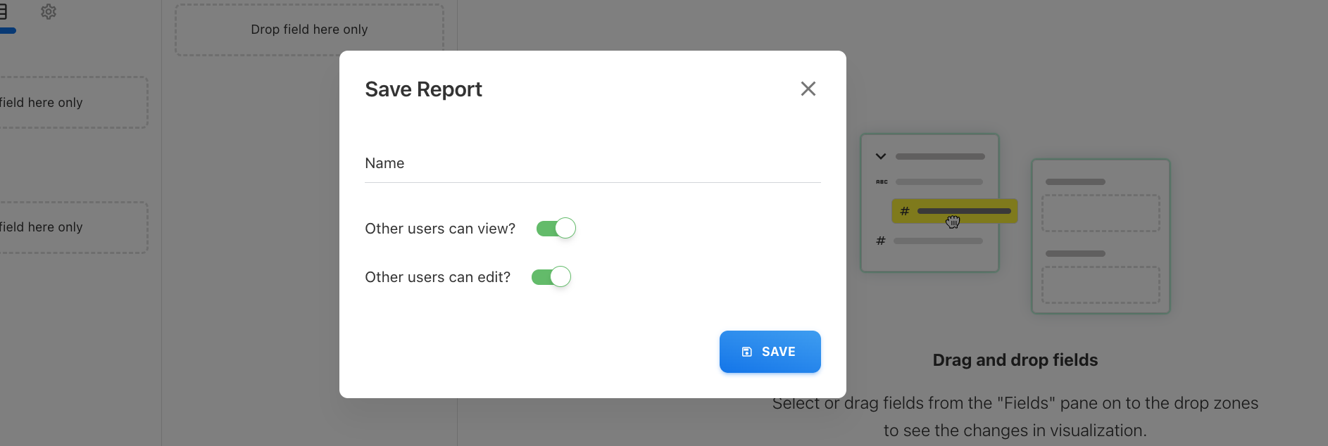
-
Edit permission allows users to update and save changes to the shared report.
Users who have View permission but do not have Edit permission do not see the Save option. They can use Save As to create their own copy of the report and make changes to that copy.
Permission behavior
Users with View permission but without Edit permission cannot use Save; they can use Save As to create their own copy.
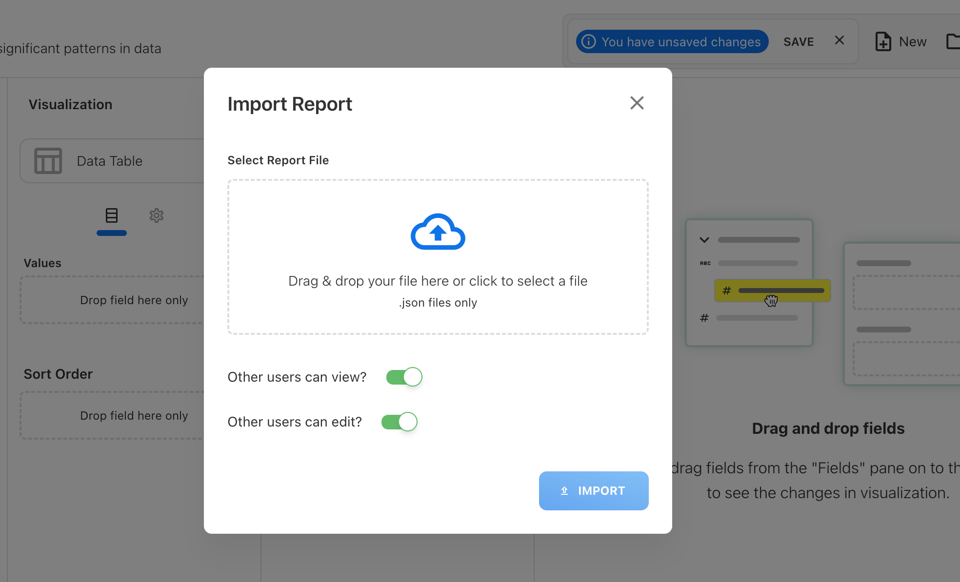
Report permissions when importing or exporting
Report permissions are not preserved when a report is exported.
When importing a report, View and Edit permissions are retained only when you manually select the required permission options during the import.
Import and export warning
Report permissions are not preserved on export. During import, manually select the required View and Edit permissions.
Pre-aggregations
The Pre-aggregations toggle controls whether Analytics uses prepared datasets where available.
Pre-aggregations improve performance by serving data from optimized reporting structures instead of recalculating each query from base data.
Keep pre-aggregations enabled for most reporting workflows, especially when working with larger datasets or recurring reports.
Performance tip
Keep pre-aggregations enabled for most workflows, especially with larger datasets or recurring reports.
Add Z-Score upper and lower bounds on Line Chart
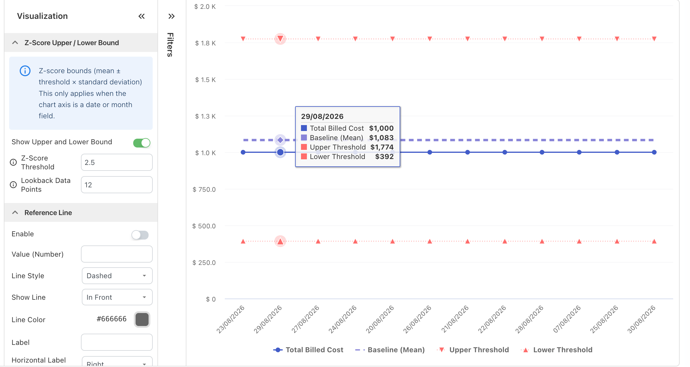
Use Z-Score Upper and Lower Bounds on a Line Chart to identify values that fall outside a statistically typical range.
Yarken calculates a baseline from historical data before the period displayed on the chart. It then adds upper and lower thresholds based on the configured Z-Score Threshold. This helps you identify unusually high or low values compared with recent historical patterns.
Note: Z-Score bounds are a chart visualization. They are different from Z-Score anomaly detection rules in Insights, which evaluate data in the background and create Insights.
What the Z-Score bounds show
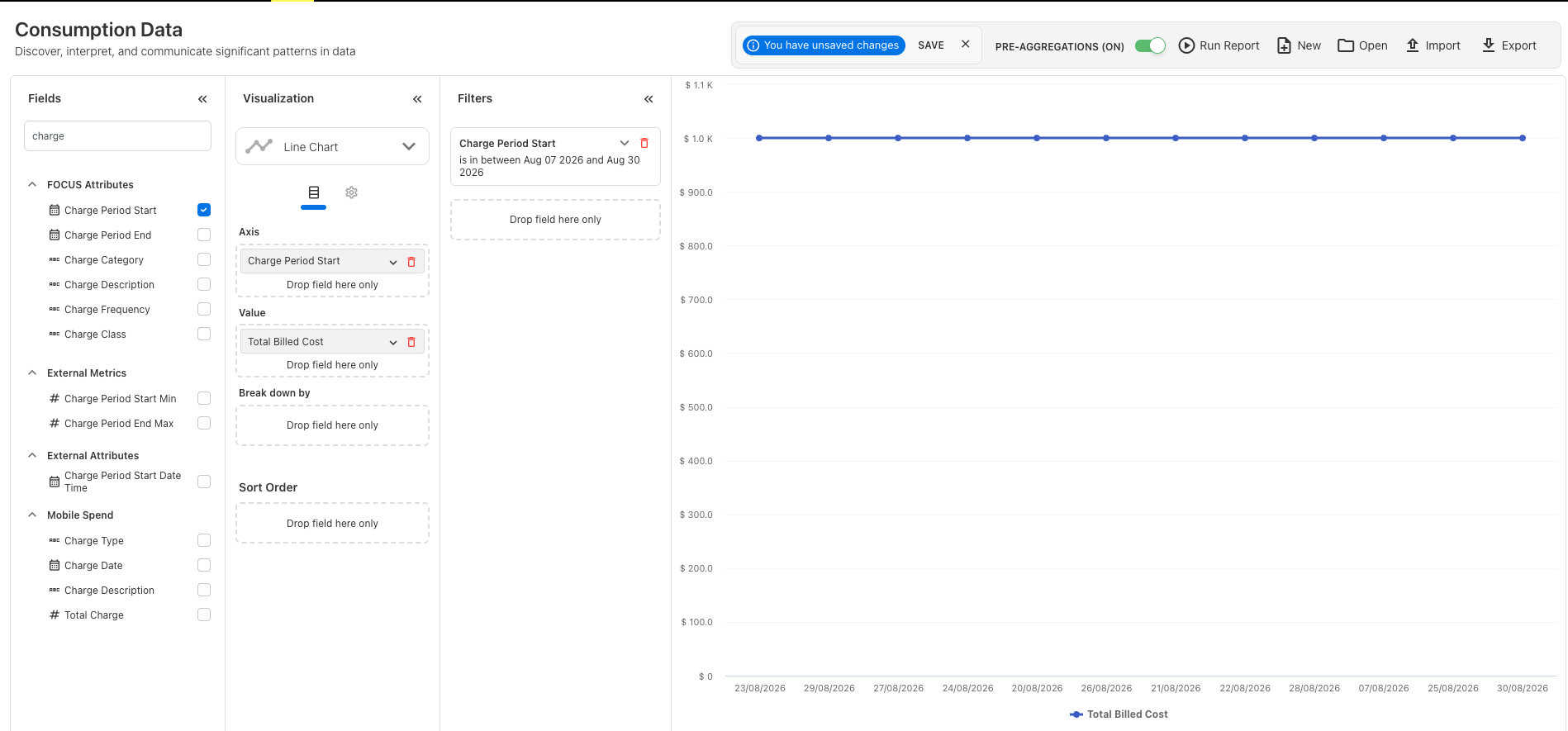
When you enable Z-Score bounds, Yarken adds three calculated lines for the selected measure:
|
Line |
What it represents |
|---|---|
|
Baseline (Mean) |
Average value calculated from the historical lookback period |
|
Upper Threshold |
Mean + (Z-Score Threshold × standard deviation) |
|
Lower Threshold |
Mean − (Z-Score Threshold × standard deviation) |
The baseline appears as a dashed line. The upper and lower thresholds appear as dotted lines with markers. These lines remain constant across the visible chart because Yarken calculates them from historical data immediately before the displayed period.
If you use Break down by, Yarken calculates a separate baseline and threshold range for each series.
Before you begin
Make sure your chart meets these requirements:
-
Select Line Chart as the visualization type. Z-Score bounds are not available for Spline, Area, Column, or other chart types.
-
Add a date or month field to the chart axis.
-
Add a measure to Value.
-
Apply a time filter that gives Yarken a start date for the visible chart period.
-
Make sure at least 6 valid historical data points exist before the displayed period.
For a date-based axis, use a date range or an after-date filter. For a month-based axis, apply a year filter. If you do not select a month, Yarken uses the tenant's fiscal-year start month.
If these requirements are not met, the Line Chart still appears, but Yarken does not draw the Z-Score bounds.
Configure Z-Score bounds
To add Z-Score bounds:
-
Open the required item from the Analytics menu.
-
In the Visualization panel, select Line Chart.
-
Add a date or month field to the chart axis.
-
Add the measure you want to evaluate to Value.
-
Apply the required time filter.
-
Open the visualization Settings.
-
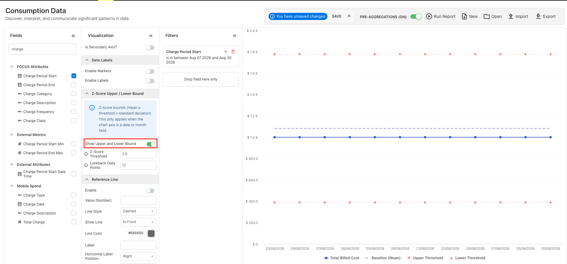
Expand Z-Score Upper / Lower Bound.
-
Turn on Show Upper and Lower Bound.
-
If needed, configure Z-Score Threshold and Lookback Data Points.
-
Review the baseline and upper and lower thresholds on the chart.
-
Save the report if you want to reuse the configuration.
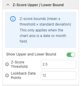
When you enable Show Upper and Lower Bound, the Z-Score Threshold and Lookback Data Points settings become available.
Configure the Z-Score threshold
Z-Score Threshold controls how far the upper and lower thresholds sit from the historical mean.
The default value is 2.5.
-
Increase the threshold to create a wider range. Fewer values are likely to fall outside the bounds.
-
Decrease the threshold to create a narrower range. More values are likely to fall outside the bounds.
For example, a threshold of 3 creates a wider range than 2.5, while 1.5 creates a narrower range.
If you leave the field blank or enter an invalid value, Yarken uses the default threshold of 2.5.
Configure the lookback data
Lookback Data Points determines how many valid historical values Yarken uses to calculate the baseline and thresholds.
The default is 12 historical data points.
You can enter a value from 6 to 365:
-
12 — default lookback.
-
6 — minimum supported lookback.
-
365 — maximum supported lookback.
If you enter fewer than 6 data points, Yarken resets the setting to the default value of 12.
Yarken retrieves the configured number of historical points immediately before the start of the period displayed on the chart. It excludes null, blank, and non-numeric values from the calculation.
How Yarken calculates the bounds
Yarken does not calculate the bounds from the values currently visible on the chart. Instead, it retrieves historical values immediately before the start of the displayed period.
For the valid historical values, Yarken calculates:
-
Upper Bound = Mean + (Z-Score Threshold × Standard Deviation)
-
Lower Bound = Mean − (Z-Score Threshold × Standard Deviation)
Yarken uses population standard deviation for this calculation.
For example, with a threshold of 2.5, a value above the upper bound is more than 2.5 standard deviations above the historical mean. A value below the lower bound is more than 2.5 standard deviations below it.
The chart displays the thresholds in the original measure values. It does not display a separate Z-Score series.
Interpret the chart
Use the bounds to determine whether the current values are consistent with recent historical behavior.
|
What you see |
What it means |
|---|---|
|
Value remains between the upper and lower thresholds |
The value is within the configured statistical range. |
|
Value is above the upper threshold |
The value is unusually high compared with the historical lookback period. |
|
Value is below the lower threshold |
The value is unusually low compared with the historical lookback period. |
|
Upper, lower, and mean lines overlap |
The historical values have little or no variation. |
-
When bounds are enabled, the shared tooltip lets you compare the actual value, mean, upper threshold, and lower threshold for the selected point.
-
Z-Score bounds help identify values that are statistically unusual compared with historical data. They do not forecast future values.
Add trend lines and forecasting
Use trend lines and forecasting to understand how measures change over time and extend selected trends into future reporting periods.
Analytics supports Cumulative Line and Linear Trendline options for Column Chart visualizations.
Note: Cumulative Line and Linear Trendline are available only for the Column Chart chart type.
Before you begin
-
The visualization must be a Column Chart.
-
Select the measure you want to analyze.
-
Use a timeline-based dimension, such as Year, Year-Month, or Date, when you want to analyze or forecast a trend across periods.
-
Add a date or reporting-period filter when you want Yarken to extend the forecast to a defined end date.
Add a cumulative line
Use Cumulative Line to show how a measure builds over the reporting period.
-
Open the required item from the Analytics menu.
-
In the Visualization panel, select Column Chart.
-
Configure the X-axis with a timeline-based dimension, such as Year, Year-Month, or Date.
-
Confirm that the measure you want to analyze is added to the chart.
-
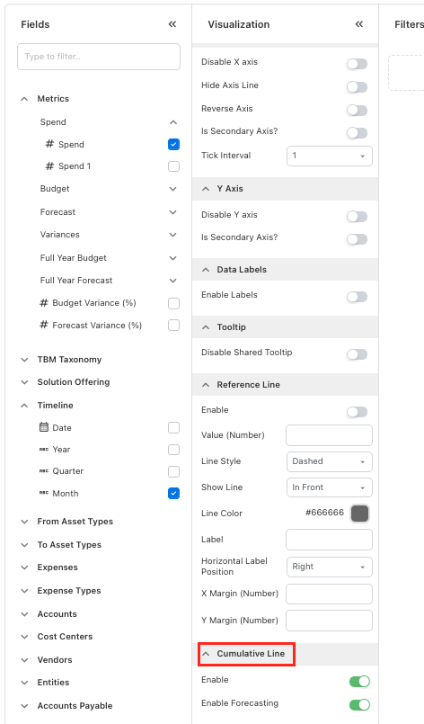
Open the visualization Settings and enable Cumulative Line.
-
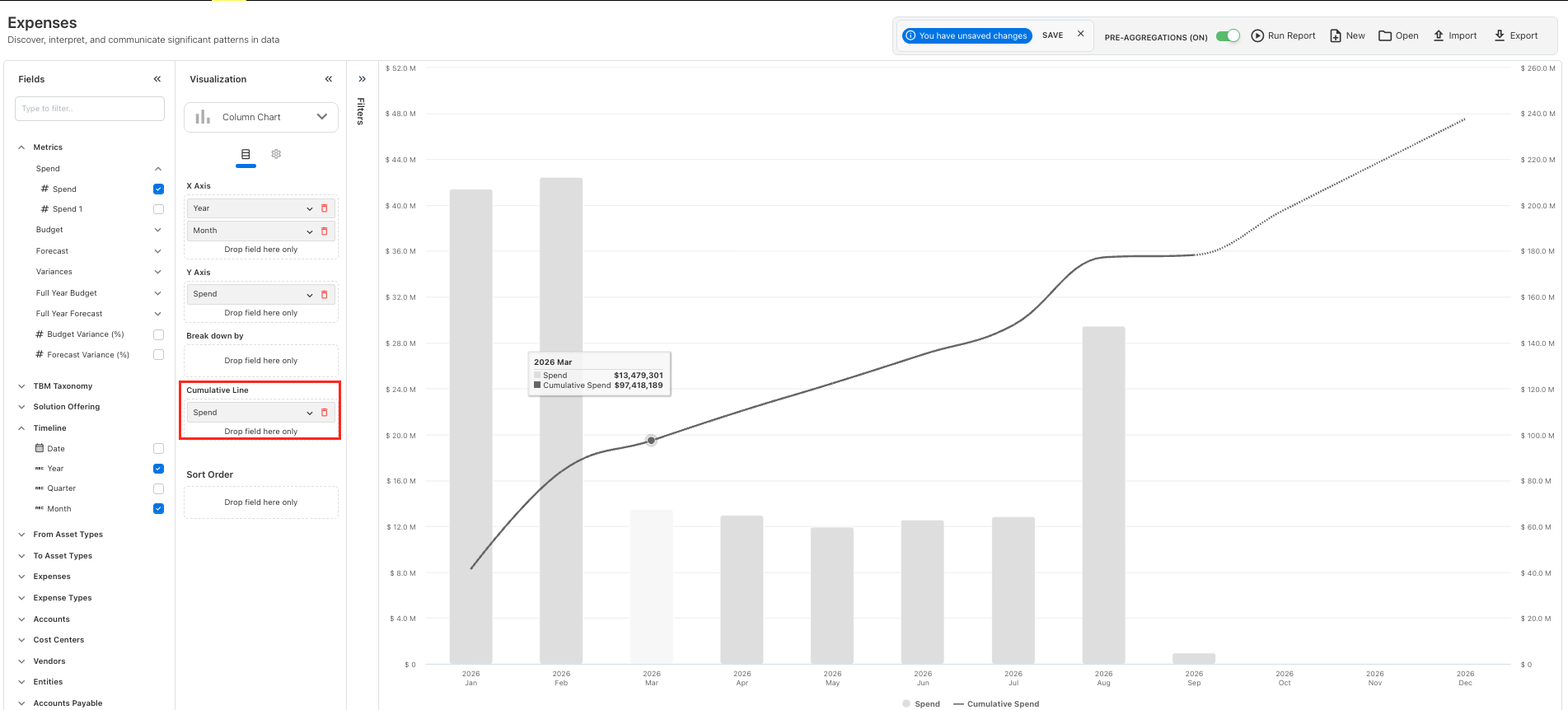
Drag the measure into the Cumulative Line section.
-
Configure the line color where required.
-
Turn on Forecasting to extend the cumulative line into future periods.
-
Review the chart and save the report if you want to reuse the configuration.
Forecasting uses a cumulative average to extend the cumulative trend into future periods.
Forecasting basis
Forecasting uses a cumulative average to extend the cumulative trend into future periods.
Add a linear trendline
Use Linear Trendline to show the overall direction of a measure across the available data points.
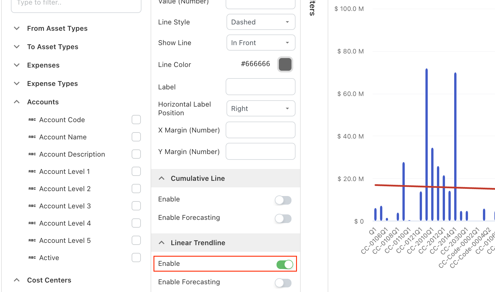
Yarken uses linear regression to calculate a straight trendline from the existing values. This can help you identify whether a measure is generally increasing, decreasing, or remaining relatively stable.
To add a linear trendline:
-
Open the required item from the Analytics menu.
-
In the Visualization panel, select Column Chart.
-
Add the measure and timeline-based dimension you want to analyze.
-
Open the visualization Settings.
-
Expand Linear Trendline.
-
Turn on Enable.
-
Configure the trendline color where required.
-
Review the chart.
-
Save the report if you want to reuse the configuration.
The trendline is calculated from the actual values available in the chart.
Interpretation
The trendline is calculated from the actual values available in the chart and represents the overall direction rather than every individual data point.
Forecast a linear trendline
Turn on Enable Forecasting under Linear Trendline to extend the calculated trend into future periods.
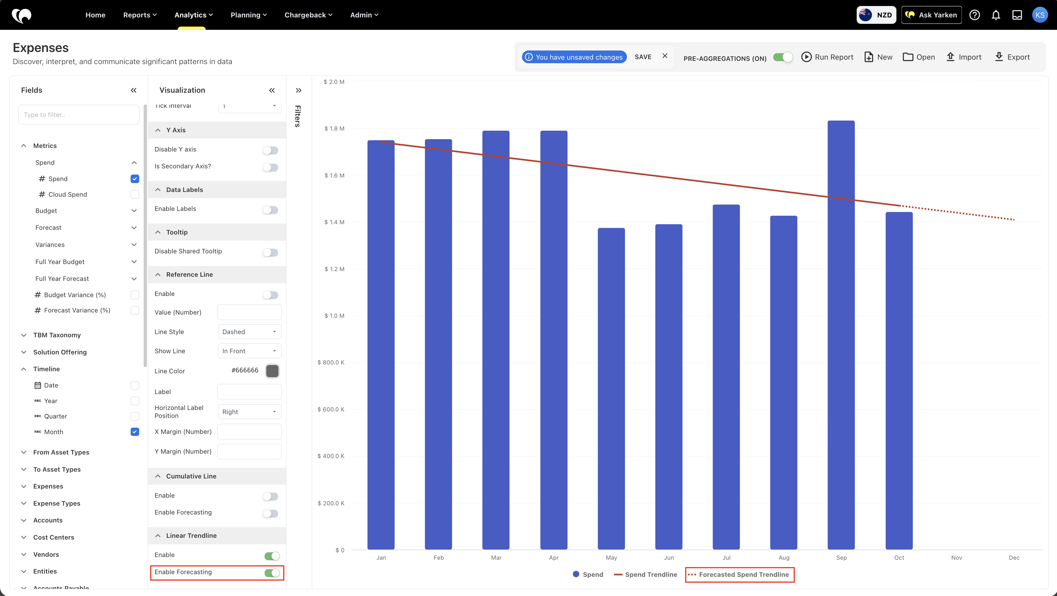
Enable Forecasting
Turn on Enable Forecasting to extend the calculated trend into future periods.
Linear Trendline
The trendline and forecast are based on linear regression calculated from the existing data points.
Projected trend
Yarken uses the calculated trend to project the direction of the data forward. The projected section appears separately from actual data.
Yarken uses the linear regression calculated from the existing data points to project the trend forward.
The forecasted section appears separately from the trendline based on actual data, helping you distinguish the observed trend from the projected trend.
Forecast limitation
A linear forecast is a projection of the current trend and does not guarantee future results.
Customize trendline colors
You can configure the line color for both Cumulative Line and Linear Trendline.
Use distinct colors when the chart contains multiple lines so viewers can distinguish actual, cumulative, trend, and forecast information more easily.
|
Option |
Use it to |
|---|---|
|
Cumulative Line |
Show the running total of a measure across the reporting period. |
|
Linear Trendline |
Show the overall direction of a measure using linear regression. |
|
Forecasting |
Extend the selected cumulative or linear trend into future periods. |
Forecast range for daily charts
For a daily time-series chart, the chart filter determines how far the forecast is plotted.
Daily forecast range
For daily time-series charts, the chart filter determines how far the forecast is plotted.
-
If the chart includes a date or reporting-period filter, Yarken uses the end of that filtered period as the forecast end date.
-
If no applicable filter is set, Yarken does not extend the forecast beyond the latest date available for the selected metric.
Unsaved changes
When a report has been changed, Analytics displays an unsaved changes message.
Save the report if the configuration should be reused later.
Discard changes only when the updated fields, filters, or visualization are no longer needed.
Before discarding
Discard changes only when the updated fields, filters, or visualization are no longer needed.
Build a basic Analytics report
To build a report:
-
Open the required item from the Analytics menu
-
Search or browse the Fields panel
-
Drag the required measure into Values
-
Add dimensions to shape the report output
-
Apply filters to narrow the dataset
-
Add sort fields where needed
-
For a timeline-based Column Chart, optionally configure a Cumulative Line or Linear Trendline and enable forecasting where required
-
Review the output in the report canvas
-
Save the report for future use
Start with a specific question. Then choose the fields and filters that answer it.
Start with the question
Choose the fields and filters that directly answer the business question you are investigating.
Choosing the right Analytics item
Select the Analytics item based on the type of question you need to answer.
Use Spend for actual spend analysis.
Use Consumer Spend for consumer-level cost accountability.
Use Asset TCO for asset cost and unit cost analysis.
Use Budgets & Forecasts for planning, budget, forecast, and variance reporting.
Use Consumption Data for cloud usage, FOCUS metrics, provider activity, and consumption-level analysis.
Use Companion Metrics for non-financial or supporting metrics used alongside financial data.
Use Recommendations for optimization opportunities, savings, and recommendation status.
Use Multi Cube when a report needs fields from more than one Analytics cube.
Use Custom Dashboards when saved reports need to be arranged into a tailored dashboard view.
Analytics and related workflows
Analytics connects with several Yarken workflows.
Use Analytics after data has been loaded, mapped, and structured through administrative and planning processes.
Analytics can support:
-
Month-end reporting
-
Finance review cycles
-
Budget and forecast analysis
-
Chargeback review
-
FinOps cost analysis
-
TCO analysis
-
Optimization reviews
-
Executive reporting
-
Governance reporting
The quality of Analytics output depends on the quality of source data, mappings, and model configuration.
Data quality matters
The quality of Analytics output depends on the quality of source data, mappings, and model configuration.
Recommended practices
Use these practices when working in Analytics:
-
Start with the business question before selecting fields
-
Use filters to keep reports focused
-
Combine measures with dimensions for useful context
-
Save reports that support recurring decisions
-
Keep naming conventions clear for saved reports
-
Use pre-aggregations for larger reports
-
Use Cumulative Line when you need to track how a total builds over time
-
Use Linear Trendline when you need to understand the overall direction of a measure
-
Treat a linear forecast as a projection of the current trend rather than a guaranteed future result
-
Use distinct line colors when cumulative, trend, and forecast lines appear together
-
Review the underlying data and reporting period before interpreting a forecast
-
Validate totals before sharing reports externally
-
Use Multi Cube only when a single Analytics item does not provide the required view
-
Apply an appropriate date or reporting-period filter before using daily forecasting so the chart has a defined forecast range
-
Use Prioritize by when a chart contains many dimension values and you want to focus on the most relevant values while optionally grouping the remainder.
Clear report structure improves decision quality and reduces manual analysis.
Recommended outcome
Clear report structure improves decision quality and reduces manual analysis.
Common troubleshooting checks
If a report does not show the expected results, review the following:
-
Confirm the correct Analytics item is selected
-
Check whether required fields are added to Values
-
Review active filters, especially Month and Entity filters
-
Confirm source data has been loaded for the selected period
-
Check whether the selected field belongs to the expected cube or dataset
-
Refresh or rebuild the report if the configuration was changed
-
Save changes before leaving the page
If Linear Trendline is not available, confirm that the visualization uses the Column Chart chart type.
If a forecasted linear trendline does not appear, confirm that Linear Trendline > Enable and Enable Forecasting are turned on and that the chart contains enough actual data to establish a trend.
If the linear trendline does not follow every data point, this is expected. The line represents the overall direction of the data using linear regression rather than connecting each individual value.
If the report still does not show expected data, confirm that the source data, mappings, permissions, and relevant models are configured correctly.
Escalation check
If expected data is still missing, confirm that source data, mappings, permissions, and relevant models are configured correctly.
When to create a saved report
Create a saved report when the same view will be reused by a team, shared across review cycles, or used as a source for dashboards.
When to save
Create a saved report when the same view will be reused by a team, shared across review cycles, or used as a dashboard source.
Saved reports are useful for:
-
Monthly finance reviews
-
Cost center reporting
-
Vendor reporting
-
Budget and forecast reviews
-
Chargeback review
-
Optimization tracking
-
Executive summaries
-
Dashboard inputs
Next step
Start with the Spend Analytics item, then apply the shared workflow described on this page.
Related content