
Overview
After configuring the queries, joins, and calculated columns, the final step is to create a visualization that presents the combined data in a meaningful way.
Multi Cube Analytics supports multiple visualization types, allowing you to display the combined dataset as tables or charts depending on your reporting requirements.
Select a visualization
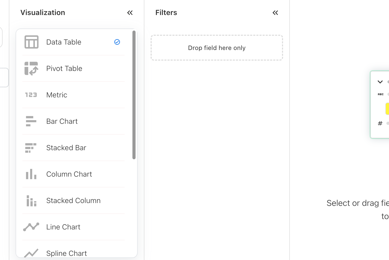
From the Visualization panel, select the required visualization type.
The available options may include:
-
Data Table
-
Bar Chart
-
Column Chart
-
Line Chart
-
Pie Chart
-
Area Chart
Add report fields
Drag the required fields from the Fields panel into the visualization.
Using the example scenario, add:
Dimensions:
-
Consumer
-
Year
-
Month
Measures:
-
Consumer Expenses
-
Remaining Expenses
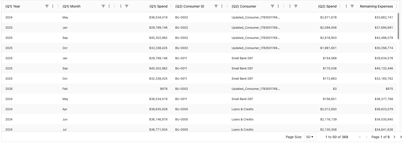
Example visualization
Using the Expenses and Consumer Expenses scenario, a Data Table may display:
Save the report
Click Save to store the Multi Cube report.
The saved report can be reopened, modified, and reused in Analytics.
Related content