
Use chart and table widgets to present Analytics data in a Custom Dashboard. Available settings depend on the selected visualization.
At a glance: Choose a visualization based on whether users need detailed values, comparisons, trends, or changes over time. Available settings vary by visualization.
Choose a visualization
Select the visualization that best matches the information you want to present. Supported options can include data tables, pivot tables, metric views, and chart visualizations.
Use tables when users need detailed values. Use charts when trends, comparisons, or changes over time are more important.
Visualization panel
The Visualization panel controls how results are displayed.
The default view is usually Data Table. Data tables are useful when users need detailed rows, column-level analysis, and clear financial review outputs.
Depending on the custom dashboard item and available configuration, users may also build other visual views.
The Visualization panel includes drop zones such as:
-
Values (X & Y axis)
-
Break down by
-
Sort Order
-
Prioritize by
Drag fields into these areas to define what the report displays, how the results are grouped or ordered, and which dimension values are prioritized.
Drag fields into these areas to define what the report displays and how the output is ordered.
Prioritize values in a chart
Use Prioritize by to focus a chart on the most relevant values from a dimension. You can automatically prioritize the top values or select specific values to display.
Note: Prioritize by is available only for supported chart types. The option may not be available for every visualization.
You can also combine the remaining values into a single category to keep charts with many dimension values easier to review.
The prioritization options become available only after you add a field to Prioritize by.
Configure Prioritize by
To prioritize values:
-
Configure the required fields for your chart.
-
Drag the dimension you want to prioritize into Prioritize by.
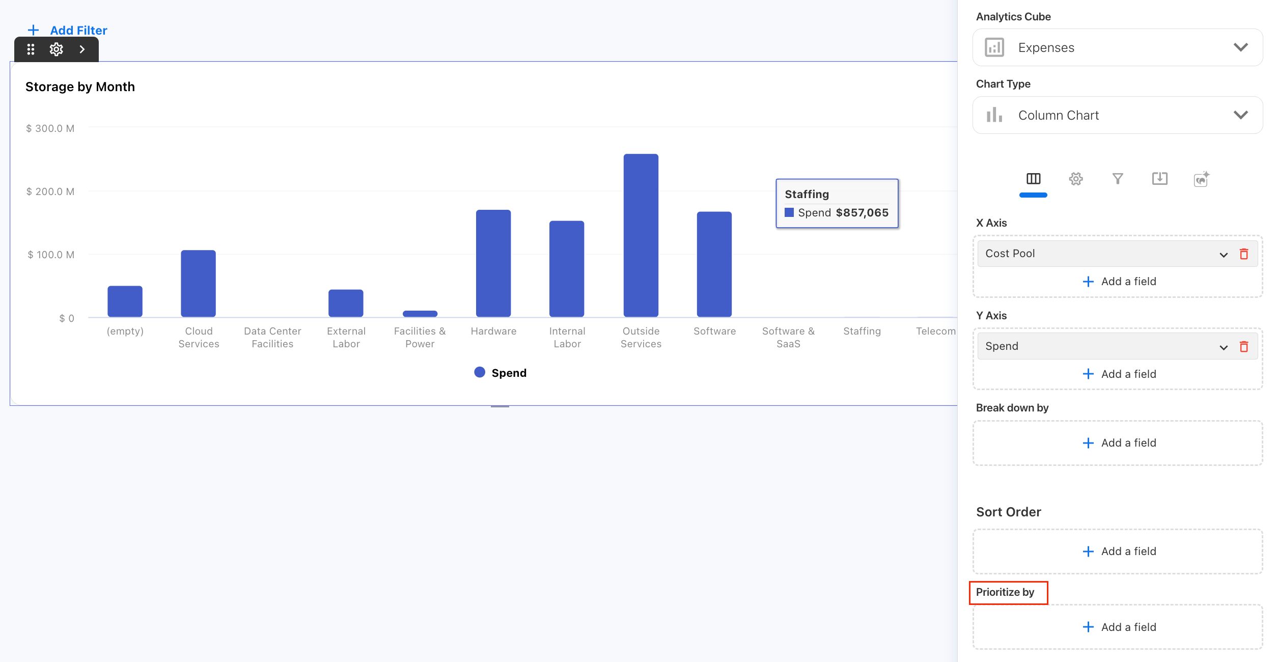
-
Expand the field under Prioritize by.
-
Choose Top N or Select value.
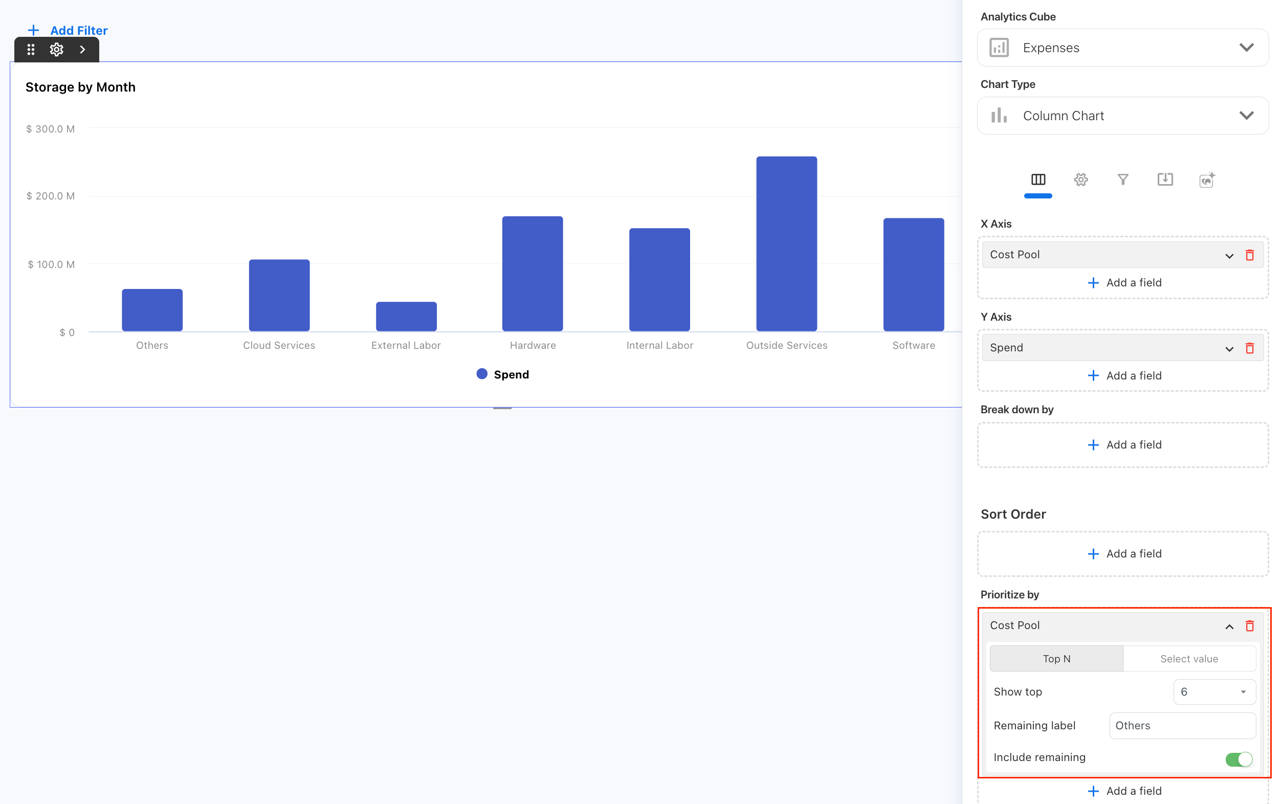
-
Configure the values you want to prioritize.
-
Choose whether to include the remaining values.
-
Run the report and review the results.
Prioritize the top values
Select Top N to let Yarken prioritize the highest values based on the chart data.
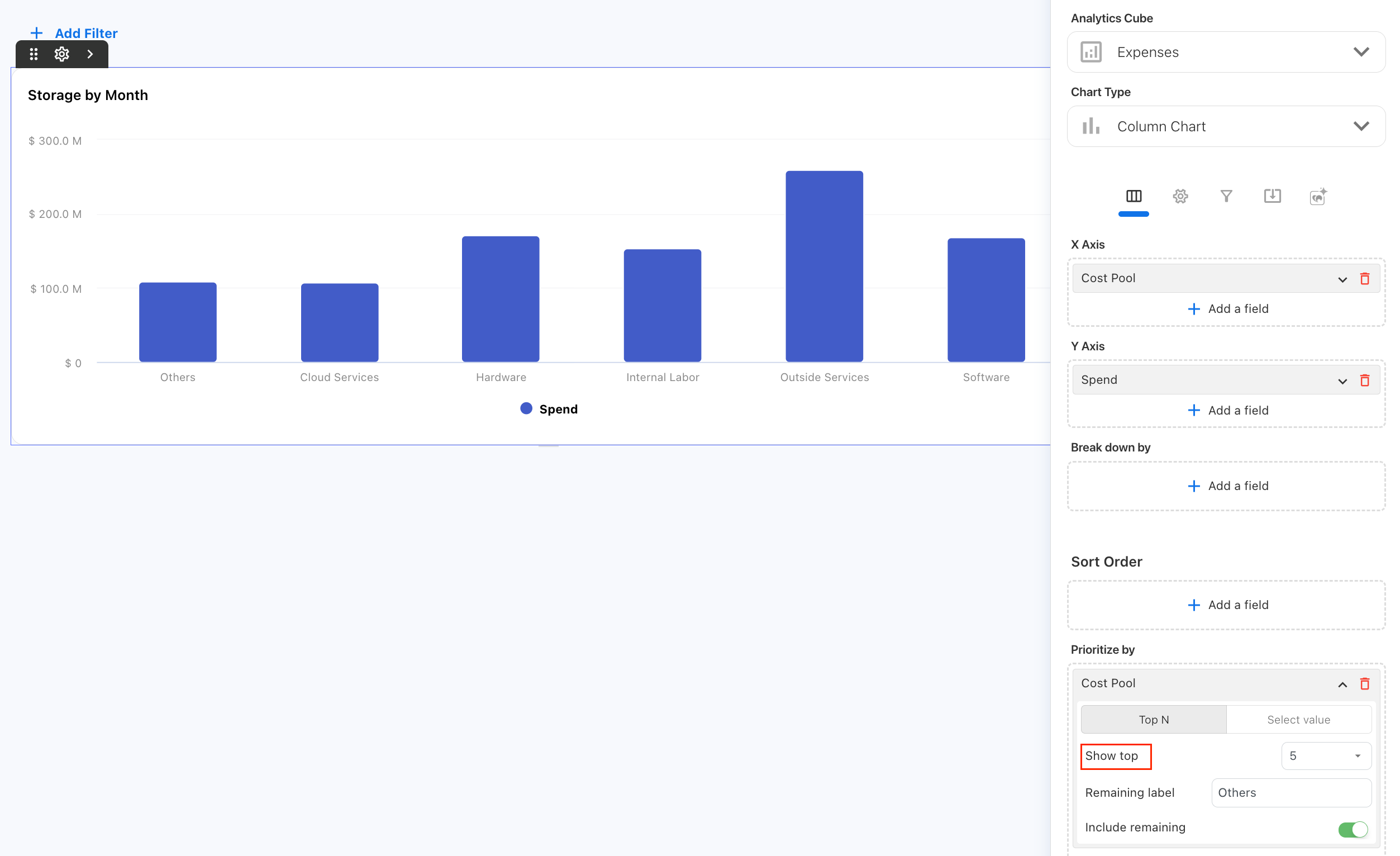
Under Show top, select the number of values you want to display individually.
For example, when Cost Pool is added to Prioritize by, you can configure the chart to display the top cost pools individually.
Prioritize specific values
Select Select value when you want to choose which dimension values appear individually.
Under Values, select the values you want to prioritize.
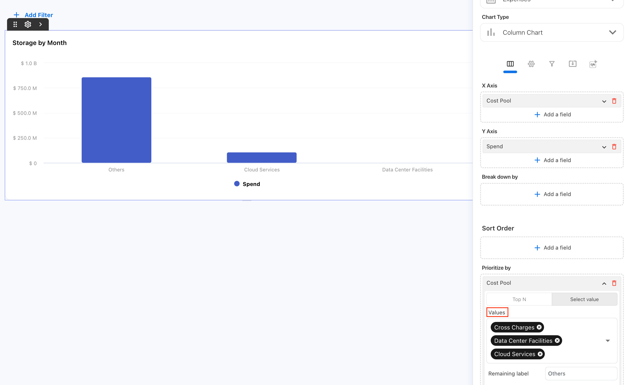
Use this option when you already know which categories are important to your analysis instead of using a Top N calculation.
Group the remaining values
Turn on Include remaining to combine values outside the prioritized selection into a single category.
Use Remaining label to customize the name of the grouped category.
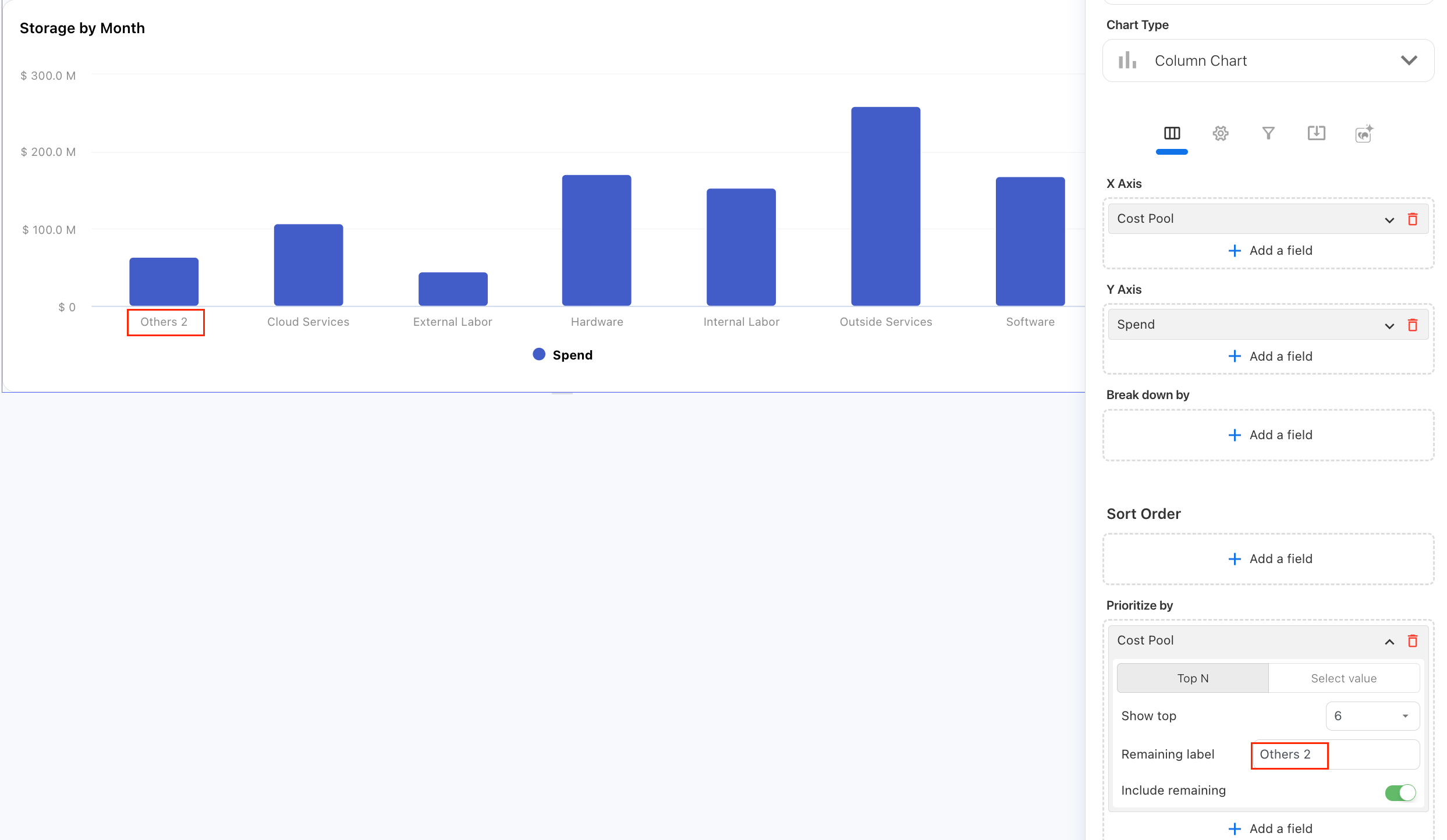
For example, you can display the highest cost pools individually and group all remaining cost pools under Others.
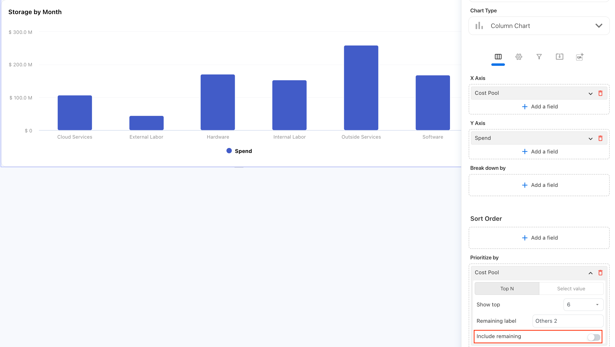
Turn off Include remaining when you do not want the remaining values included in the chart.
Configure a chart or table
-
Open the Custom Dashboard and select Edit.
-
Add or select the required Analytics widget.
-
Select the Analytics cube and fields required for the report.
-
Choose the visualization.
-
Configure values, dimensions, sorting, and filters as required.
-
Open the widget settings to configure the display options available for the selected visualization.
-
Review the widget and finish editing the dashboard.
Configure Z-Score upper and lower bounds on Line chart
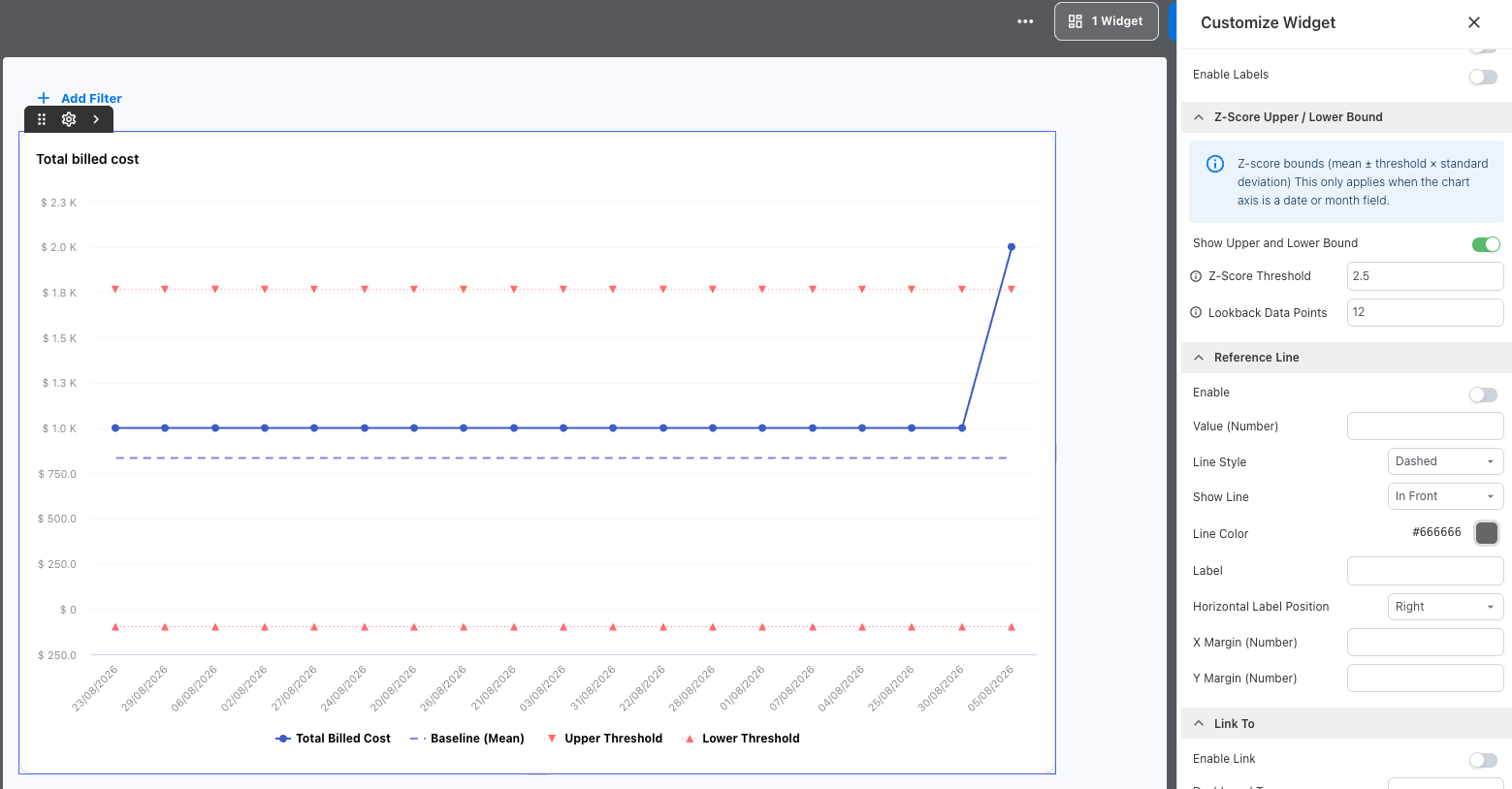
Use Z-Score Upper and Lower Bounds on a line chart to compare current values with a statistical range calculated from historical data.
Yarken uses historical values before the current chart period to calculate three reference lines:
|
Line |
What it represents |
|---|---|
|
Baseline (Mean) |
The average of the historical lookback values. |
|
Upper Threshold |
The upper boundary calculated from the historical mean and standard deviation. |
|
Lower Threshold |
The lower boundary calculated from the historical mean and standard deviation. |
Values above the upper threshold or below the lower threshold indicate unusual movement compared with the historical lookback data.
Note: Z-Score bounds provide a visual comparison against historical behavior. They do not create Insights or forecast future values.
Before you begin
Before configuring Z-Score bounds:
-
Select Line Chart as the visualization.
-
Use a date or month field for the chart axis.
-
Add the measure you want to analyze to Value.
-
Apply a time filter that defines the start of the visible chart period.
-
Make sure at least 6 valid historical data points are available before the visible period.
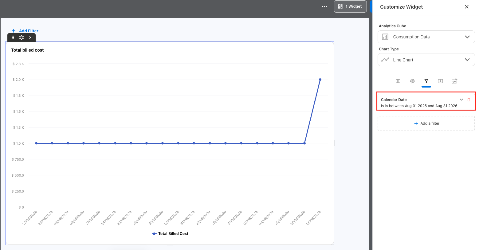
For a date-based axis, use a date range or after-date filter. For a month-based axis, apply a year filter. You can also apply a month filter.
If these requirements are not met, the chart continues to display, but Yarken does not draw the Z-Score bounds.
Add Z-Score bounds to a line chart
To configure Z-Score bounds:
-
Open the required Custom Dashboard.
-
Select Edit.
-
Add a new Analytics widget or select an existing widget.
-
Select Line Chart as the visualization.
-
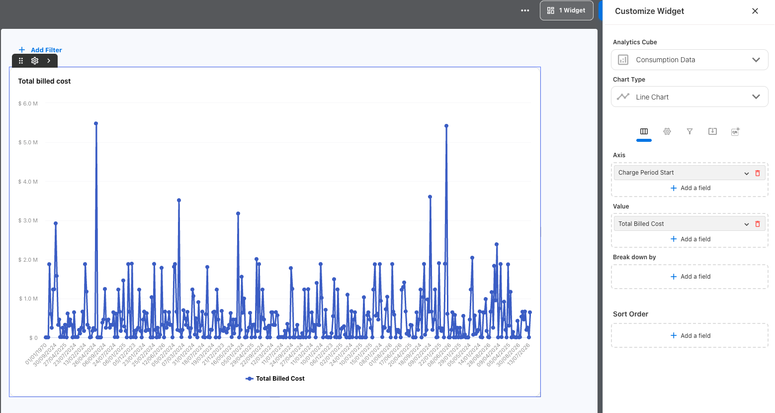
Add a date or month field to the chart axis.
-
Add the measure you want to analyze to Value.
-
Apply the required time filter.
-
Open the widget settings.
-
Expand Z-Score Upper / Lower Bound.
-
Turn on Show Upper and Lower Bound.
-
If needed, configure Z-Score Threshold and Lookback Data Points.
-
Review the baseline and thresholds on the chart.
-
Finish editing and save the dashboard.
When you turn on Show Upper and Lower Bound, the Z-Score Threshold and Lookback Data Points settings become available.
Configure the Z-Score threshold
Z-Score Threshold controls the distance between the historical mean and the upper and lower thresholds.
The default value is 2.5.
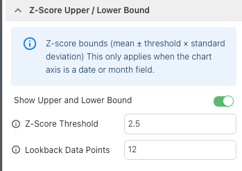
A higher value creates a wider range, so fewer values fall outside the thresholds. A lower value creates a narrower range, so more values may fall outside the thresholds.
If the value is blank or invalid, Yarken uses the default value of 2.5.
Configure the lookback data
Lookback Data Points determines how many valid historical values Yarken uses to calculate the baseline and thresholds.
|
Setting |
Value |
|---|---|
|
Default |
12 |
|
Minimum |
6 |
|
Maximum |
365 |
Yarken uses historical values immediately before the visible chart period.
If you enter fewer than 6 data points, Yarken resets Lookback Data Points to the default value of 12.
Interpret Z-Score bounds
Use the baseline and thresholds to identify values that differ from the historical range.
|
What you see |
What it means |
|---|---|
|
Value is between the thresholds |
The value is within the configured statistical range. |
|
Value is above the upper threshold |
The value is unusually high compared with the historical range. |
|
Value is below the lower threshold |
The value is unusually low compared with the historical range. |
|
Thresholds overlap the baseline |
Historical values have little or no variation. |
Use the chart tooltip to compare the actual value, Baseline (Mean), Upper Threshold, and Lower Threshold for the same point.
Configure Data Table pagination
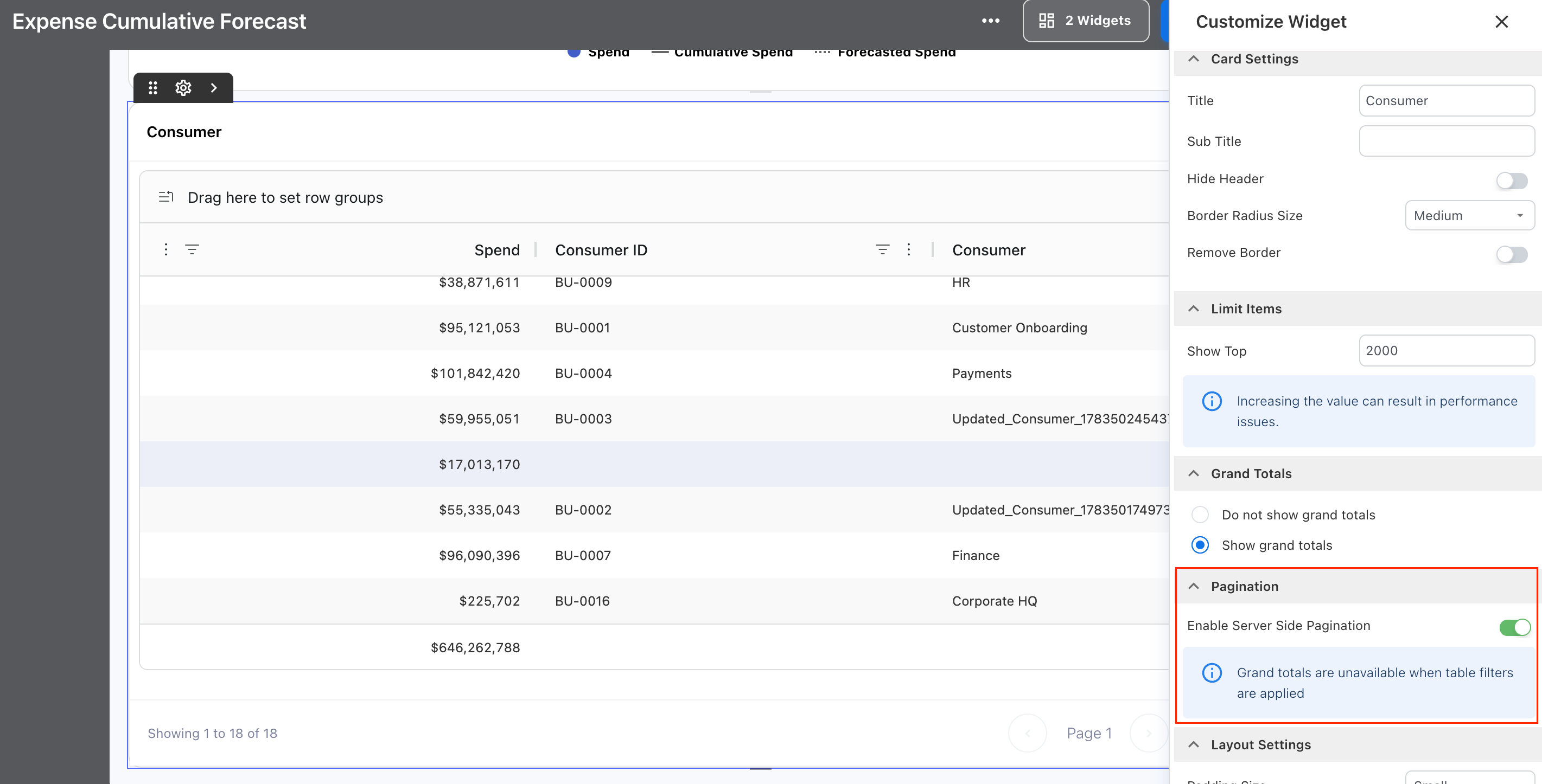
Data Table widgets support server-side and client-side pagination. Choose the pagination option based on the size of the dataset and how you want Yarken to load the table data.
Note: Pagination is available only for the Data Table chart type.
To configure pagination:
-
Open the required Custom Dashboard.
-
Select Edit.
-
Select the Data Table widget you want to configure.
-
Open the widget settings.
-
Expand Pagination.
-
Configure Enable Server Side Pagination:
-
Turn it on to use server-side pagination.
-
Turn it off to use client-side pagination.
-
-
Review the table and finish editing the dashboard.
Server-side pagination
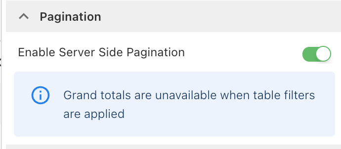
When Enable Server Side Pagination is turned on, Yarken retrieves the table data in pages. This helps prevent the complete dataset from being loaded into the browser at once and is recommended for large datasets.
Client-side pagination
When Enable Server Side Pagination is turned off, Yarken loads the table data into the browser and handles pagination locally.
Caution: Use client-side pagination carefully with large datasets. Loading a high volume of records into the browser can affect performance.
Understand Grand Total
Under Grand Totals, select Show grand totals to display a Grand Total across the complete dataset. The total is not limited to the records displayed on the current page.
For example, if a Data Table contains several pages of records, Grand Total includes values from all pages.
Select Do not show grand totals when you do not want to display the Grand Total row.
Note: Grand Total is unavailable while a local table filter is applied.
A local table filter does not run another server query. The existing Grand Total would therefore continue to represent the complete dataset rather than only the filtered rows. To prevent a misleading total, Yarken hides Grand Total while a local table filter is active.
Configure a Proportional Bar
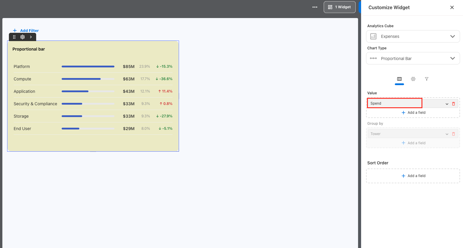
Use a Proportional Bar to compare a single metric across multiple categories. Each category can display its value together with its proportion of the total, making relative differences easier to review.
For example, you can use a Proportional Bar to compare spend across platforms, applications, cost centers, or other available dimensions.
To create a Proportional Bar:
-
Open the required Custom Dashboard.
-
Select Edit.
-
Add a new Analytics widget or select an existing widget.
-
Select the required Analytics Cube.
-
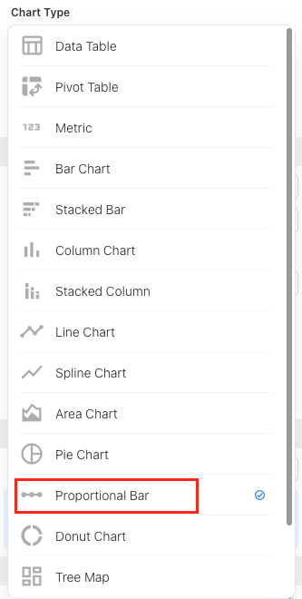
Under Chart Type, select Proportional Bar.
-
Select the metric you want to measure.
-
Select the dimension that defines the categories.
-
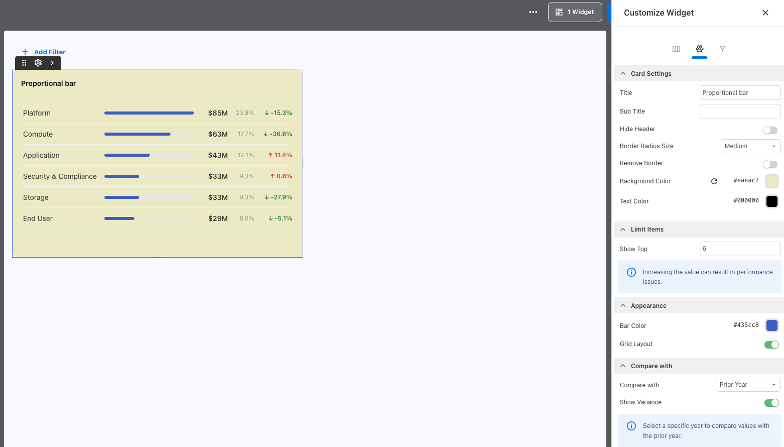
Configure the widget settings as required.
-
Review the visualization.
-
Save or finish editing the dashboard.
The visualization displays the selected metric across the available categories and can show each category's share of the total.
Limit the number of items
Use Limit Items to control how many categories appear in the Proportional Bar.
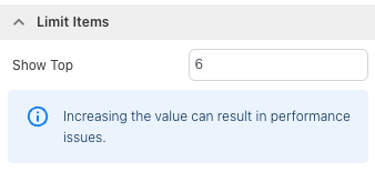
Under Show Top, enter the number of categories you want to display.
By default, the visualization displays the top six categories.
Note: Increasing the number of displayed categories can affect dashboard performance.
Customize the appearance
You can customize the bars, displayed values, column information, and comparison with the prior year.
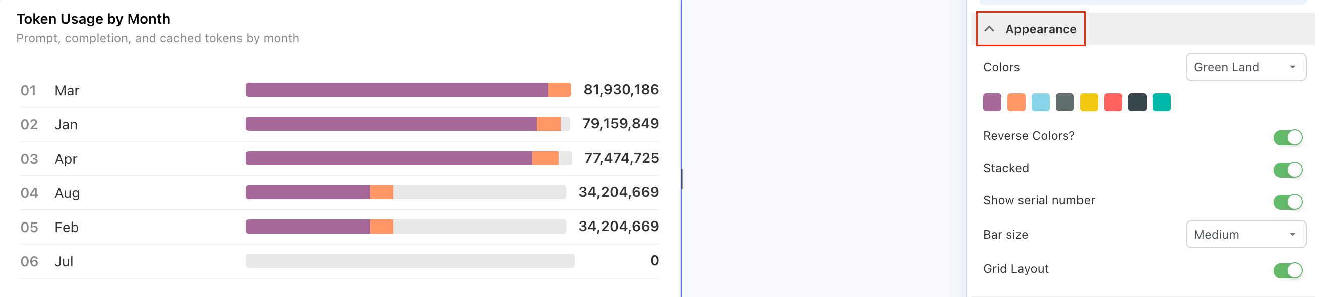
Expand Appearance to configure how the Proportional Bar is displayed.
-
Colors — Select a color theme for the visualization.
-
Reverse Colors? — Reverse the order of colors in the selected theme.
-
Stacked — Display the bars in a stacked layout.
-
Show serial number — Show or hide serial numbers for the displayed categories.
-
Bar size — Select the required bar thickness.
-
Grid Layout — Display the visualization using a grid layout.
Configure columns
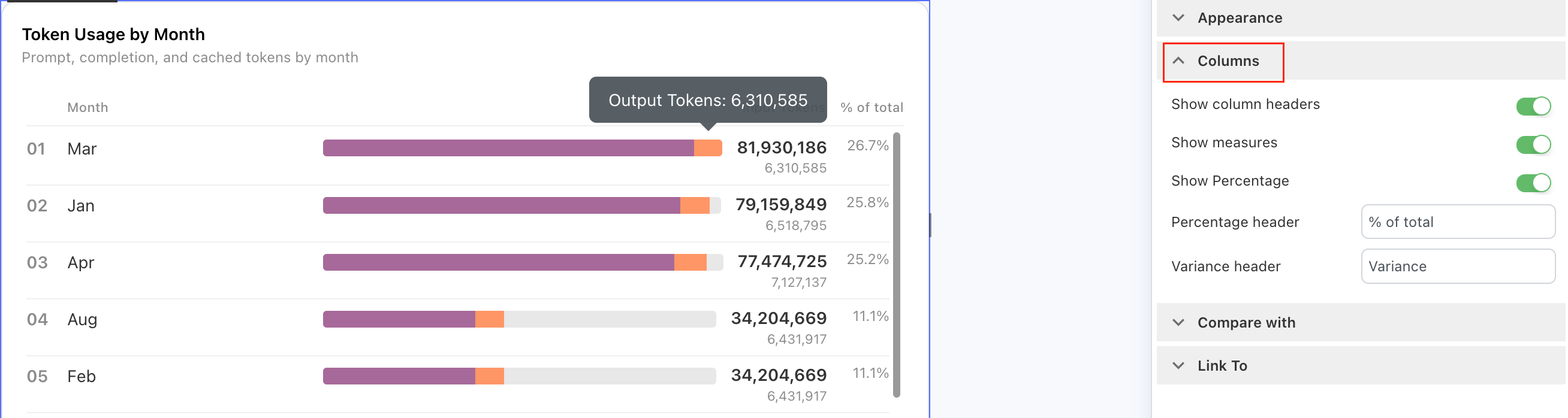
Expand Columns to control the information displayed with the bars.
-
Show column headers — Show or hide the column headings.
-
Show measures — Show or hide additional measure values.
-
Show Percentage — Show or hide the percentage contribution for each category.
-
Percentage header — Customize the heading used for the percentage column.
-
Variance header — Customize the heading used for the variance column.
Compare with the prior year
Use Compare with to compare each category with its corresponding value from the prior year.
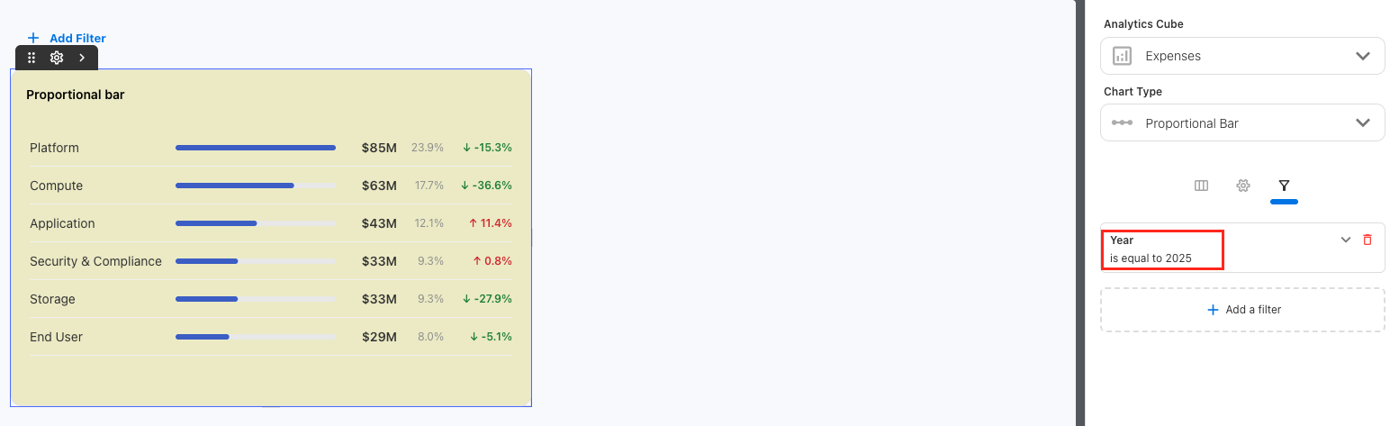
Year filter: To compare values with the prior year, select a specific year in the Year filter.
To configure the prior-year comparison:
-
Add a Year filter to the dashboard or widget.
-
Select the specific year you want to analyze.
-
Open the Proportional Bar widget settings.
-
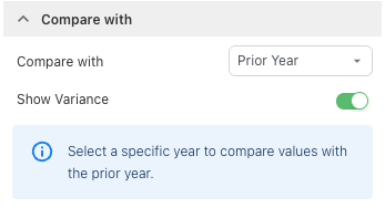
Expand Compare with.
-
Under Compare with, select Prior Year.
-
Turn on Show Variance to display the change from the prior year.
-
Review the comparison and finish editing the dashboard.
Yarken applies the same applicable filters to the current-year and prior-year values.
For example, if you select 2026 and March, Yarken compares March 2026 with the corresponding values from March 2025.
The visualization can show the direction and percentage change for each category, helping you identify categories that increased or decreased from the prior year.
Configure a Heatmap
Use a Heatmap to compare one measure across two dimensions. The visualization arranges one dimension into rows and another into columns, creating a matrix of values.
Each cell represents the selected measure for the corresponding row and column combination. Cell colors help you compare relative values and identify concentrations or patterns across the data.
For example, you could configure:
-
Value: Spend
-
Rows: AI Service
-
Columns: AI Model
Each cell then represents the spend for an AI Service and AI Model combination.
Configure the Heatmap fields
To configure the Heatmap:
-
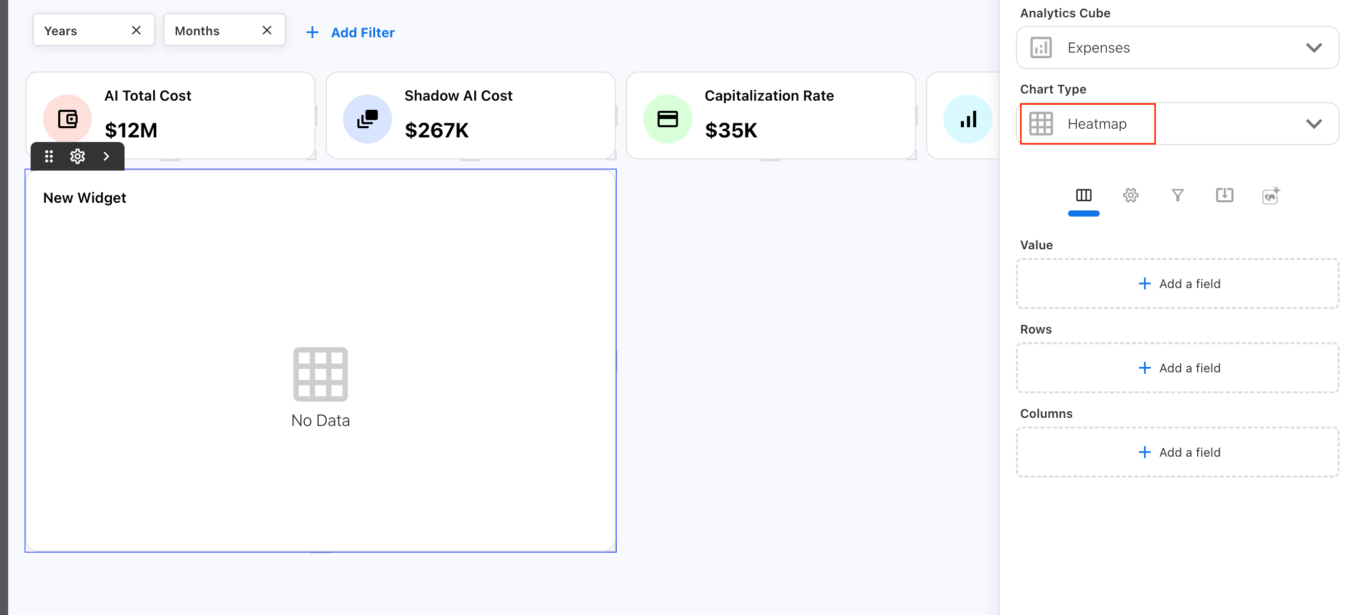
Select Heatmap under Chart Type.
-
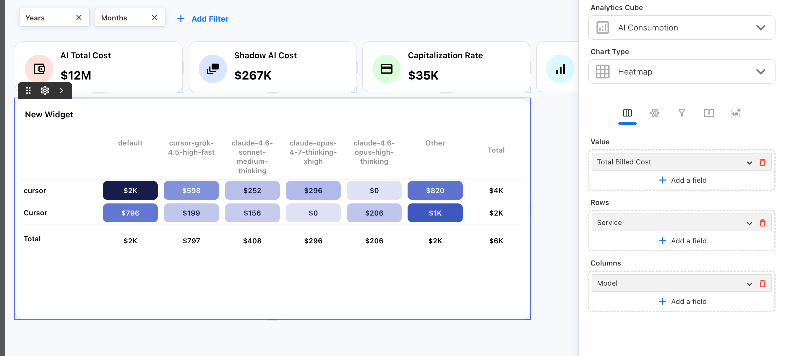
Under Value, add the measure you want to analyze.
-
Under Rows, add the dimension you want to display as rows.
-
Under Columns, add the dimension you want to display as columns.
-
Run the report.
Note: A Heatmap requires one measure, one row dimension, and one column dimension.
Use a Heatmap when you want to compare a metric across the intersection of two categories.
Limit rows and columns
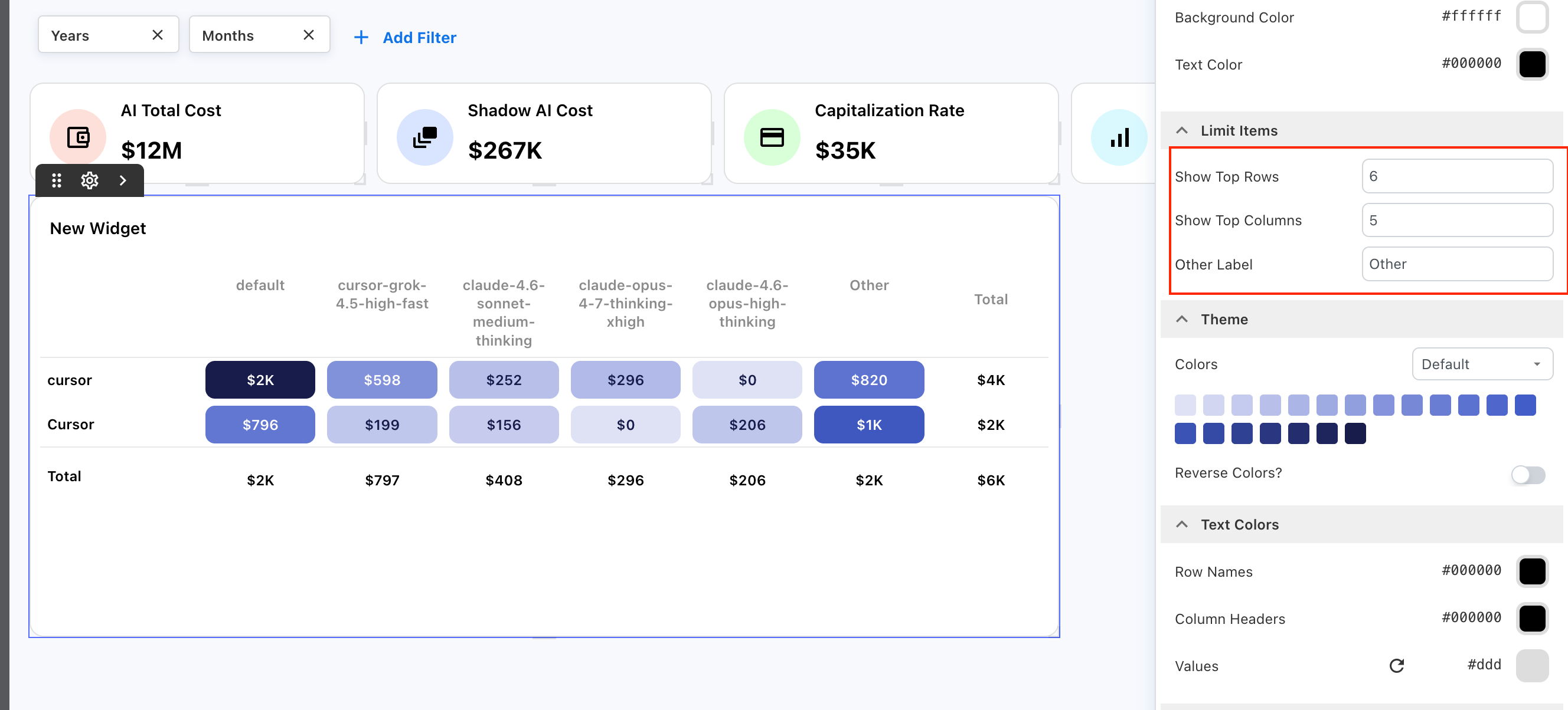
Use Limit Items to control how many row and column values appear in the Heatmap.
|
Setting |
Description |
|---|---|
|
Show Top Rows |
Sets the number of individual row values displayed. |
|
Show Top Columns |
Sets the number of individual column values displayed. |
|
Other Label |
Sets the label for values grouped outside the configured row or column limits. |
By default, the Heatmap displays up to 6 rows and 5 columns.
When the available values exceed a configured limit, Yarken groups the remaining values under Other.
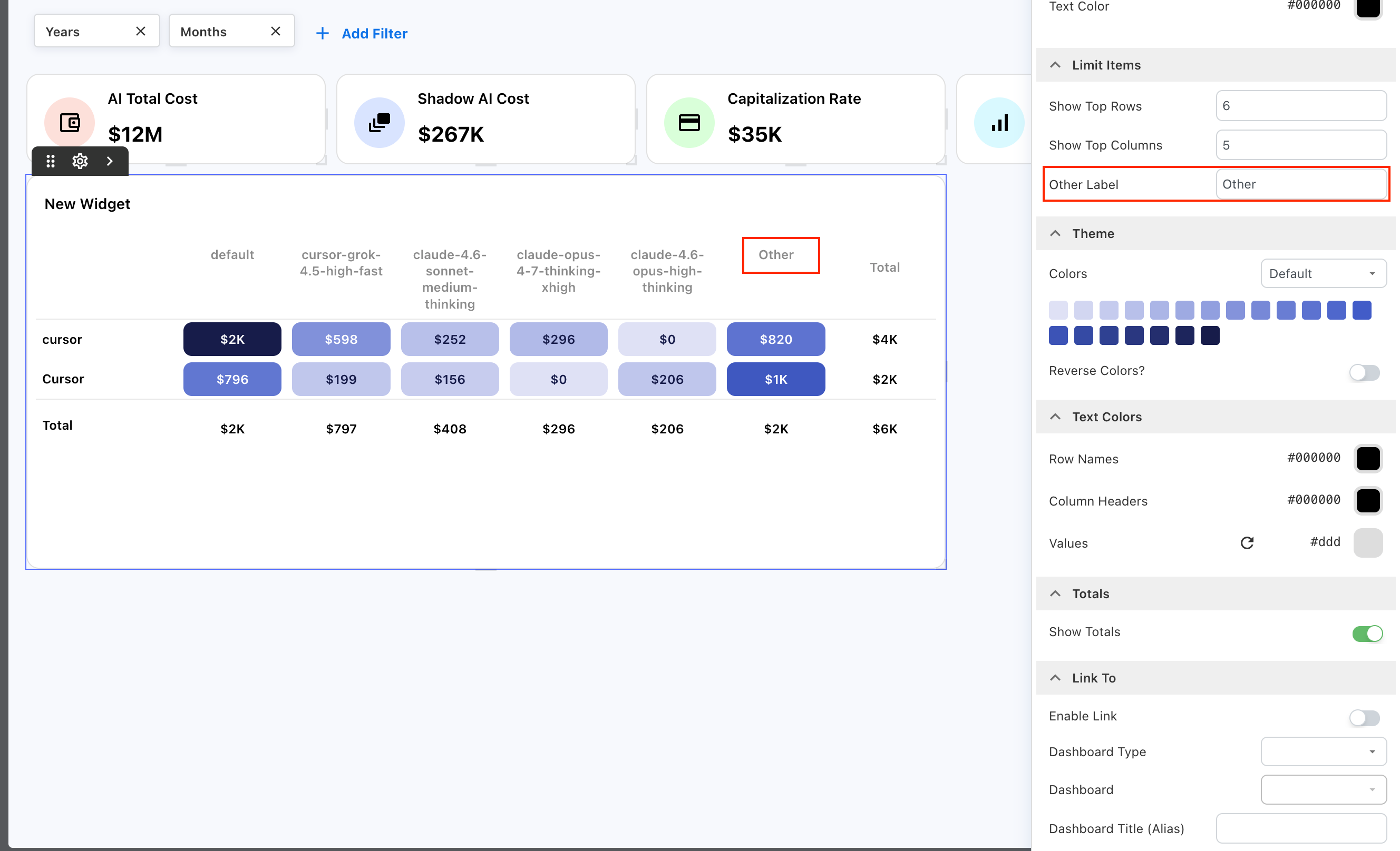
For example, if you reduce Show Top Columns to four, the Heatmap displays four individual column values and groups the remaining values under Other.
You can change Other Label when another name better represents the grouped values.
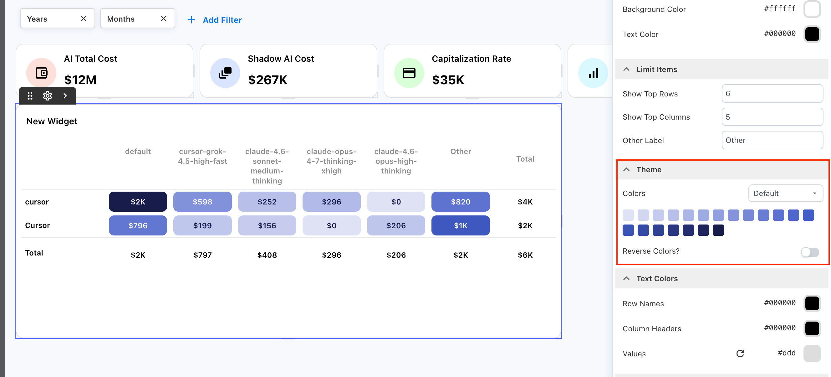
Customize the theme
Use Theme to control how values are represented across the Heatmap.
Under Colors, select the required color theme. Yarken applies the selected color scale to the Heatmap cells, helping you compare relative values across the matrix.
Turn on Reverse Colors? to reverse the direction of the selected color scale.
Configure text colors
Use Text Colors to control the appearance of text within the Heatmap.
You can configure the colors for:
-
Row Names
-
Column Headers
-
Values
Choose text colors that provide clear contrast with the selected Heatmap theme.
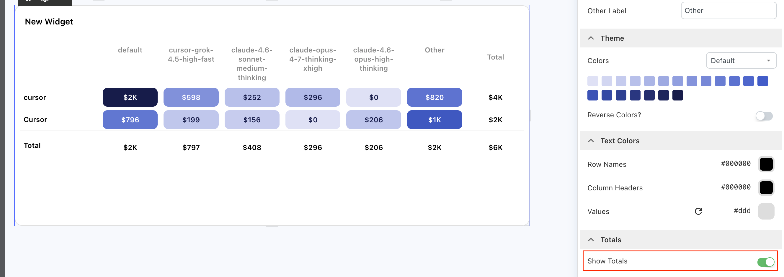
Show totals
Turn on Show Totals to display totals alongside the Heatmap.
Totals provide additional context for the values across each dimension and make it easier to compare individual intersections with their overall row and column values.
Drill down from a Heatmap
Heatmaps support the standard drill-down capability.
Use a Heatmap with Ask Yarken
Ask Yarken can use the underlying analytical data from a Heatmap as dashboard context.
Configure a Scatter Chart
Use a Scatter Chart to compare two measures and understand the relationship between them across a selected dimension.
Each point is positioned using an X Axis Measure and a Y Axis Measure. The selected Point Label identifies what each point represents. You can also use Group By to organize the points by another dimension.
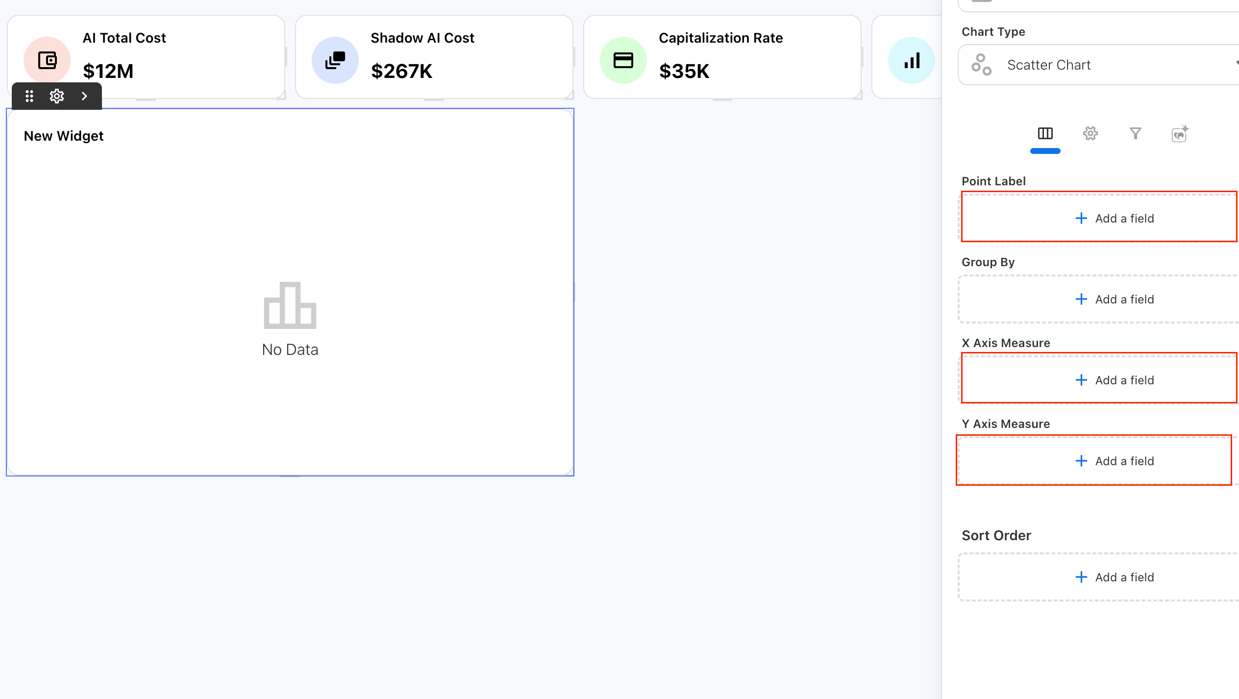
For example, you can compare tagging compliance with billed cost across service categories:
-
Point Label: Service Category
-
Group By: Provider
-
X Axis Measure: Tagging Compliance %
-
Y Axis Measure: Total Billed Cost
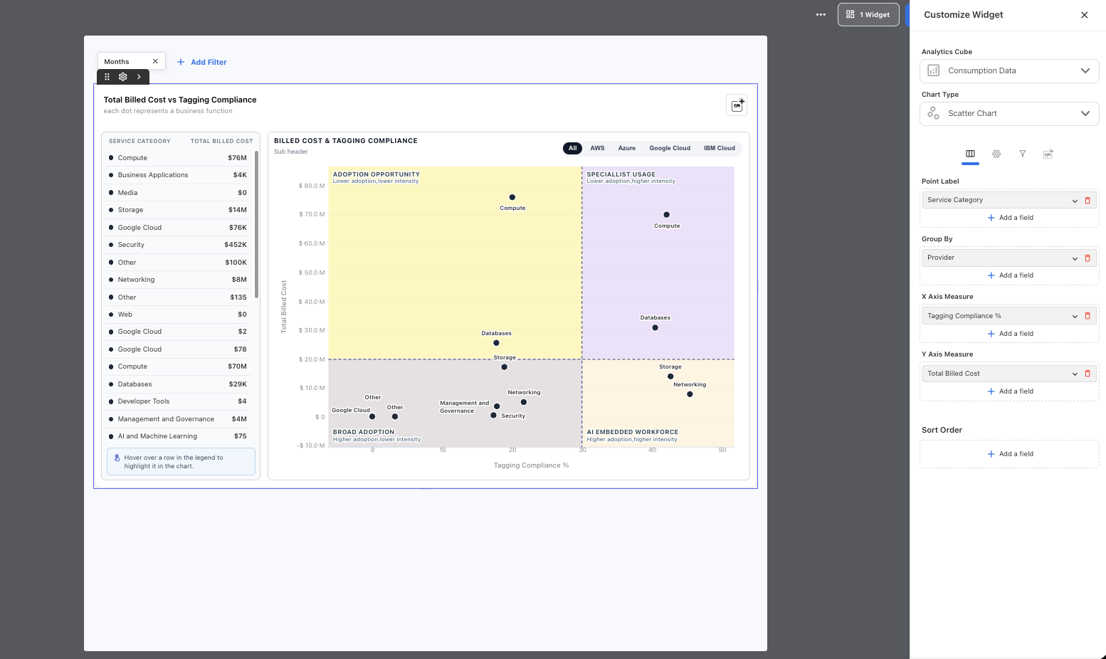
Each service category appears as a point positioned according to its tagging compliance and total billed cost. Grouping by Provider lets you further explore the results by cloud provider.
Scatter Charts can help you identify relationships, clusters, outliers, and categories that require further investigation.
Configure the Scatter Chart fields
To configure a Scatter Chart:
-
Open the required Custom Dashboard.
-
Select Scatter Chart under Chart Type.
-
Under Point Label, add the dimension that identifies each point.
-
Optionally, under Group By, add another dimension to group the points.
-
Under X Axis Measure, add the measure for the horizontal axis.
-
Under Y Axis Measure, add the measure for the vertical axis.

-
Optionally, add a field under Sort Order.
-
Review the chart and configure its appearance as required.
Understand Point Label
Point Label determines what each point on the Scatter Chart represents.
Each unique value from the selected dimension becomes an individual point. Yarken positions each point according to its X-axis and Y-axis measure values.
For example, when Service Category is the Point Label, categories such as Compute, Storage, Databases, and Networking appear as individual points.
The fields work together as follows:
-
Point Label identifies what is being compared.
-
X Axis Measure determines the horizontal position of each point.
-
Y Axis Measure determines the vertical position of each point.
Group the points
Use Group By to organize the Scatter Chart using another available dimension.
For example, select Provider to group the service categories by cloud provider. You can then use the provider options in the chart to focus the visualization on a specific provider.
The dimensions available for grouping depend on the selected Analytics cube.
Configure the side list
Use Side List to display a supporting list alongside the Scatter Chart.
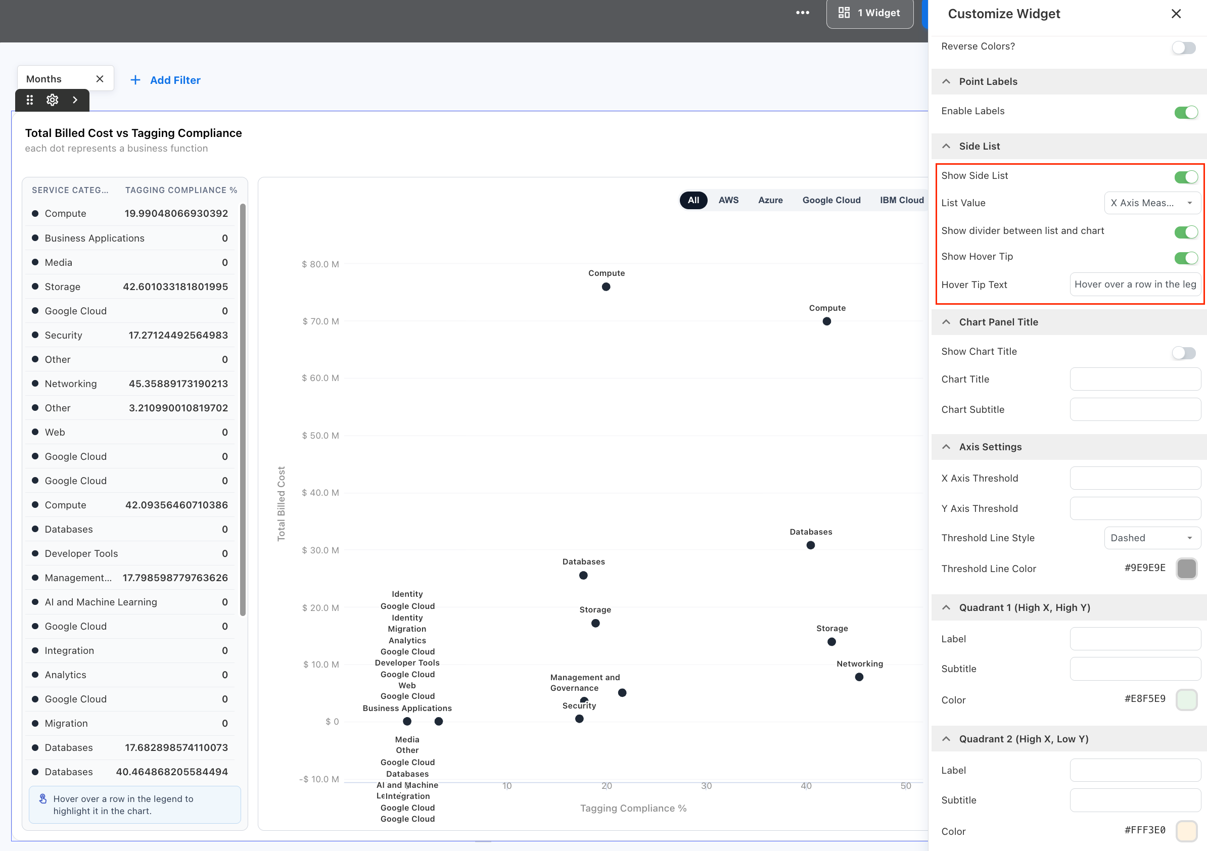
Configure the following settings as required:
|
Setting |
Description |
|---|---|
|
Show Side List |
Shows or hides the supporting list. |
|
List Value |
Selects the X-axis or Y-axis measure displayed with each item. |
|
Show divider between list and chart |
Shows or hides the divider between the list and chart. |
|
Show Hover Tip |
Shows guidance for interacting with the list. |
|
Hover Tip Text |
Defines the guidance displayed for the hover interaction. |
For example, when List Value uses the Y-axis measure, the side list can display each Service Category with its Total Billed Cost.
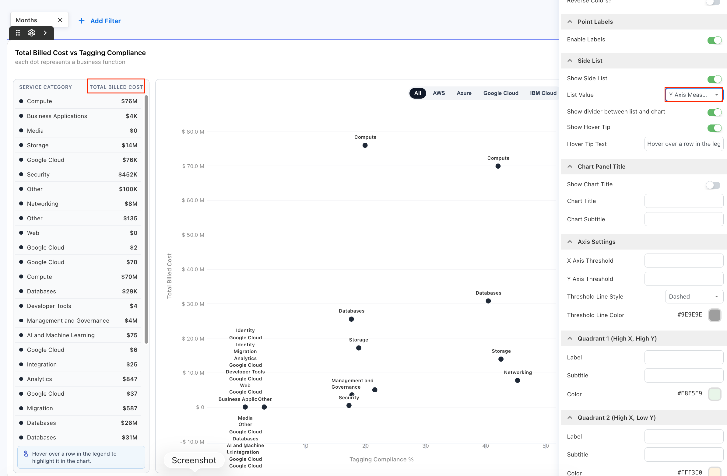
Hover over a row in the side list to highlight the corresponding point in the Scatter Chart.
Customize the chart theme
Under Theme, use Colors to select the required color theme.
Turn on Reverse Colors? to reverse the order of the selected color palette.
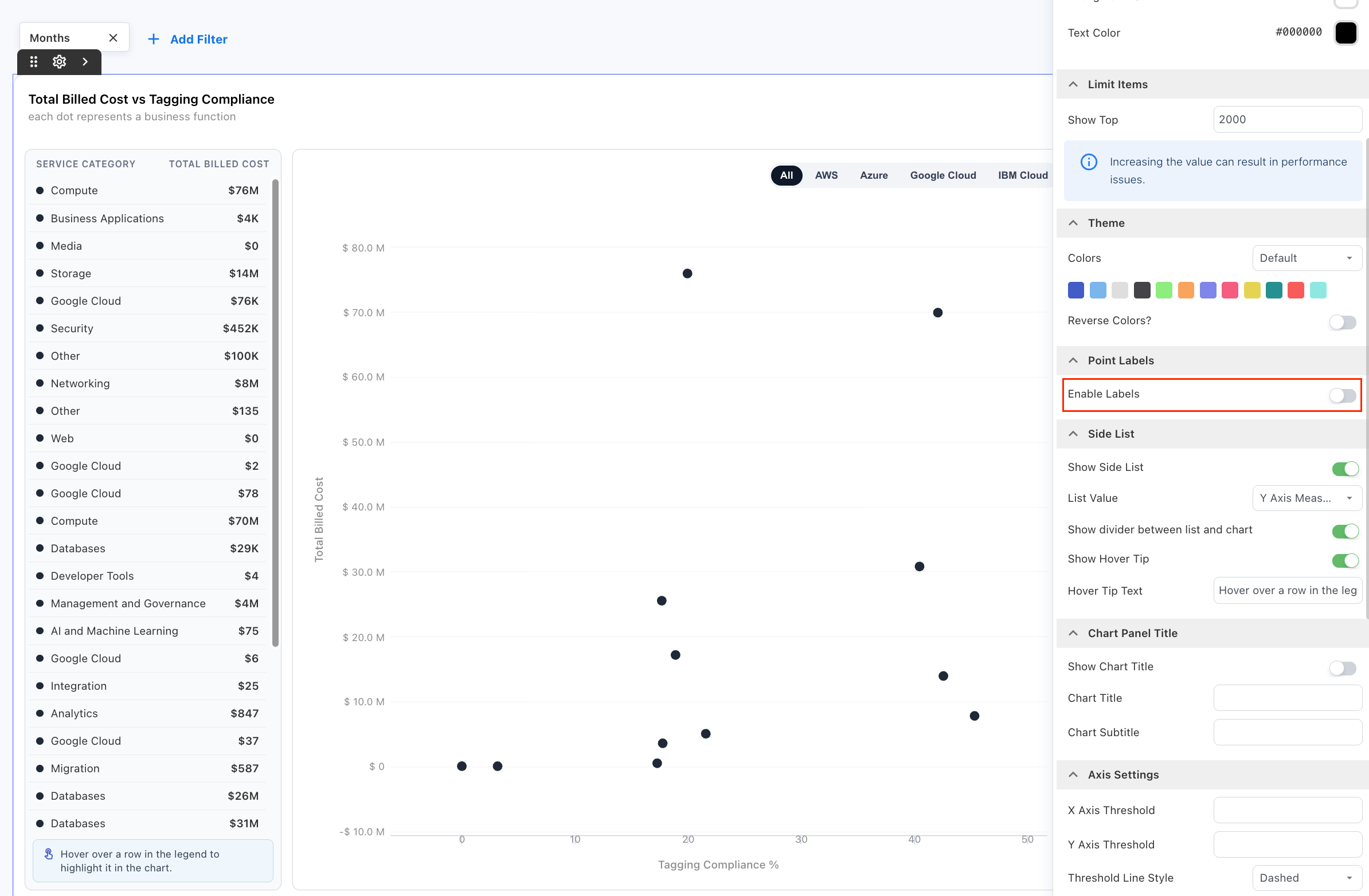
Show point labels
Under Point Labels, turn on Enable Labels to display labels with individual points.
Point labels make it easier to identify the category represented by each point without hovering over the visualization.
For charts with many points, turn off Enable Labels to reduce visual clutter.
Configure the chart panel title
Use Chart Panel Title to add a title and subtitle to the chart area.

Turn on Show Chart Title, then configure:
-
Chart Title
-
Chart Subtitle
These settings are separate from the title and subtitle configured under Card Settings.
Configure quadrants
Use Axis Settings to divide the Scatter Chart into four quadrants. Quadrants can help you interpret different combinations of high and low values across the two measures.
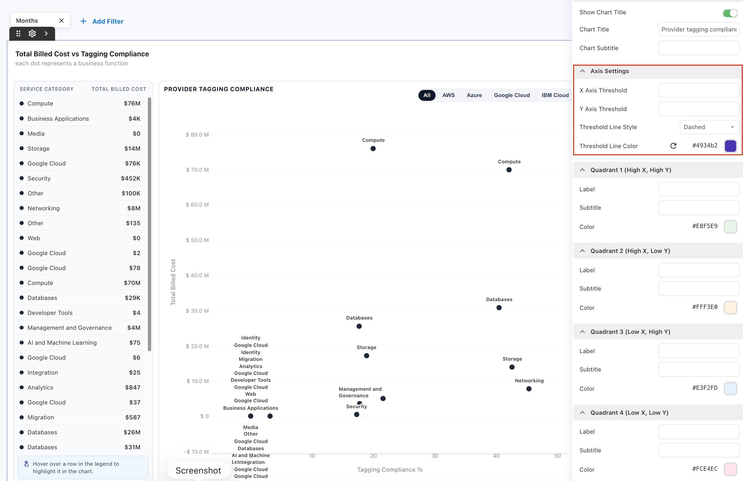
Configure:
-
X Axis Threshold to define where the vertical threshold line appears.
-
Y Axis Threshold to define where the horizontal threshold line appears.
-
Threshold Line Style to control the appearance of the threshold lines.
-
Threshold Line Color to set the threshold line color.
For example, when comparing Tagging Compliance % with Total Billed Cost, you could set:
-
X Axis Threshold: 30
-
Y Axis Threshold: $20M
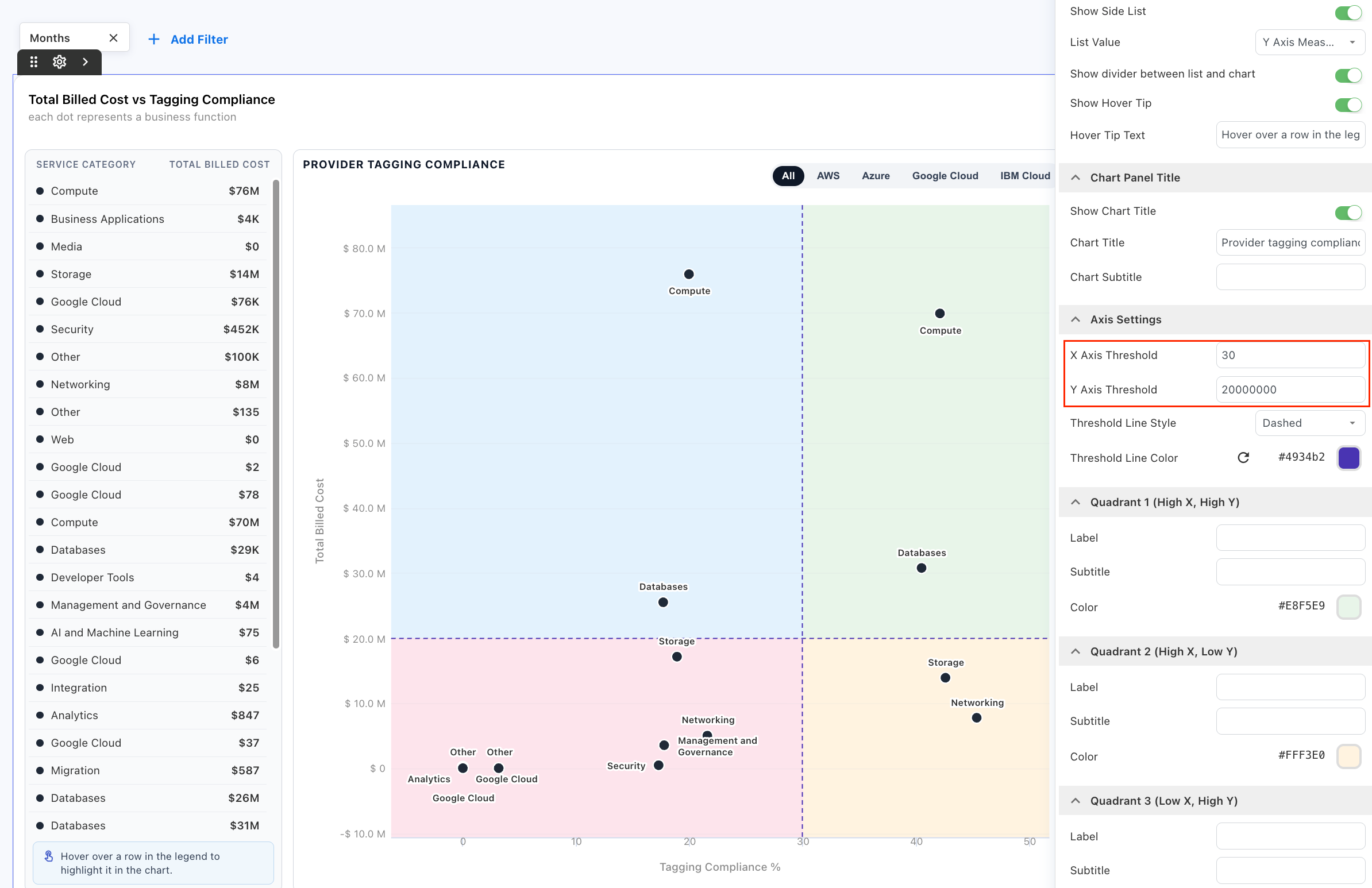
These thresholds divide the chart into four areas based on whether tagging compliance and billed cost are above or below the configured values.
The four quadrants are:
-
Quadrant 1 (High X, High Y)
-
Quadrant 2 (High X, Low Y)
-
Quadrant 3 (Low X, High Y)
-
Quadrant 4 (Low X, Low Y)Customize the quadrants
Customize the quadrants
For each quadrant, configure:
-
Label
-
Subtitle
-
Color
Labels and subtitles let you explain the business meaning of each area rather than requiring dashboard viewers to interpret the X-axis and Y-axis values alone.
Quadrant labels example:
For the Tagging Compliance and Total Billed Cost example, the quadrants can represent:
|
Quadrant |
Example label |
Interpretation |
|---|---|---|
|
High X, High Y |
Specialist Usage |
Higher adoption and higher intensity |
|
High X, Low Y |
AI Embedded Workforce |
Higher adoption and lower intensity |
|
Low X, High Y |
Adoption Opportunity |
Lower adoption and higher intensity |
|
Low X, Low Y |
Broad Adoption |
Lower adoption and lower intensity |
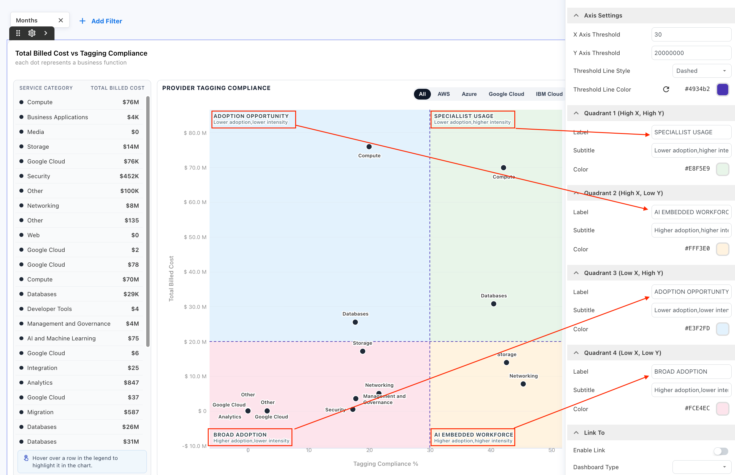
Note: Quadrant labels, subtitles, and colors are customizable. Their meaning depends on the measures and thresholds configured for the Scatter Chart.
Configure trend lines and forecasting
Use trend lines to understand how a measure changes over time and, where required, extend the observed pattern into future periods.
Custom Dashboards support Cumulative Line and Linear Trendline options for Column Chart visualizations.
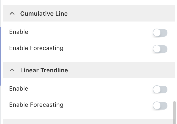
Note: Cumulative Line and Linear Trendline are available only for the Column Chart chart type.
Before you begin
-
The widget must use a Column Chart.
-
Select the measure you want to analyze.
-
Use an appropriate time-based dimension when you want to analyze or forecast a trend across periods.
-
Apply the required reporting-period filter when forecasting should extend to a defined future period.
Add a cumulative line
Use Cumulative Line to show how a measure builds over the reporting period.
-
Open the dashboard and select Edit.
-
Select the required Column Chart.
-
Add the measure you want to analyze to the Y-axis.
-
Set the X-axis to a timeline-based dimension, such as Year, Year-Month, or Date.
-
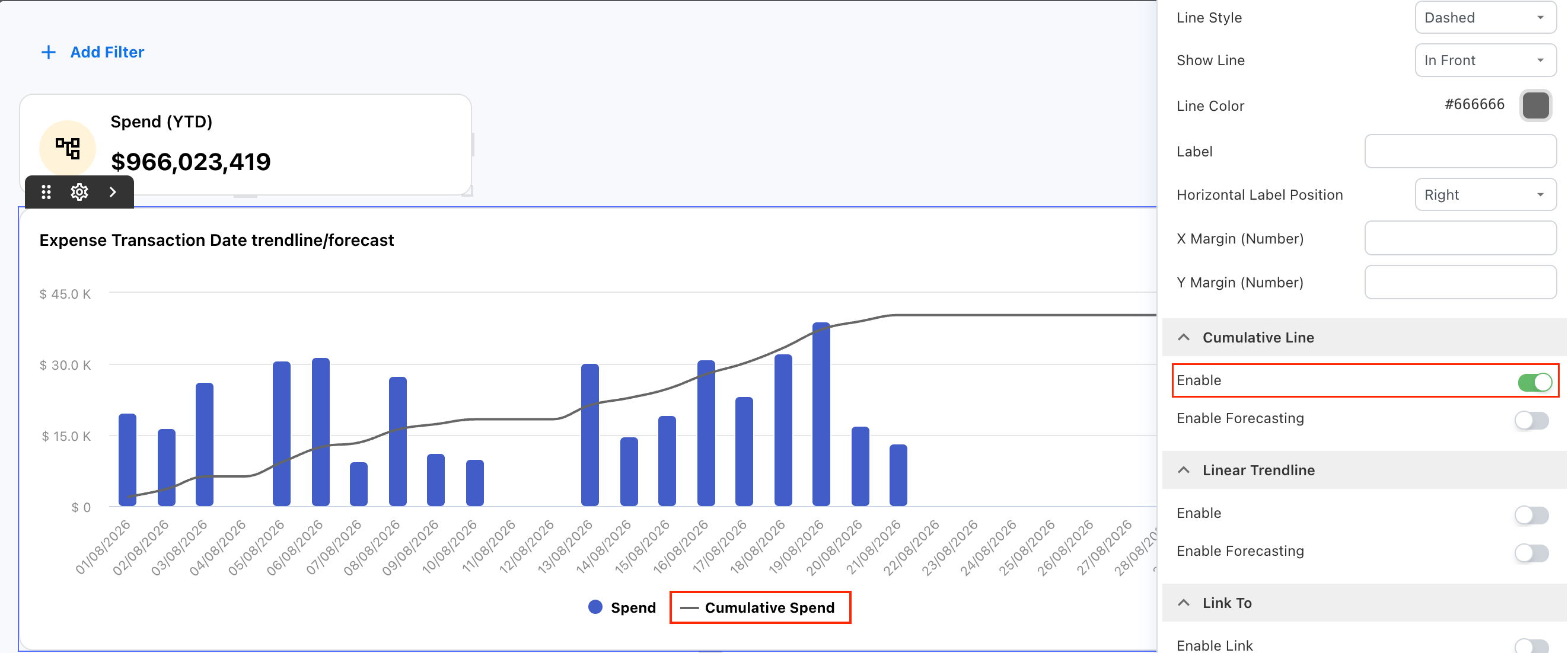
Open the widget settings and expand Cumulative Line.
-
Turn on Enable.
-
Configure the line color where required.
-
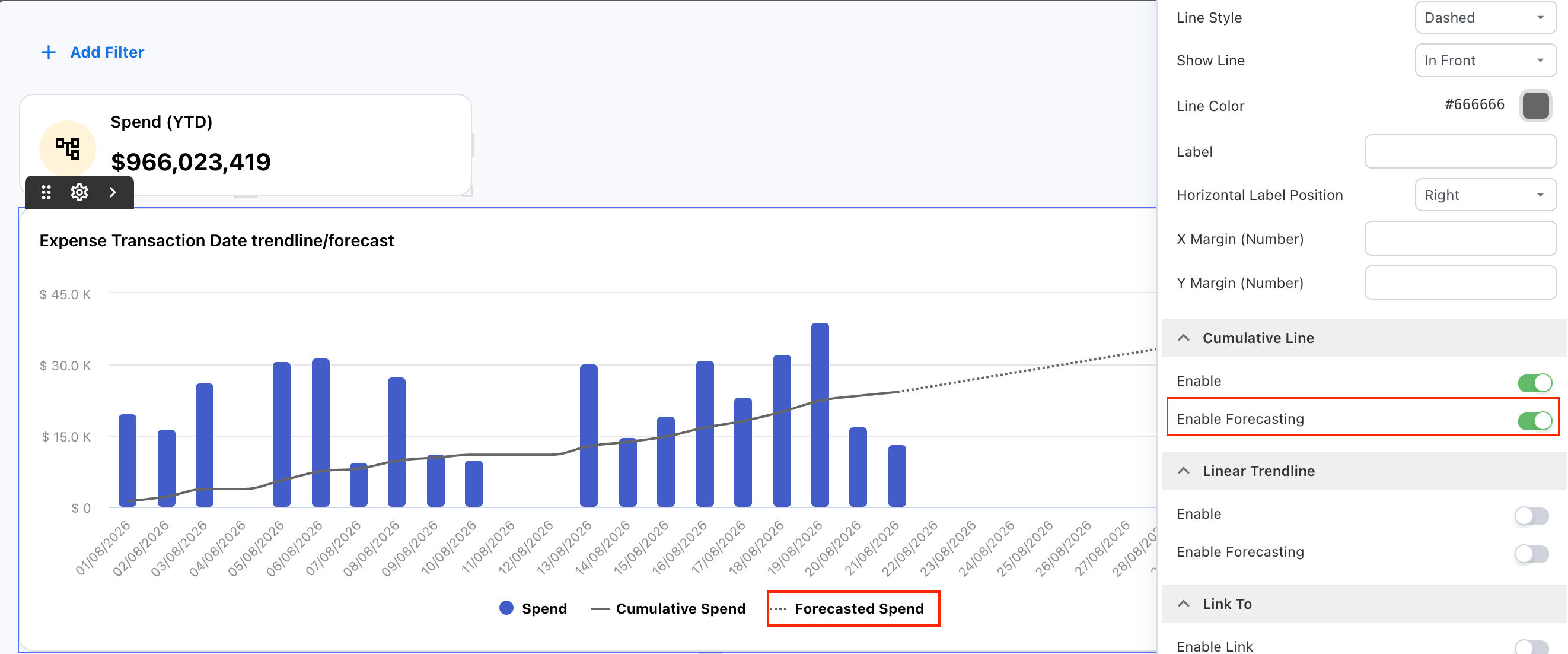
Turn on Enable Forecasting if you want to extend the cumulative line into future periods.
-
Review the chart and finish editing the dashboard.
When forecasting is enabled, Yarken extends the cumulative line into future periods using a cumulative average.
For daily time-series charts, the chart filter defines the end of the forecast period. If no applicable filter is set, the chart does not extend the forecast beyond the latest available date for the selected metric.
Tip: Apply the reporting period before reviewing a daily forecast so the chart has a defined forecast range.
Add a linear trendline
Use Linear Trendline to show the overall direction of a measure across the available data points.
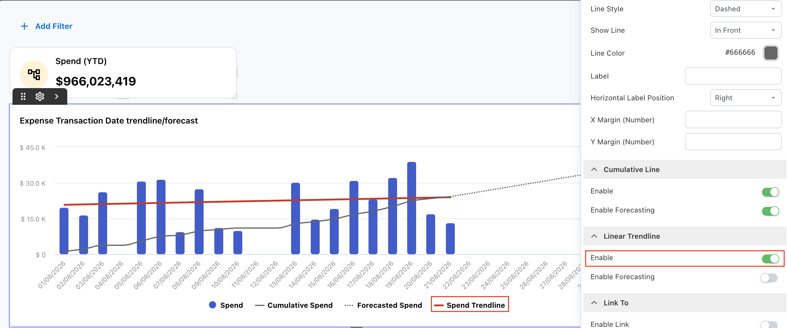
Yarken uses linear regression to calculate a straight trendline from the existing values. This can help you identify whether a measure is generally increasing, decreasing, or remaining relatively stable.
To add a linear trendline:
-
Open the required Custom Dashboard.
-
Select Edit.
-
Select the Column Chart you want to configure.
-
Open the widget settings.
-
Expand Linear Trendline.
-
Turn on Enable.
-
Configure the trendline color where required.
-
Review the chart.
-
Finish editing the dashboard.
The trendline is calculated from the actual values available in the chart.
Forecast a linear trendline
Turn on Enable Forecasting under Linear Trendline to extend the calculated trend into future periods.
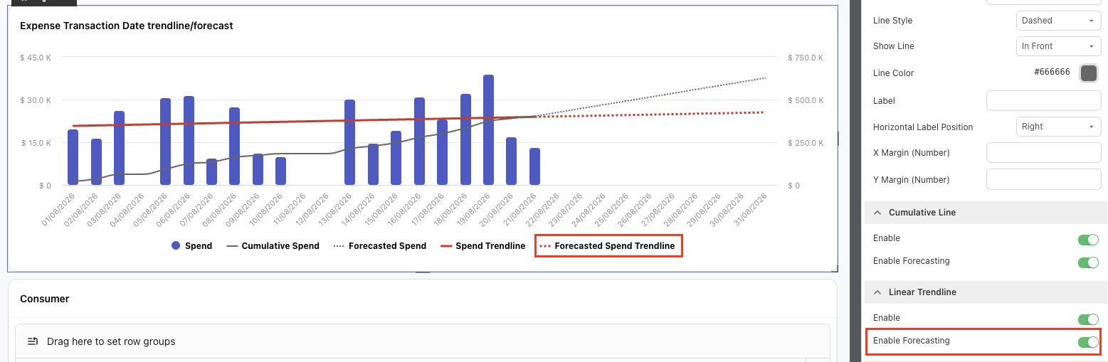
Yarken uses the linear regression calculated from the existing data points to project the trend forward.
The forecasted section appears separately from the trendline based on actual data, helping you distinguish the observed trend from the projected trend.
For example, if the available data shows a gradual increase in spend, the forecasted linear trendline extends that direction into the future reporting periods.
Note: A linear forecast is a projection of the current trend. It does not guarantee future results.
Customize trendline colors
You can configure the line color for both Cumulative Line and Linear Trendline.
Use distinct colors when the chart contains multiple lines so viewers can distinguish actual, cumulative, trend, and forecast information more easily.
|
Option |
Use it to |
|---|---|
|
Cumulative Line |
Show the running total of a measure across the reporting period. |
|
Linear Trendline |
Show the overall direction of a measure using linear regression. |
|
Enable Forecasting |
Extend the selected cumulative or linear trend into future periods. |
Recommended practices
-
Choose a visualization that supports the reporting question you want to answer.
-
Use server-side pagination for large Data Table datasets.
-
Use client-side pagination only when the dataset size is appropriate for browser loading.
-
Remember that Grand Total represents the complete dataset, not only the current page.
-
Review active local table filters when Grand Total is not displayed.
-
Use a Proportional Bar when you want to compare one metric across several categories and understand each category's relative contribution.
-
Keep Show Top focused on the categories that matter to the reporting purpose.
-
Select a specific year before using prior-year comparison.
-
Review active filters before interpreting prior-year variance.
-
Keep chart titles and labels clear.
-
Use Cumulative Line when you need to track how a total builds over time.
-
Use Linear Trendline when you need to understand the overall direction of a measure.
-
Treat a linear forecast as a projection of the current trend rather than a guaranteed future result.
-
Use distinct line colors when cumulative, trend, and forecast lines appear together.
-
Review the underlying data and reporting period before interpreting a forecast.
-
Apply an appropriate reporting-period filter before using daily forecasting.
-
Validate chart and table totals before using them for financial reporting.
Troubleshooting
Grand Total is not displayed in a Data Table
Check whether a local table filter is active. Yarken hides Grand Total while a local table filter is applied because the filter does not recalculate the server-side total.
Clear the local table filter to display Grand Total again.
A Data Table takes a long time to load
Check the pagination setting. For large datasets, turn on Enable Server Side Pagination so Yarken retrieves records in pages instead of loading the complete dataset into the browser.
Pagination settings are not available
Confirm that the widget uses the Data Table chart type. Pagination settings are not available for other chart types.
Prior-year variance does not appear in a Proportional Bar
Confirm that Compare with is set to Prior Year, Show Variance is turned on, and a specific year is selected in the Year filter. Also confirm that data is available for the prior year.
The Proportional Bar shows fewer categories than expected
Check Limit Items > Show Top. The default value is six. Increase the value if you need to display more categories.
Increasing the number of categories can affect dashboard performance.
The prior-year comparison does not match the expected period
Review the active filters. Yarken applies the same applicable filter context to the prior-year comparison. For example, when one month is selected, the corresponding month from the previous year is compared.
Linear Trendline is not available
Confirm that the widget uses the Column Chart chart type. Linear Trendline is not available for other chart types.
The forecasted linear trendline does not appear
Confirm that Linear Trendline > Enable and Enable Forecasting are turned on. Also confirm that the chart contains enough actual data to establish a trend and that the reporting context includes future periods where applicable.
The trendline does not follow every data point
This is expected. A linear trendline represents the overall direction of the data using linear regression. It does not connect or reproduce each individual data point.
A daily forecast does not extend beyond the latest actual date
Check whether the chart has an applicable date or reporting-period filter. Without a defined forecast range, Yarken stops at the latest available metric date.
A chart does not show the expected values
Review the selected fields, measures, filters, and sorting. Confirm that the underlying Analytics data is available for the selected reporting period.
The Heatmap does not display data
Confirm that the visualization includes:
-
One field under Value
-
One dimension under Rows
-
One dimension under Columns
All three are required to build the Heatmap.
Some row or column values are grouped under Other
Check Limit Items.
Values outside Show Top Rows or Show Top Columns are grouped under Other.
Increase the limit if you need to display additional individual values.
Heatmap values are difficult to read
Review the selected Theme, Reverse Colors?, and Text Colors settings.
Choose colors that provide sufficient contrast between the cells, labels, and values.
The Heatmap becomes difficult to review
Reduce Show Top Rows or Show Top Columns.
A smaller matrix can make important patterns easier to identify.
The Scatter Chart does not display data
Confirm that you have configured Point Label, X Axis Measure, and Y Axis Measure.
Also confirm that data is available for the selected fields and active filters.
Point labels overlap
Turn off Point Labels > Enable Labels, or reduce Limit Items > Show Top.
You can still identify individual points using hover details or the side list.
The quadrants do not represent the expected ranges
Review X Axis Threshold and Y Axis Threshold under Axis Settings.
These values determine where Yarken divides the Scatter Chart into high and low X-axis and Y-axis regions.
The Scatter Chart contains too many points
Reduce Limit Items > Show Top to display fewer points and make the visualization easier to review.
The Scatter Chart is difficult to interpret
Review the selected Point Label, X-axis and Y-axis measures, thresholds, quadrant labels, and colors.
Choose measures that provide a meaningful comparison, and use quadrant labels to explain how each area should be interpreted.
Related content