
Introduction
This document provides comprehensive information about the analytics. It includes details on how to navigate the analytics, visualize data using multiple chart types such as bar, stacked bar, column, stacked column, line, area, and table, generate reports, and save reports.
Table of Contents
Analytics
Definition:
Analytics is the systematic computational analysis of data. It involves the discovery, interpretation, and communication of meaningful patterns in data. It also encompasses the use of data, statistical analysis, and explanatory and predictive models to gain insights, inform decisions, and drive business strategies. Typically involves processes such as data collection, data processing, data visualization, and data interpretation.
Analytics can be accessed via the Analytics menu.
Based on the CUBE we have categories the Analytics into.
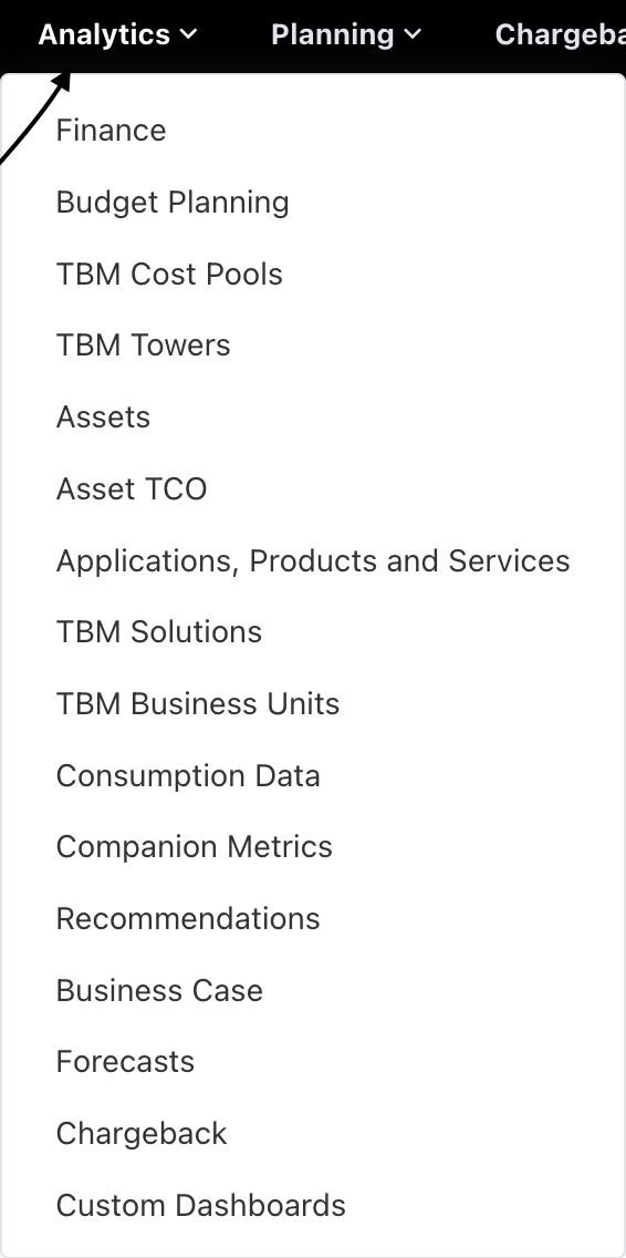
Figure-1
The above image will show the list of cube analytics available in the Analytics menu. You can access these via the Analytics menu. Each cube is specifically tailored to its respective focus area.
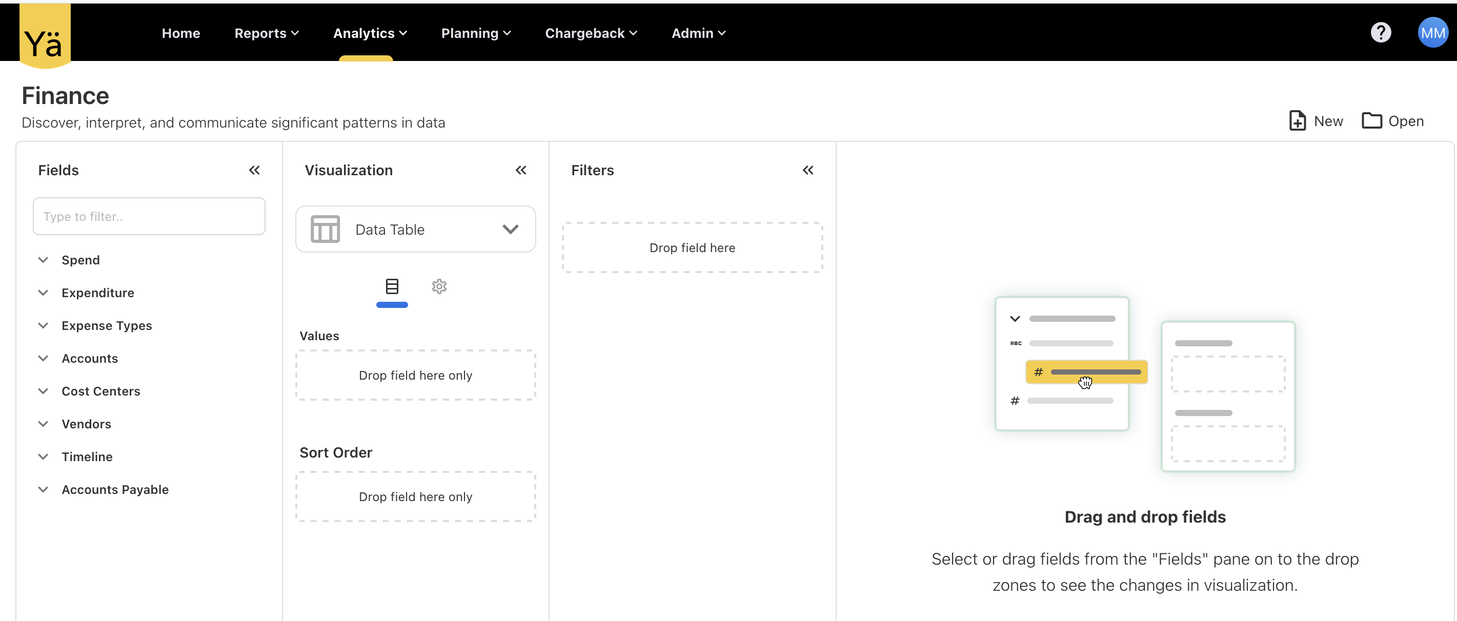
Figure -2
The Figure -2 shows an overview of the analytics cube. Here, I am using the Finance cube as an example. It has four sections.
-
Fields
-
Visualization
-
Filters
-
Visualization Panel
Fields:
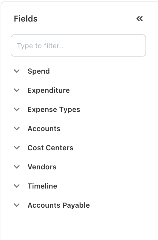
Figure -3
The Figure -3 will show the list of cube available in the Finance Analytics Cube. Here every cube has it’ own fields.
Figure -4
By clicking the down arrow, you can see the fields available in the cube.
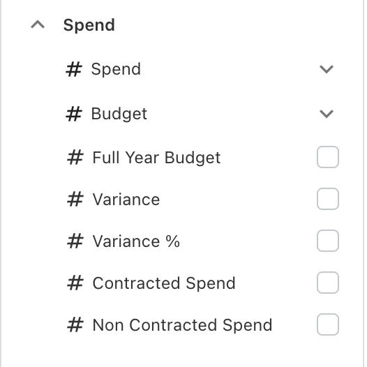
Figure -5
The Spend cube has its own fields, including Spend, Budget, Full Year Budget, Variance, Variance %, Contracted Spend, and Non-Contracted Spend.Similarly other cubs has it’s own fields. As per the cube, fields have been categorized into Measures and Dimensions. Measure fields are those on which you can perform aggregate functions such as Sum, Min, Max, Avg, and Count. The remaining fields fall under Dimensions.
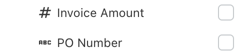
Figure -6
The Figure -6 shows the Invoice Amount and PO Number. The Invoice Amount has an icon of #, and the PO Number has an icon of ABC. Here, we differentiate Measure and Dimension fields by their icons. Normally the # will be the measures and ABC will be the dimension.
Mostly the Spend, Budget, Variance and count fields will fall under the measures.
Some fields have the Sum and Avg options for giving the average amount and summed amount. This Sum and Avg will only be applied to Measures.
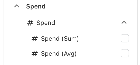
Figure -7
Visualization:
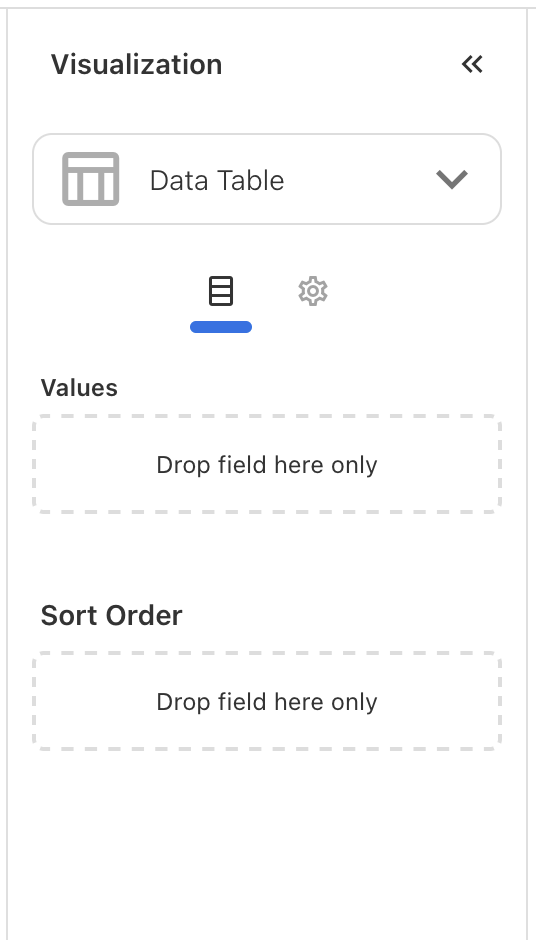
Figure -8
Figure 8 show the basic view of visualization, It has Sort Order, Values and Chart Type.
We have multiple chart types to display data. Right now, it’s showing a Data Table. If you click the down arrow, you can see the chart types to set the data.
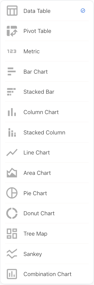
Figure -9
The above image shows the chart types. Here, you can select the chart type you want.
The cube fields you selected will drop into the values in the visualization. In Figure 8, as it is a “Data Table,” it shows values in the visualization. Depending on the chart type, you will see Axis, Column, and Values. Whatever column you select in the fields will drop into values or the respective axis in the visualization. If you don’t want to select fields as part of the chart or table, you can delete them from here.
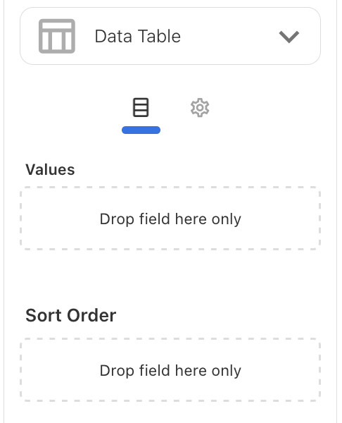
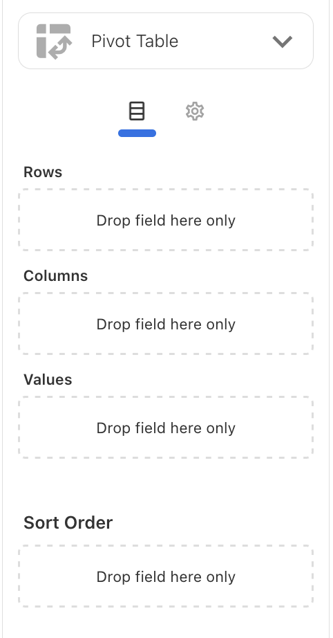
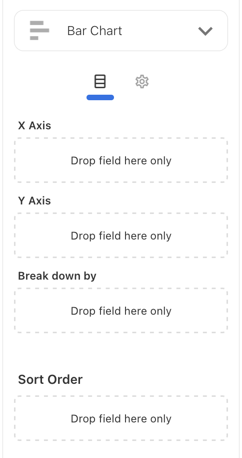
Figure -10 Figure -11 Figure -12
The above Figures will show different types of Axis for Data Table, Pivot Table and Bar Chart.
All the visualization part have a Sort Order. You can sort the fields by dropping into the Sort Order. Once the fields are dropped into the Sort Order, you will get a button to select ASC or DESC for sorting. You can see those in Figure -13
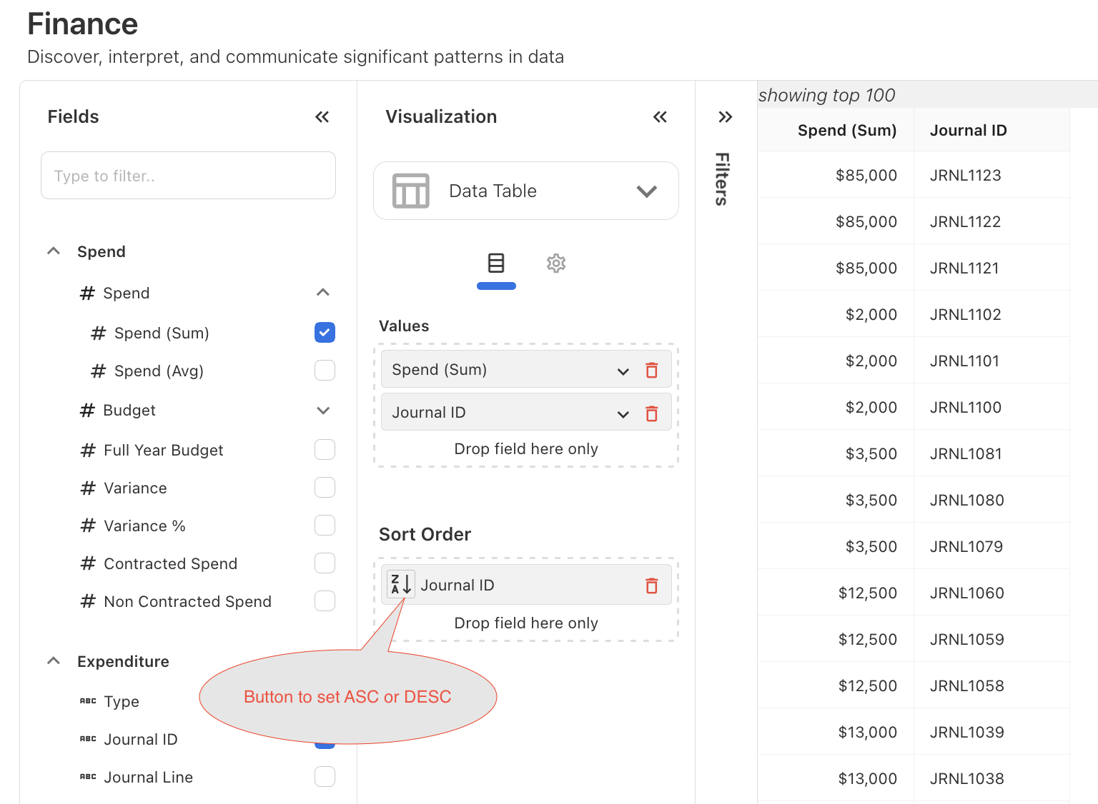
Figure -13
In the visualization we have settings also, If you click the settings icon you will see additional features to customize the table or chart depending on the chart type.
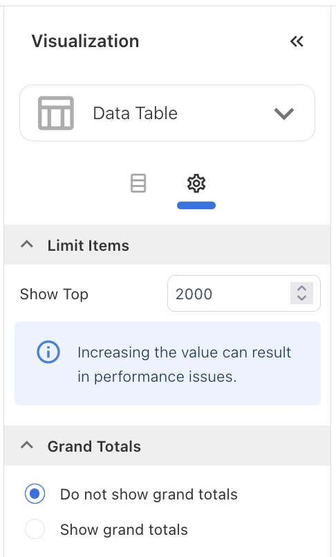
Figure -14
In the visualization settings for the chart type "Data Table," you will see options for "Limit Items" and "Grand Total." "Limit Items" allows you to specify the number of top records you want to display in the visualization panel. "Grand Total" provides an option to show or hide the total spend.
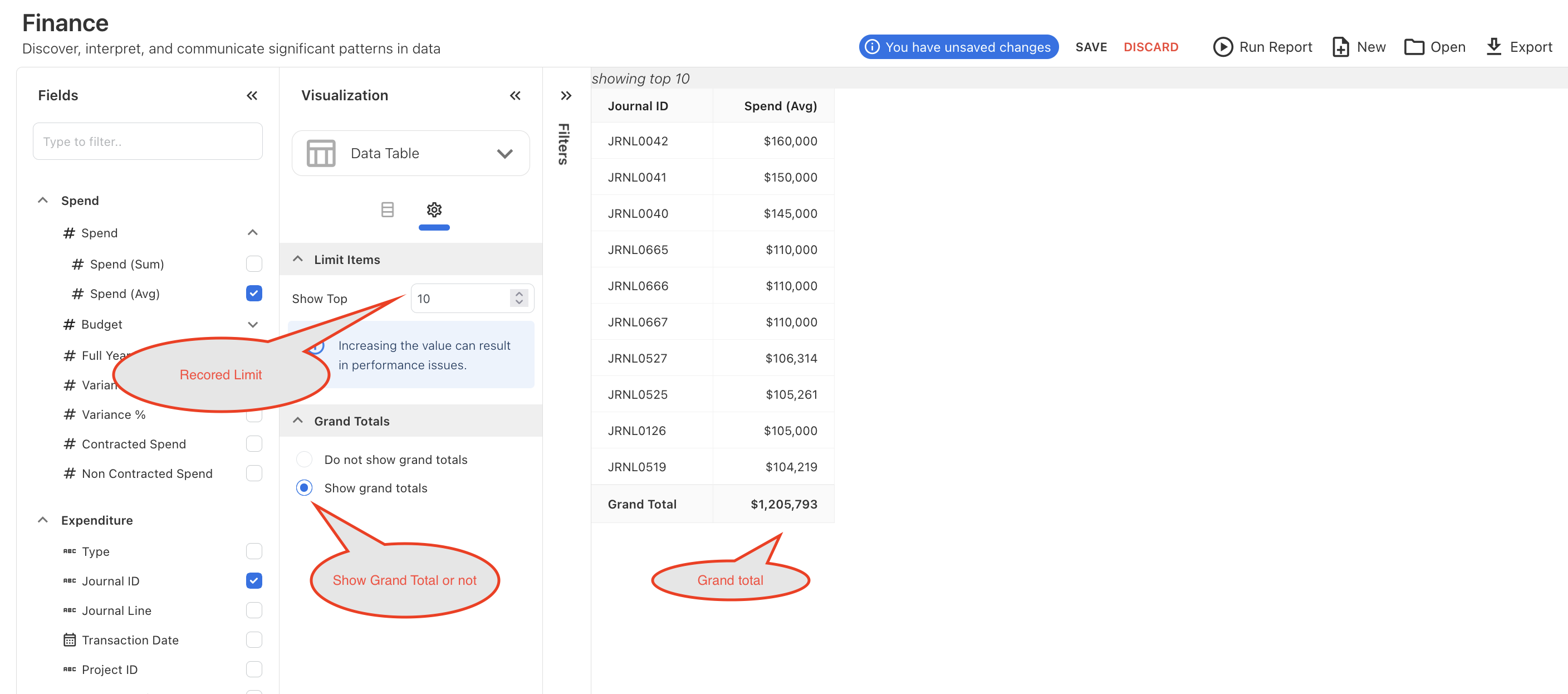
Figure -15
Figure-15 shows the options to display the top records and the grand total. Similarly, other chart types have different features to customize the chart.
In the visualization settings for the chart type "Bar Chart" we have features like Limit item, Theme, Legend, X-Axis, Y-Axis, Data Labels, Tool tip, Data label and Reference Line.
"Limit Item" will limit the chart by displaying the top number of items you want to see. You can see it in figure-16
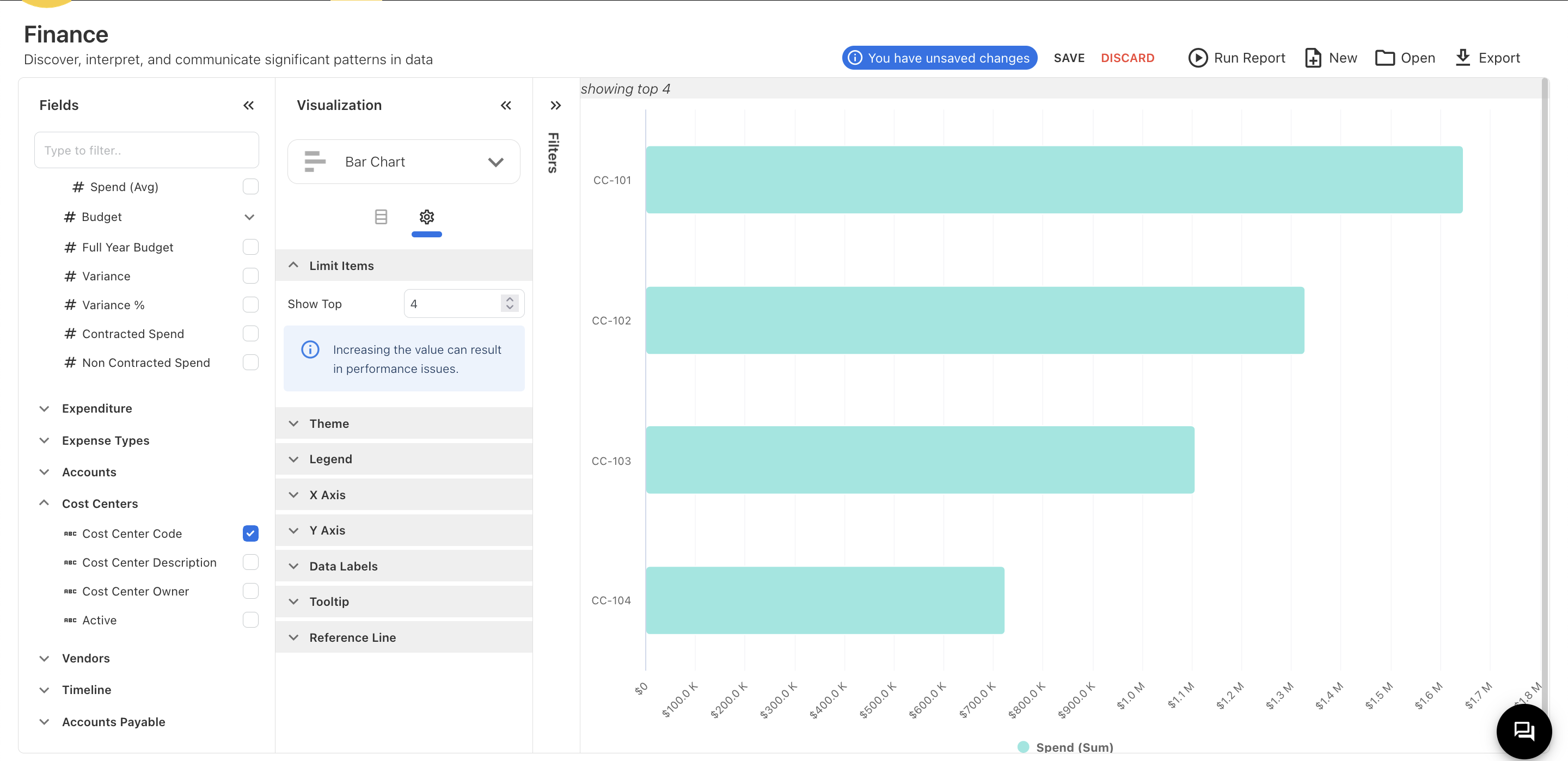
Figure -16
"Theme" will provide customizable colors for the chart, as shown in Figure 17.
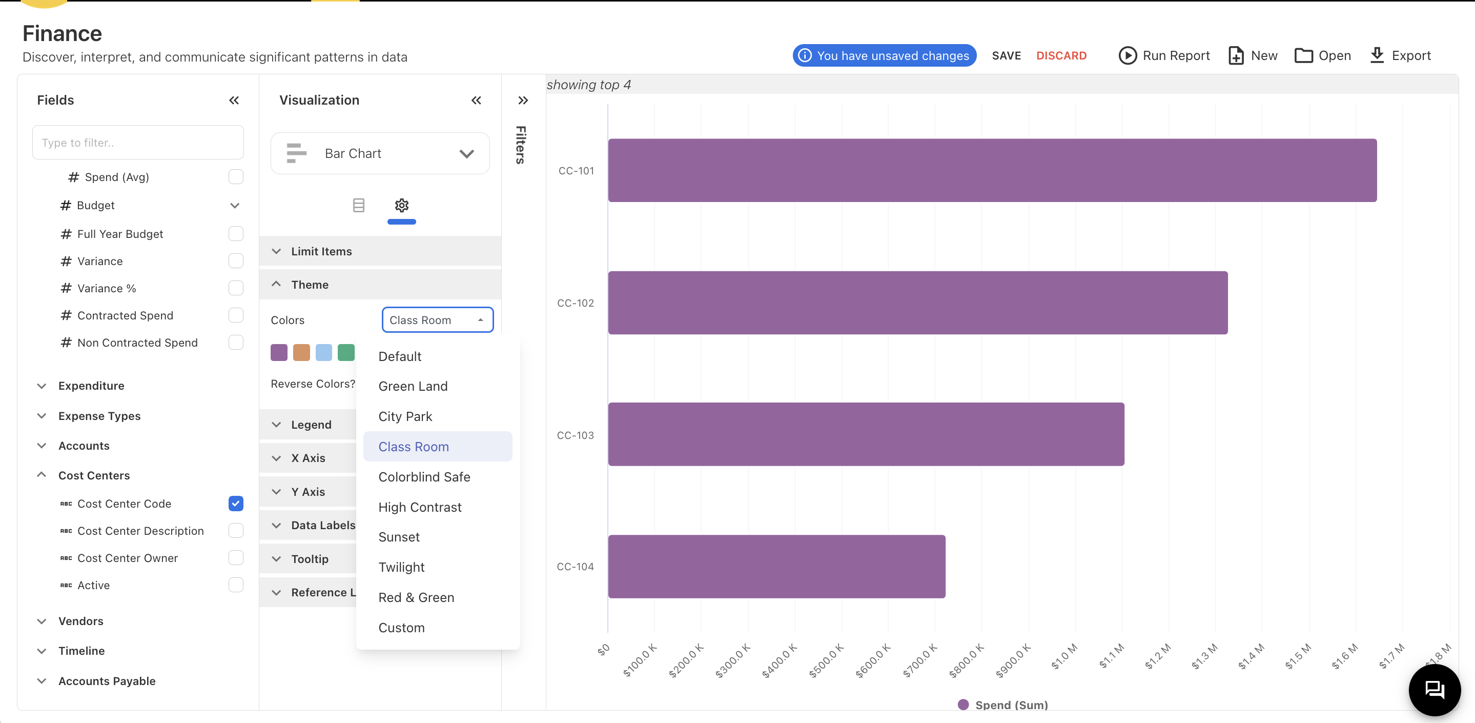
Figure- 17
“Legend ” Will provide customization like Position, Legend Symbol Shape the legend in chart
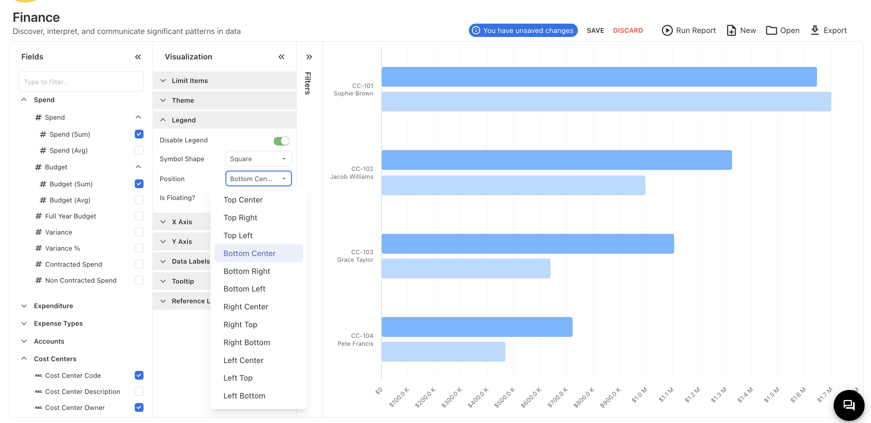
Figure-18
"X-Axis" and "Y-Axis" provide options to disable, hide, reverse, and make a secondary axis, as shown in Figure 19.
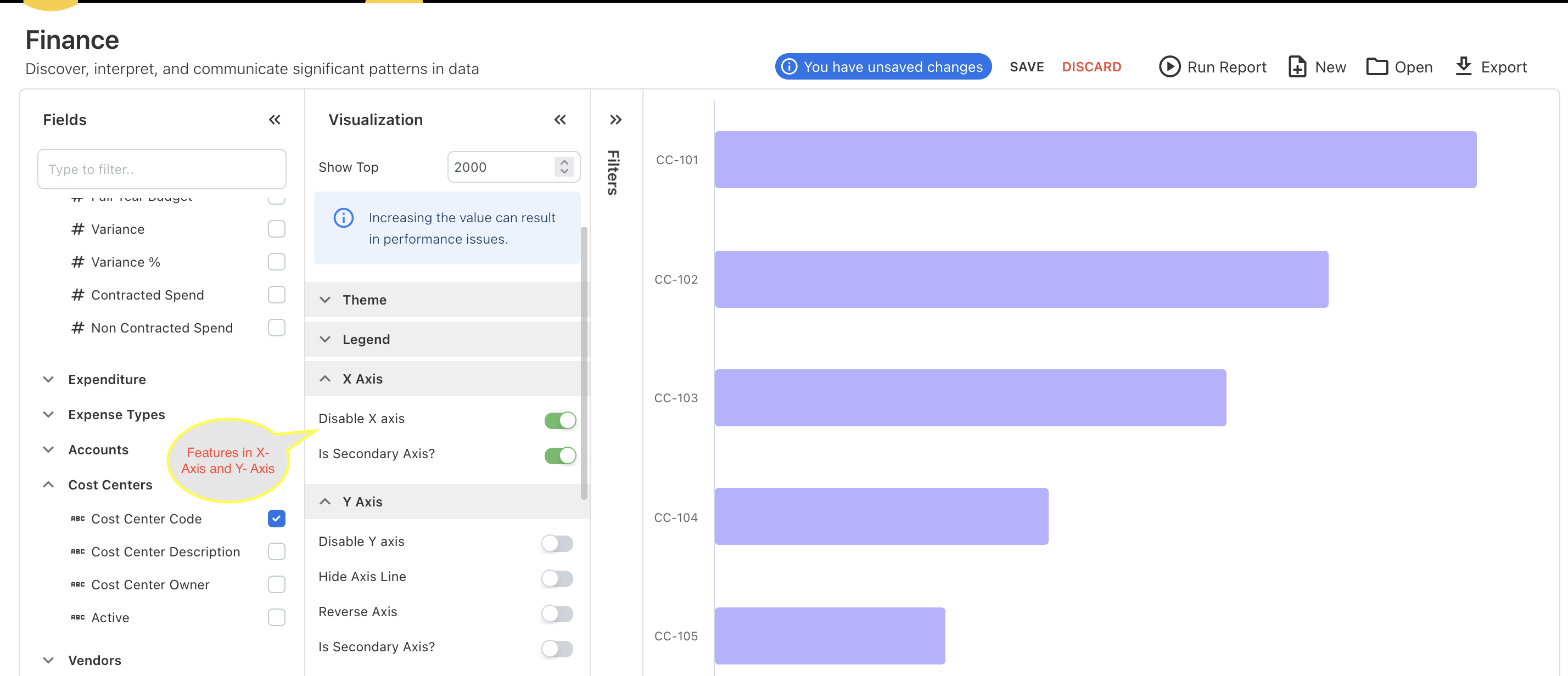
Figure -19
“Data labels” have option to enable or disable the data labels as Figure 20.
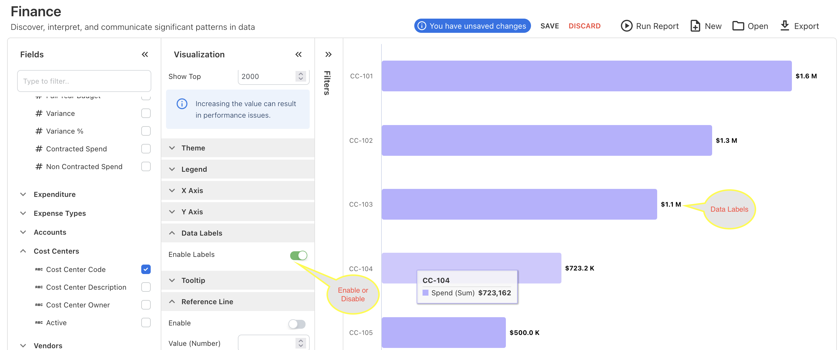
Figure -20
Enabling "Reference Line" provides a reference line on the chart to set a target or other reference point. It includes customization options such as color, line type, and position, allowing you to adjust the reference line according to your requirements as shown in Figure-21.
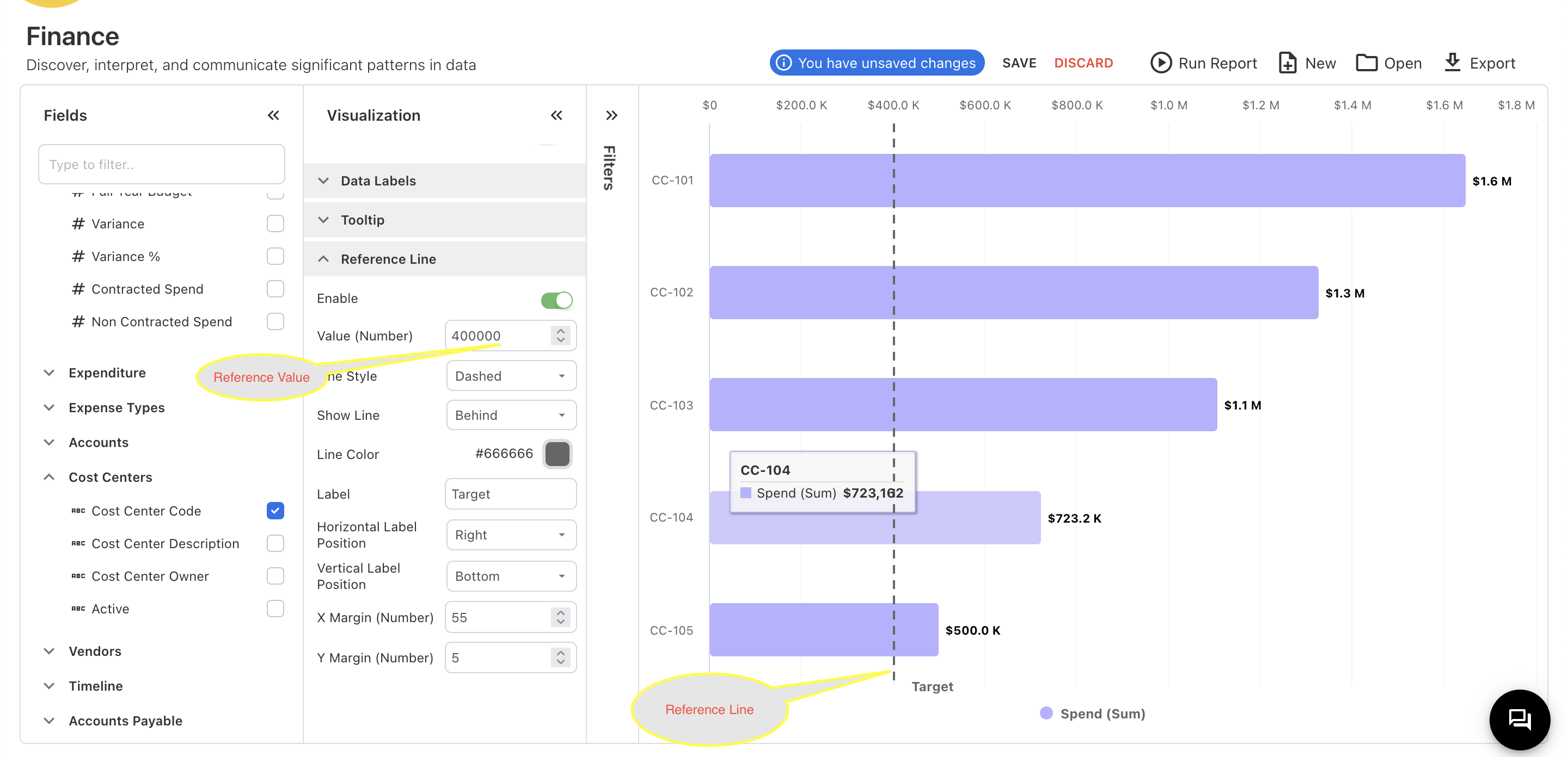
Figure -21
Filters:
Filters are used to narrow down data displayed in a visualization or report by including only the data that meets certain criteria. This helps in focusing on specific subsets of data, improving clarity, and making analysis more targeted and relevant. Filters can be applied based on various parameters such as date ranges, categories, values, or any other specific attributes relevant to the dataset.
We have provide a basic overview of filtes section in figure -22. There you can drop the field which you want to filter.
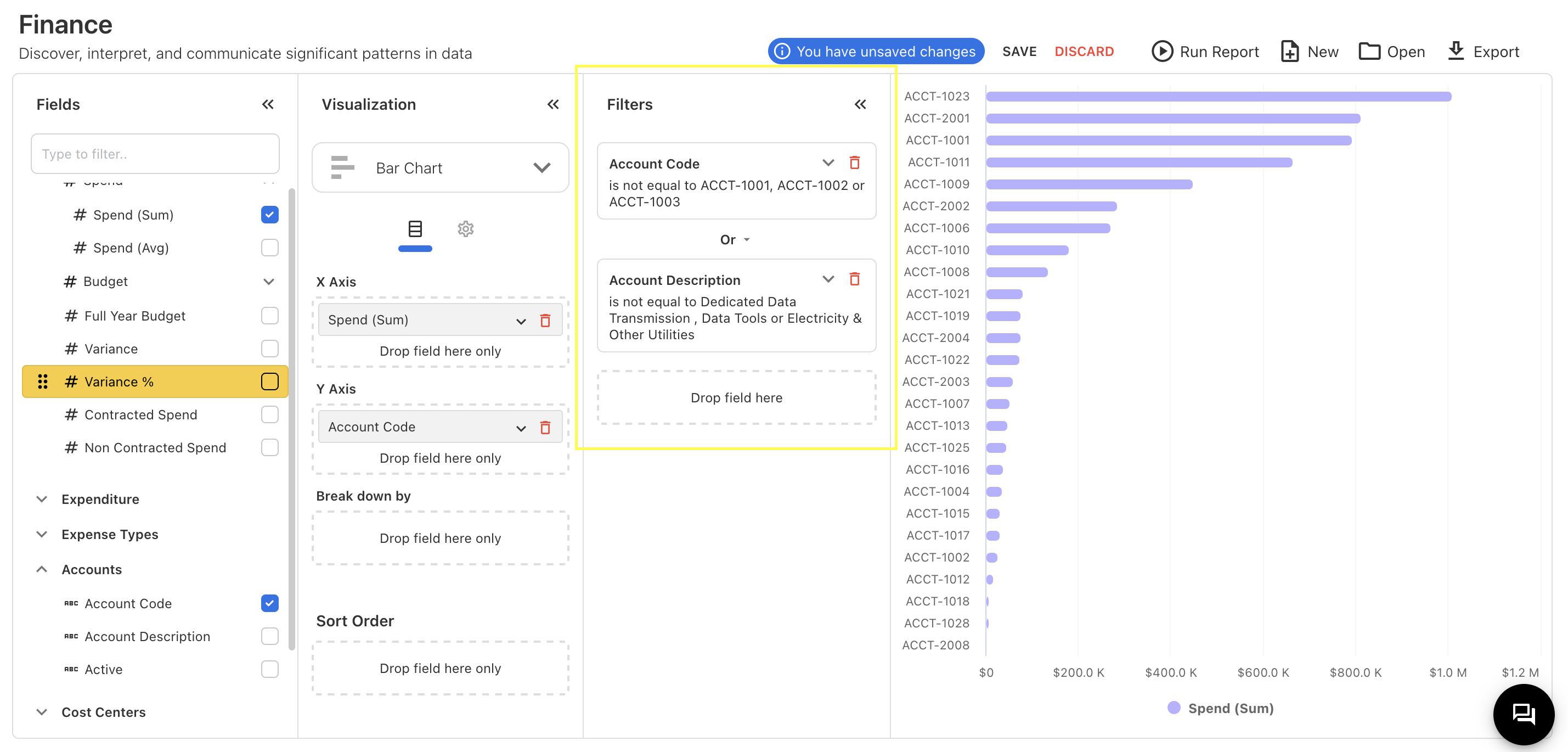
Figure -22
In the filters, we have features to select whether a field is equal to, not equal to, contains, does not contain, starts with, ends with, is null, or is not null to the selected value. You can see it in Figure -23
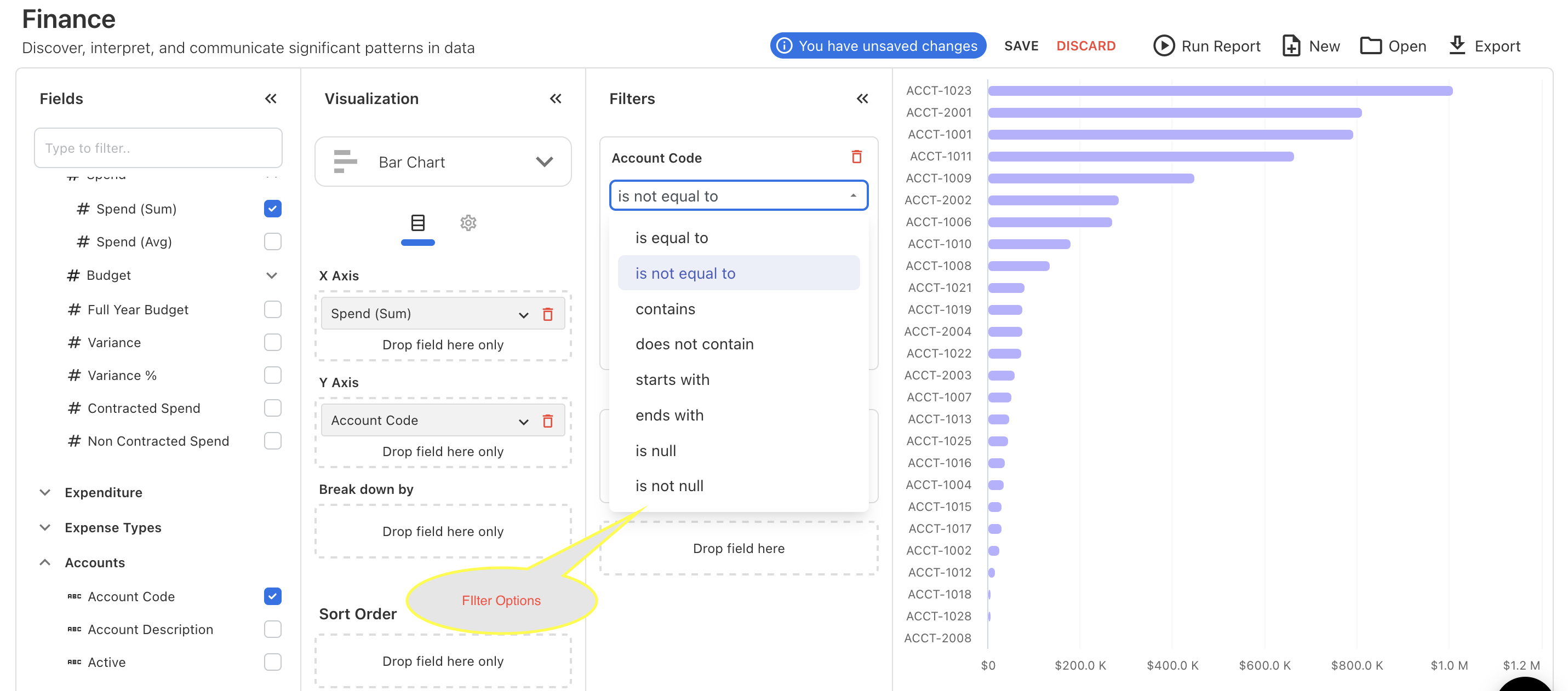
Figure -23
If you select more than one field for a filter, you can specify whether the filters are combined with "OR" or "AND" logic as Figure -24.
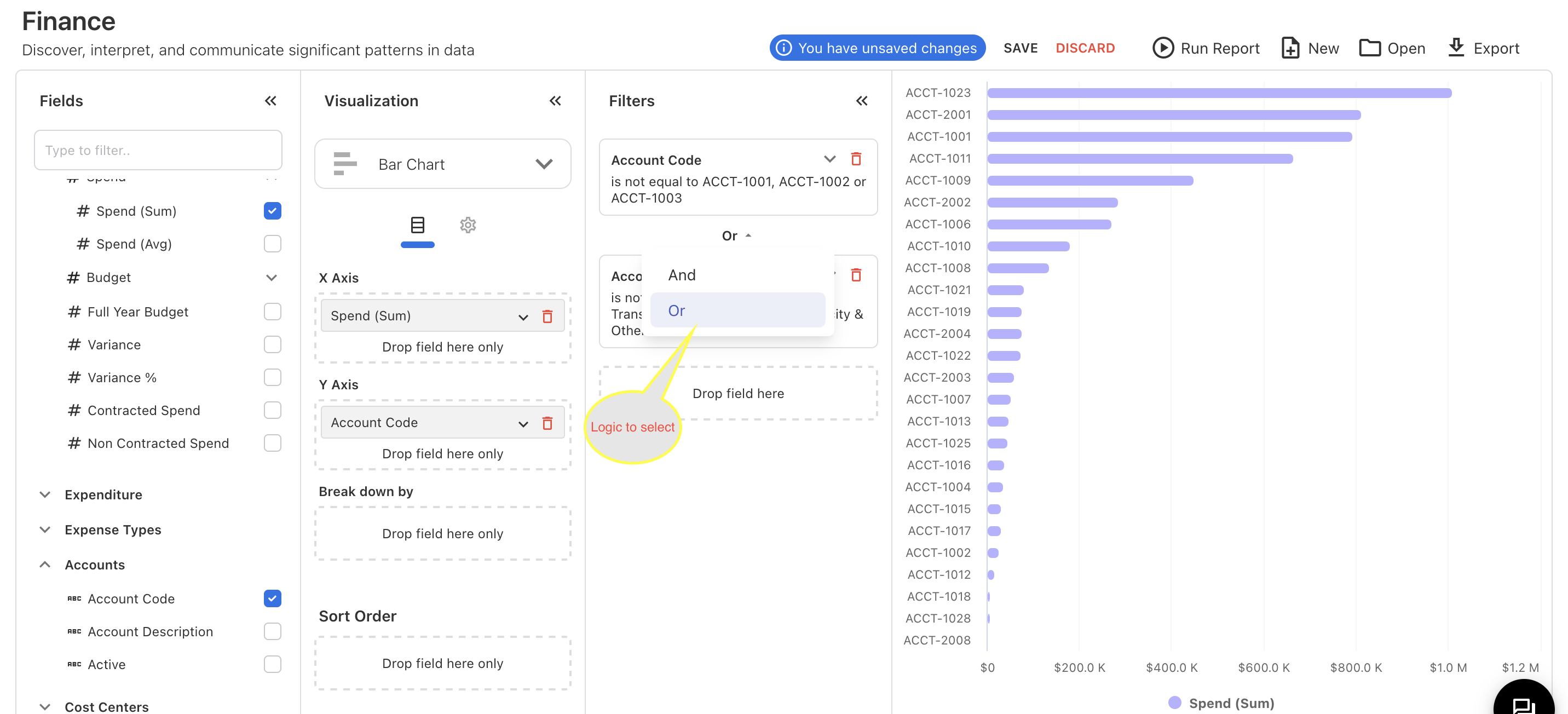
Figure -24
Figure -24 we have selected two fields for filter, there we can select that filters are combination logic of “And” or “Or”.
Once you select all the fields you want and apply the features mentioned above, you can drag the sections such as Fields, Visualization, and Filter by clicking the arrow in the top right corner of each section as like shown Figure -25.
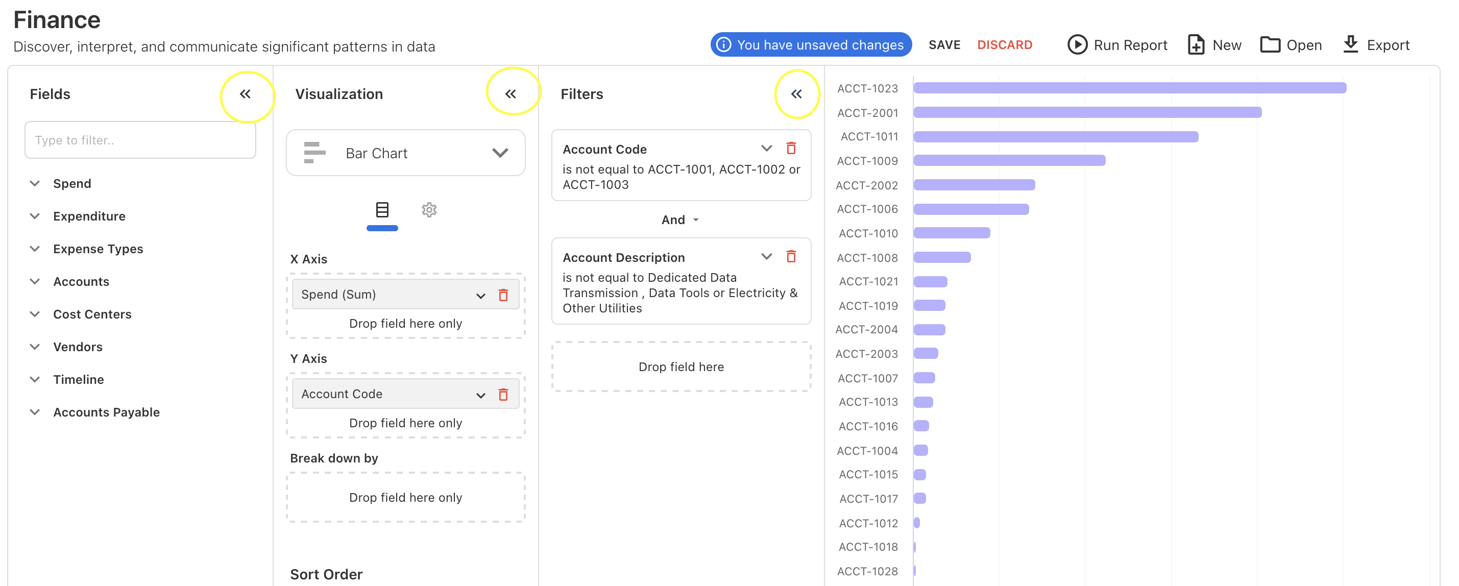
Figure -25
After you drag those sections, you can see the chart or table at full width as Figure -26.
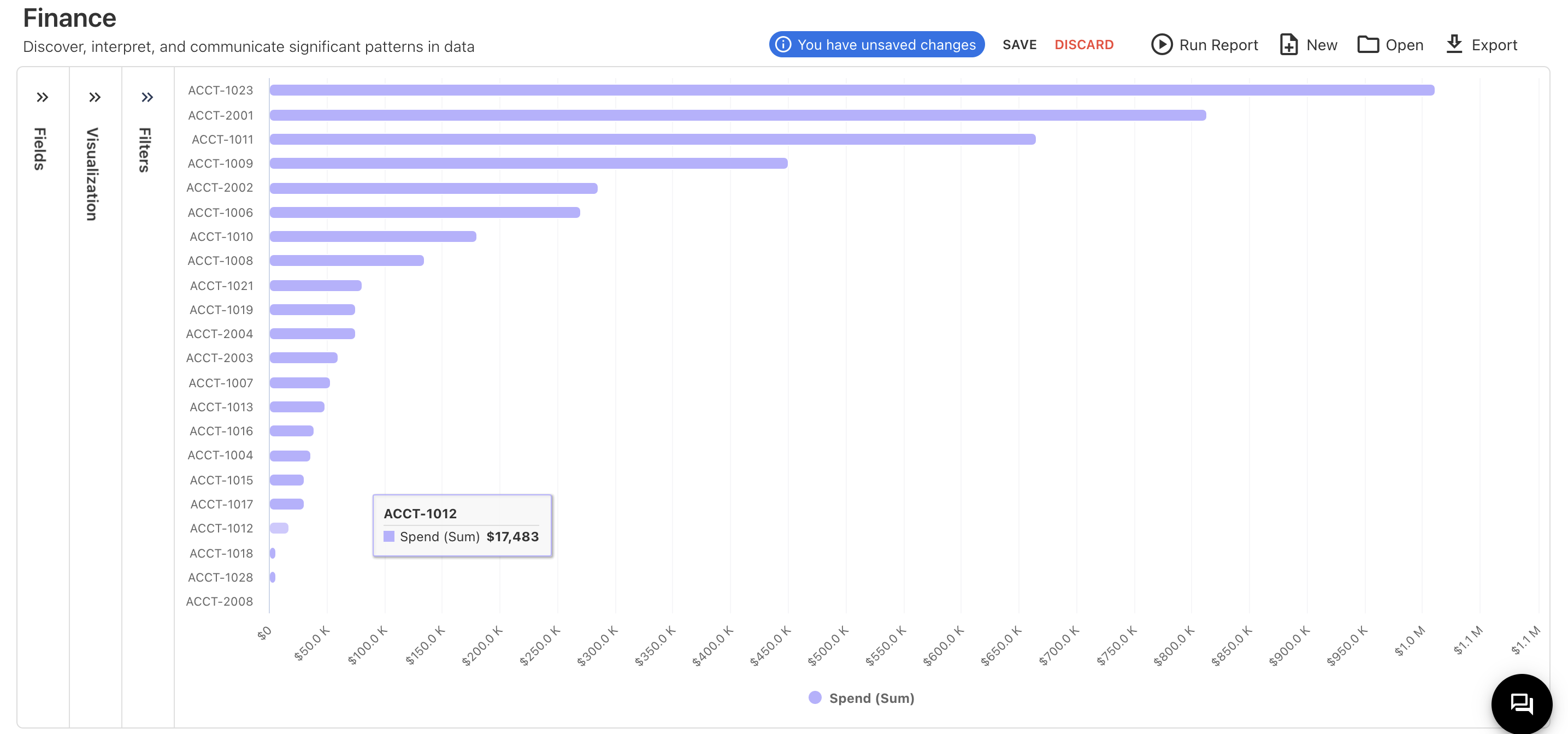
Figure -26
Other Features:
We have other features like Export, Open, Run report, Discard, New, Save and Indication that we have Unsaved Changes.
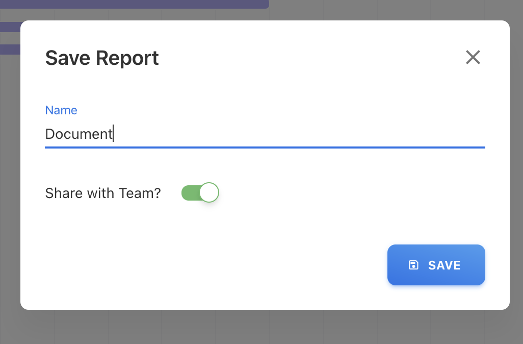
Save
Once you click the save option, a popup will appear where you will need to provide the name of the report. You will also have the option to enable or disable "Share with Team." By enabling "Share with Team," your teammates will be able to see your report.
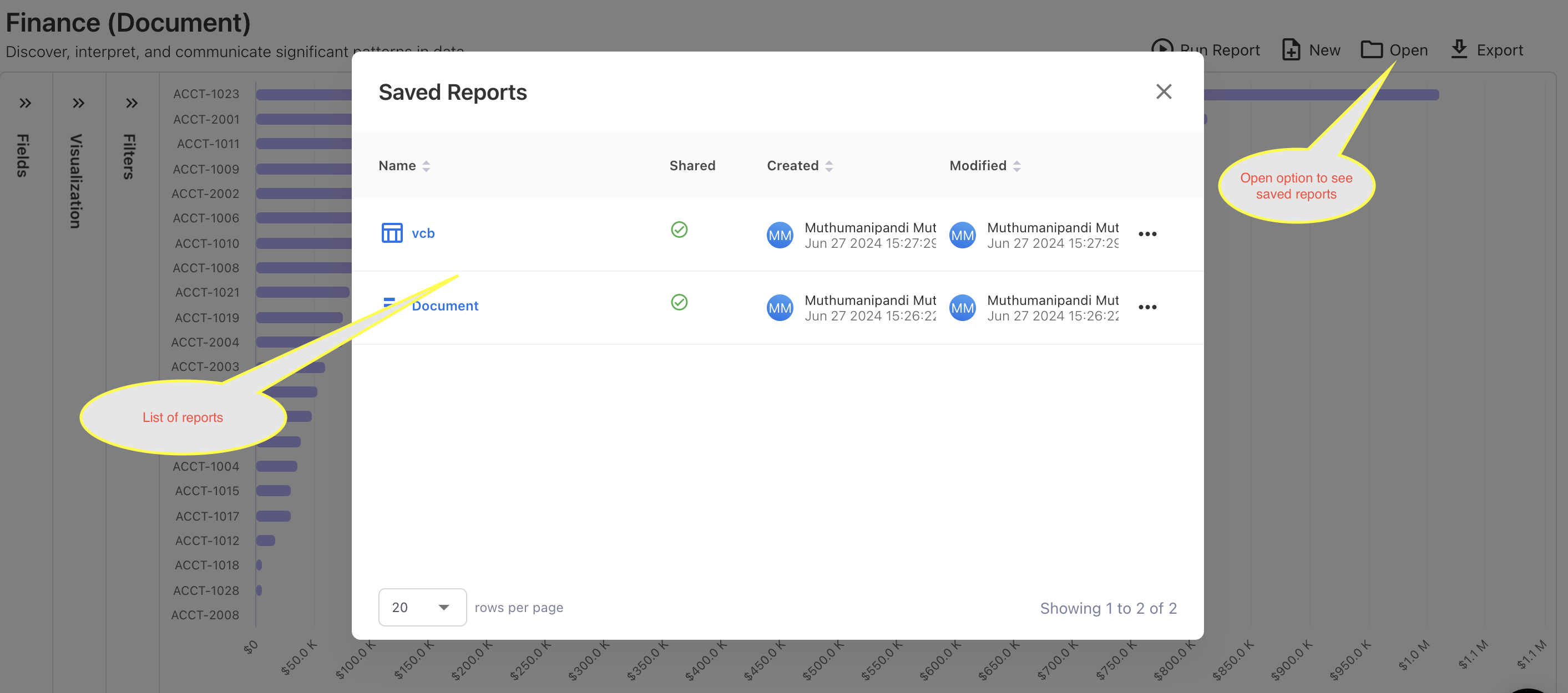
Open
Once you save the report you can able to see the saved reports on “Open” there you can rename and delete the report.
Run Report
"Run Report" will provide the option to re-run the report after you modify something.
New
"New" will discard the current change and provide a new report page to start from scratch.
Export
“Export” will provide the feature to download your reports
Visualization Panel
This is the place to display data in a visual format, such as charts, graphs, or tables, to help users better understand and analyze the information. Visualization panels make it easier to spot trends, patterns, and outliers in the data, facilitating more informed decision-making and insights.