
Introduction
This document provides comprehensive information about the dashboards. It includes details on how to navigate the dashboard, generate reports, and use the popup feature for detailed insights.
Table of Contents
Dashboard
A dashboard is a visual display of key metrics, data, and performance indicators that provides a quick, at-a-glance overview of business status. It is designed to simplify complex data sets, making it easier for users to monitor performance, identify trends, and make informed decisions.
Dashboard can be accessed via the Reports menu.
List of Dashboards
Based on the TBM taxonomy we have categories the dashboard into.
-
Cost Transparency
-
Finance
-
Vendor
-
Technology
-
Cloud
-
Applications
-
Solutions
-
Business Units
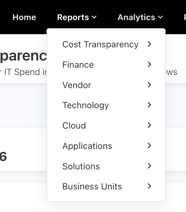
Figure 1
Each category has a dashboard specifically tailored to its respective focus area.
In this document, I am going to use the Cost Transparency category's Cost Transparency Overview dashboard as shown Figure 3
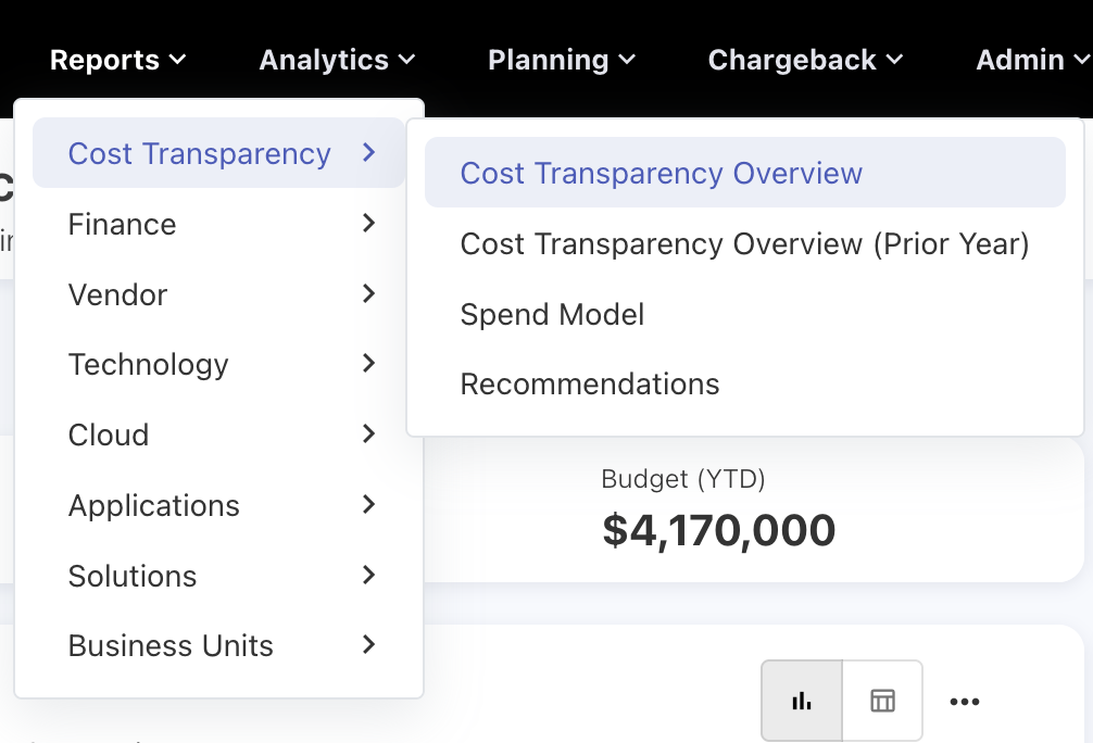
Figure 2
Figure 3 will show the basic overview of dashboard.
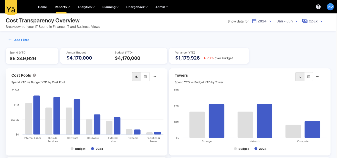
Figure 3
In Figure 3, the top left corner contains the title and description, as shown in Figure 4.
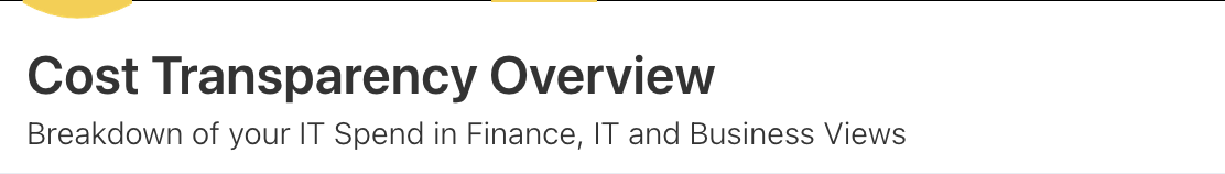
Figure 4
Most of the dashboards have default filters for Year, Month and Expense Type. Some dashboards are not based on Expense Type; those dashboards will not have an Expense Type filter.
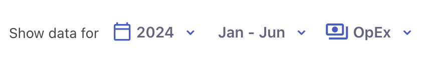
Figure 5
Year Filter :
By changing the year from the year filter, you can see the data for various years. The year filter is single-select, so you can’t select more than one year at a time as shown in Figure 6.
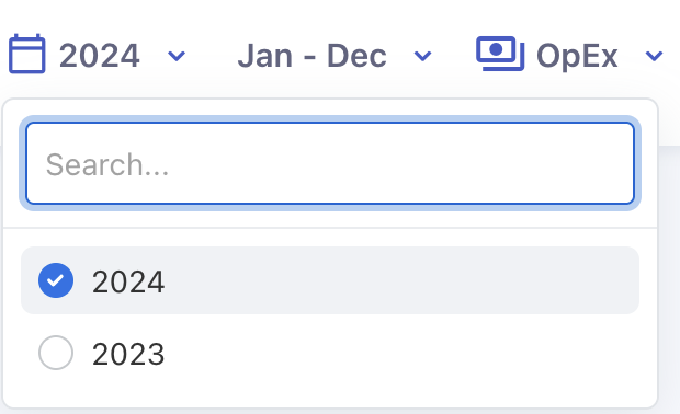
Figure 6
Month Filter:
Here, the month filter has the options "From Month" and "To Month." In the image below, Jan is the "From Month" and Jun is the "To Month."
Figure 7
The “From Month” is based on the Financial Year Start Month option in the default settings under settings. If you change the financial year start month in the options, the "From Month" in the month filter will change to that particular month.
|
Admin >> Settings >> Default Settings >> Financial Year Start Month |
Figure 8
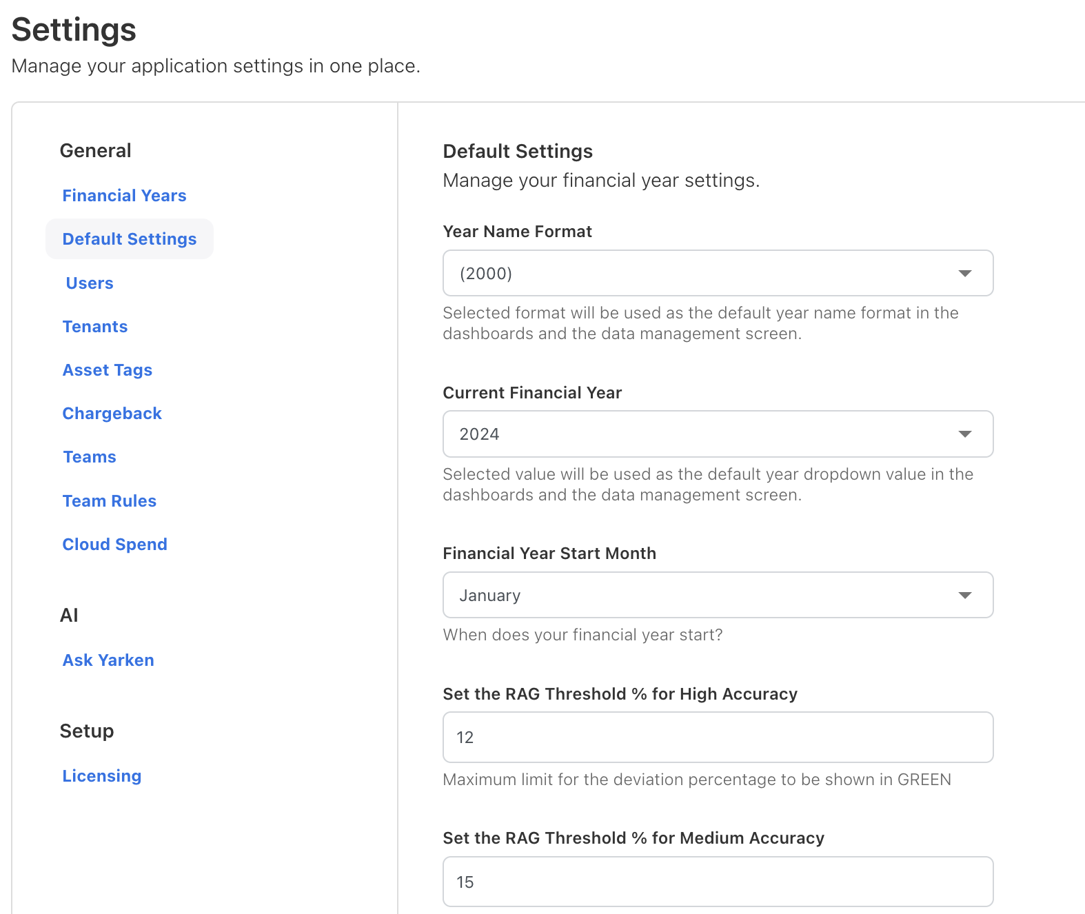
Figure 9
The "To Month" option allows you to select up to which month you want to see the data from the month filter as shown in Figure 10.
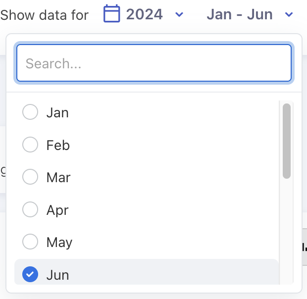
Figure 10
In Figure 10, we have selected the month up to June, so we can expect the data from January to June.
Expense Type Filter:
The Spend and Budget have two types of expenses: one is "CapEx" and the other is "OpEx." These two are options in the expense type filter, which is a multi-select filter, so you can select both at the same time
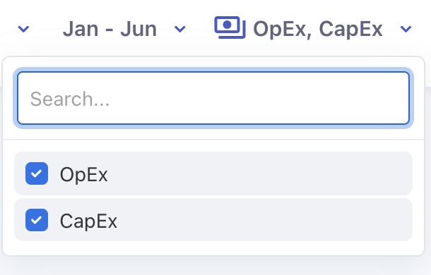
Figure 11
We also have an external filters. By clicking the "Add Filter" button, you can see the list of filters available in that dashboard.
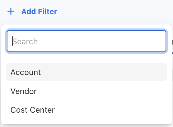
Figure 12
By clicking a filter in the list, you can apply the filter you want. Once the filter is selected, you can see the options for that filter to choose from. These filters are multi-select, so you can select more than one option.
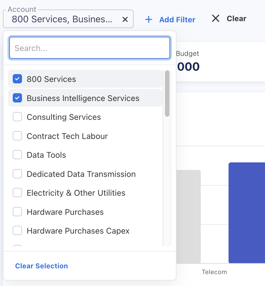
Figure 13
You can add all the filters that are in the list. Once you select multiple filters, you can clear all of them by clicking "Clear" button as showin Figure 14.
Figure 14
Or, if you want to clear a particular filter, you can do by clicking the clear icon for that filter on the right side as shown in Figure 15.
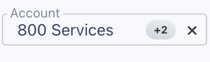
Figure 15
Banners:
Here, banners are used to show the important details about the dashboard.Dashboards can be based on spend vs. budget or spend vs. prior year spend. If the dashboard is based on budget, the banner will display spend year to date, annual budget, budget year to date, and the variance between spend year to date and budget year to date as shown in Figure 16.
Figure 16
If the dashboard is based on the prior year, the banner will display spend year to date, prior year spend year to date, total prior year spend, and the variance between spend year to date and prior year spend year to date as shown in Figure 17.
Figure 17
Dashboards:
A dashboard is a visual display of key metrics, data, and performance indicators that provides a quick, at-a-glance overview of business status. It is designed to simplify complex data sets, making it easier for users to monitor performance, identify trends, and make informed decisions.
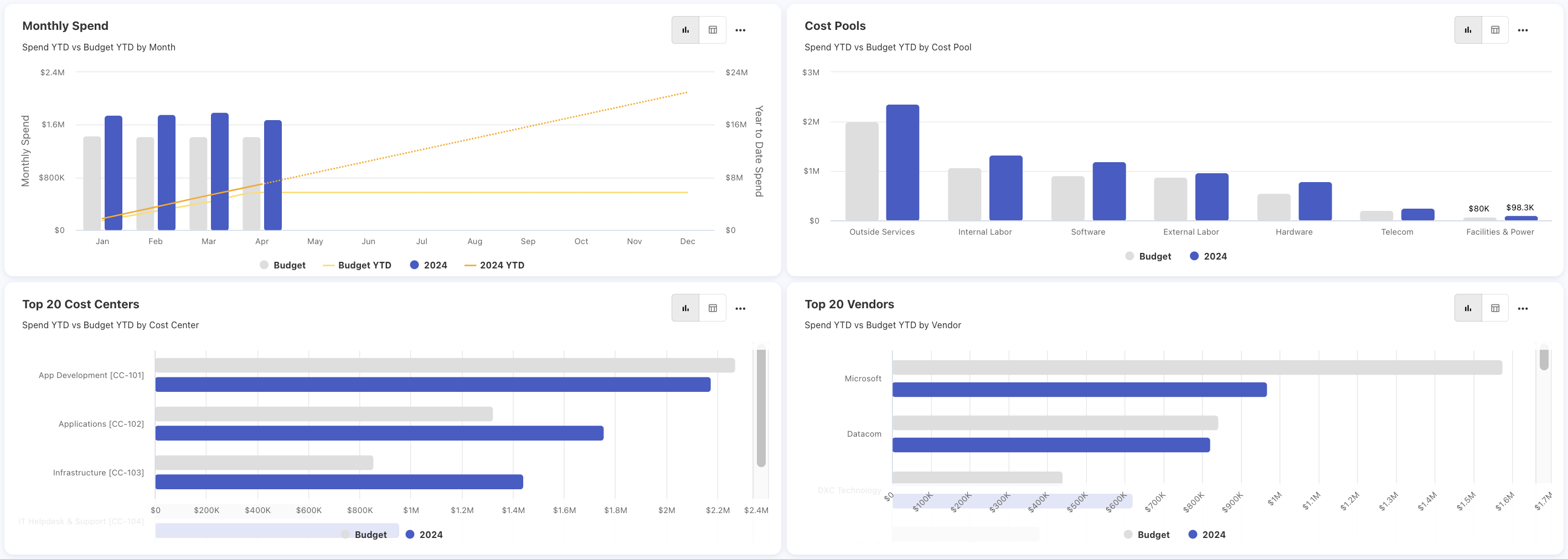
Figure 18
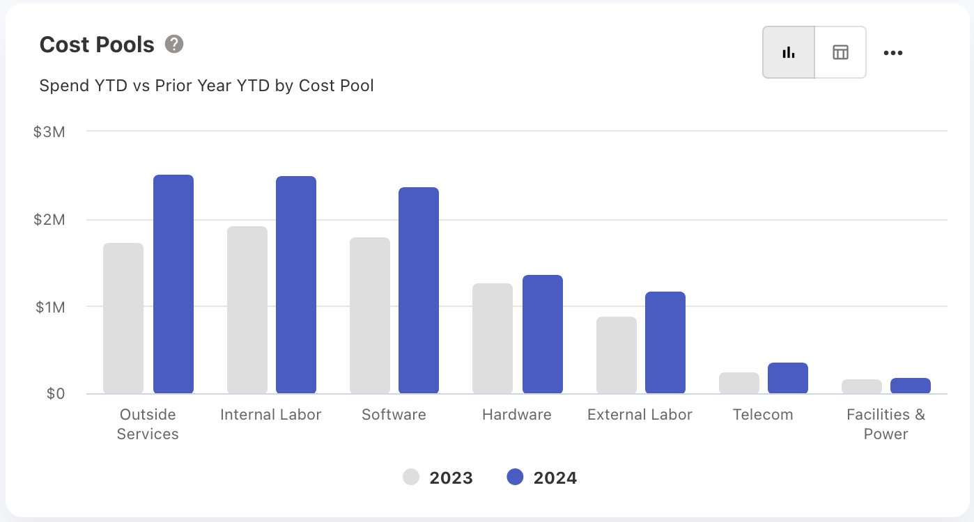
Figure 19
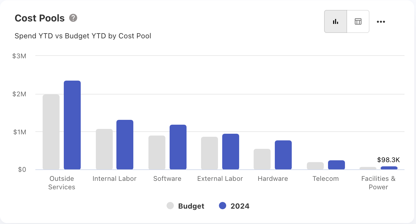
Figure 20
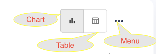
Figure 21
Figure 20 show cost pools against budget and spend, and cost pools against the current year and prior year. Most of the dashboard will have a comparison between the current year and prior year or budget and spend.
The dashboard's default mode is chart. If you want to switch to table mode, you can do so by clicking the table icon located at the top right side as shown in Figure 21.
Figure 22 and 23 will show the dashboard and it’s table mode.
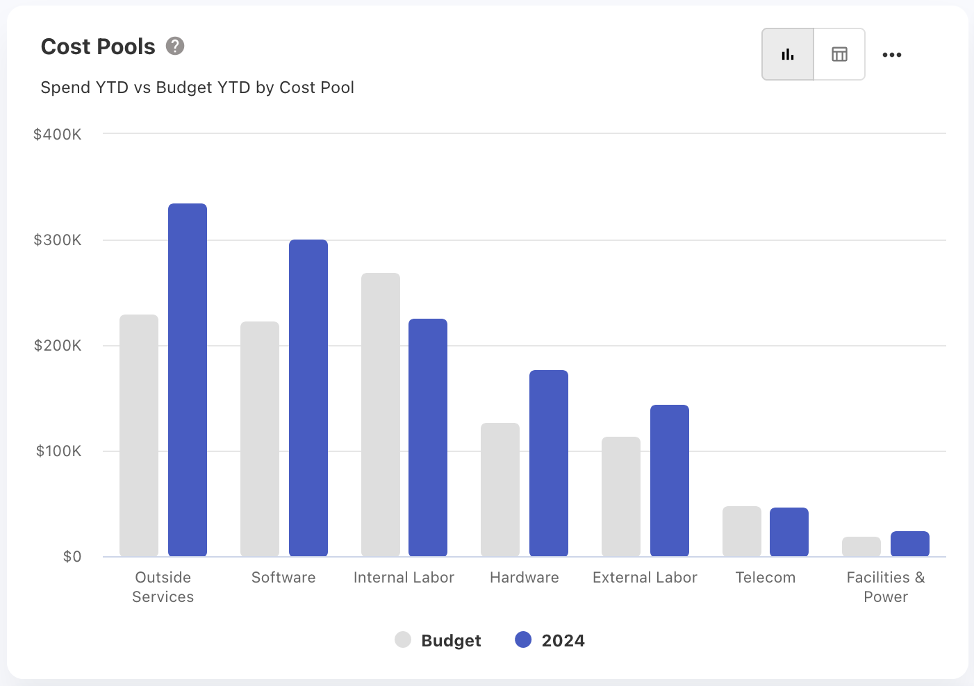
Figure 22
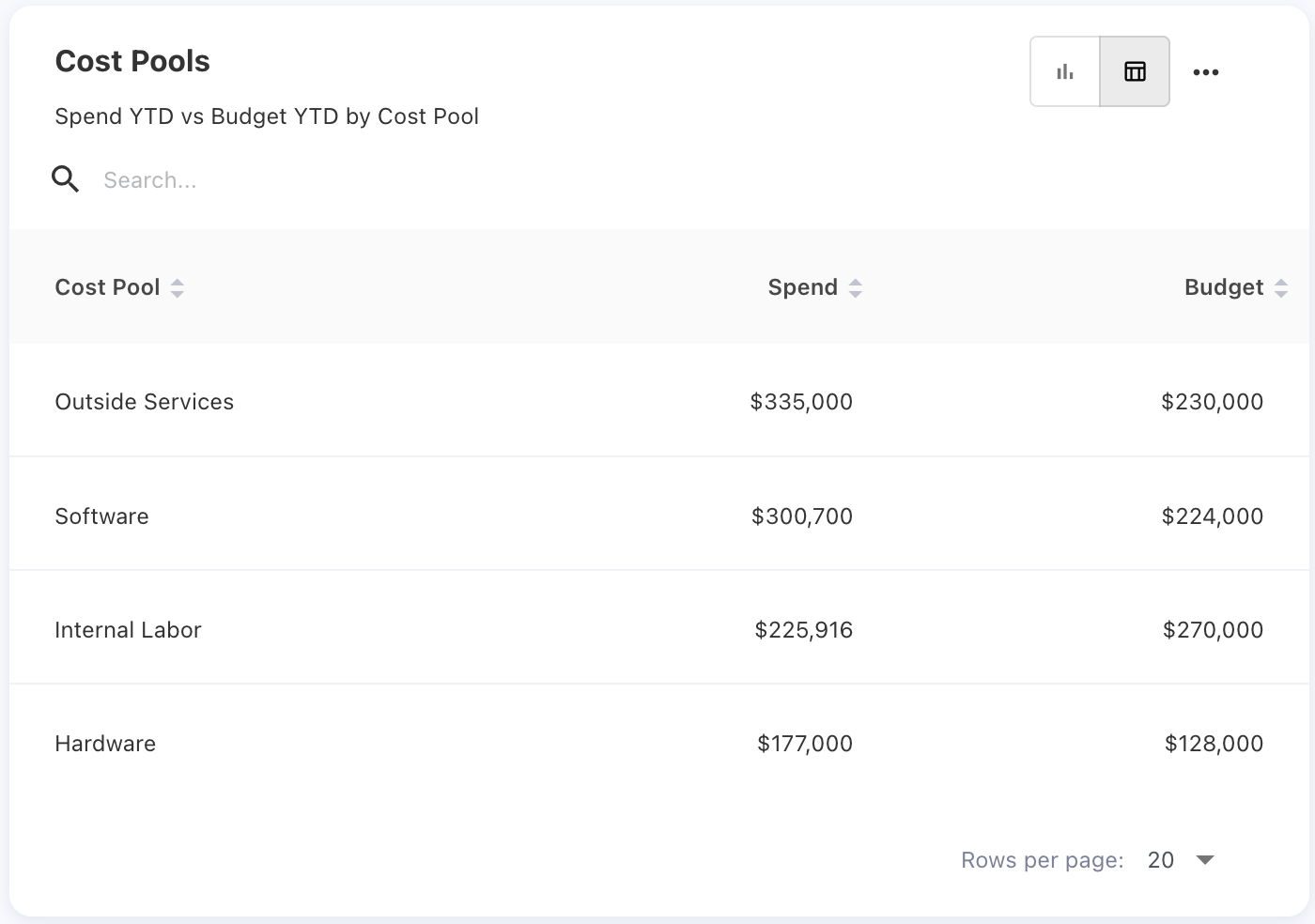
Figure 23
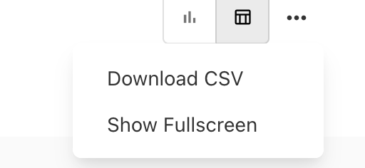
Figure 24
In the Dashboard Menu, we have two options as shown in Figure 24: Download and Show Full Screen. Users can download the dashboard and view the dashboard in full screen.
Table:
The image below shows an overview of the table. Here, we have options like search, sort, and filter. The columns shown in the table are default columns. We also have optional and mandatory columns. Mandatory columns cannot be deselect.
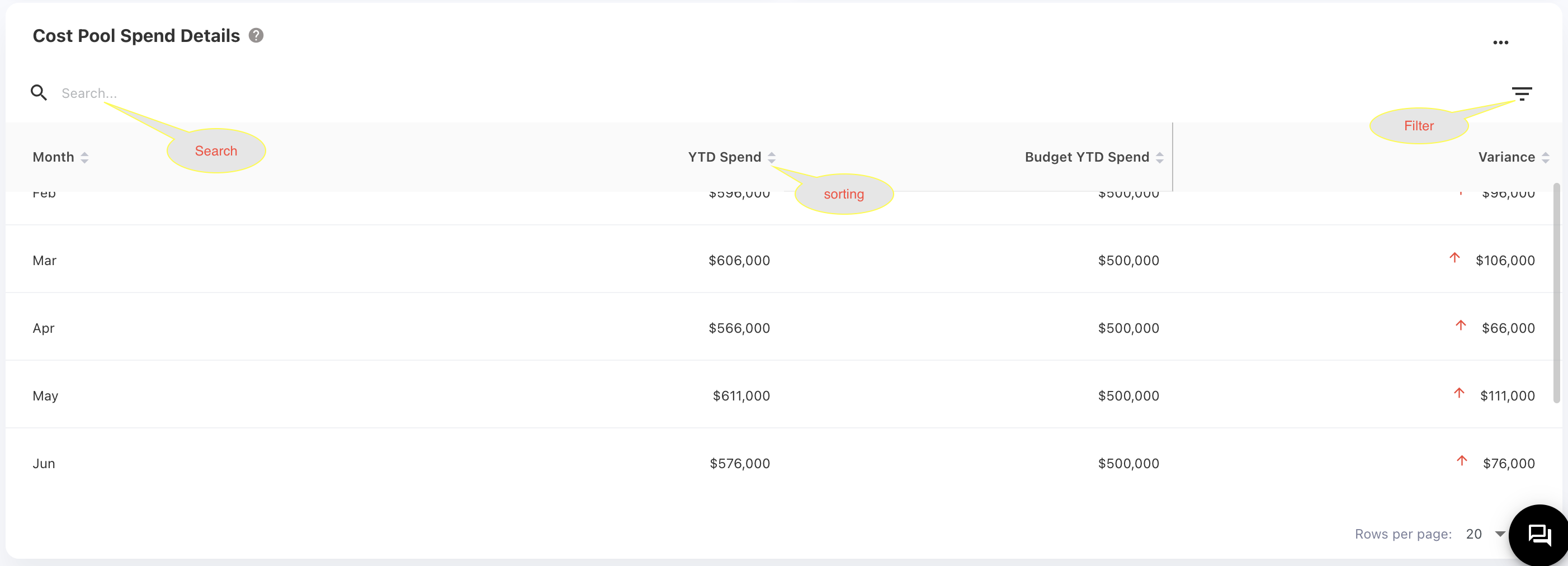
Figure 25
In Figure 26, the checked columns are default columns, the columns checked in gray are mandatory, and the unchecked columns are optional. If you want the optional columns to be part of your table, you can select them.
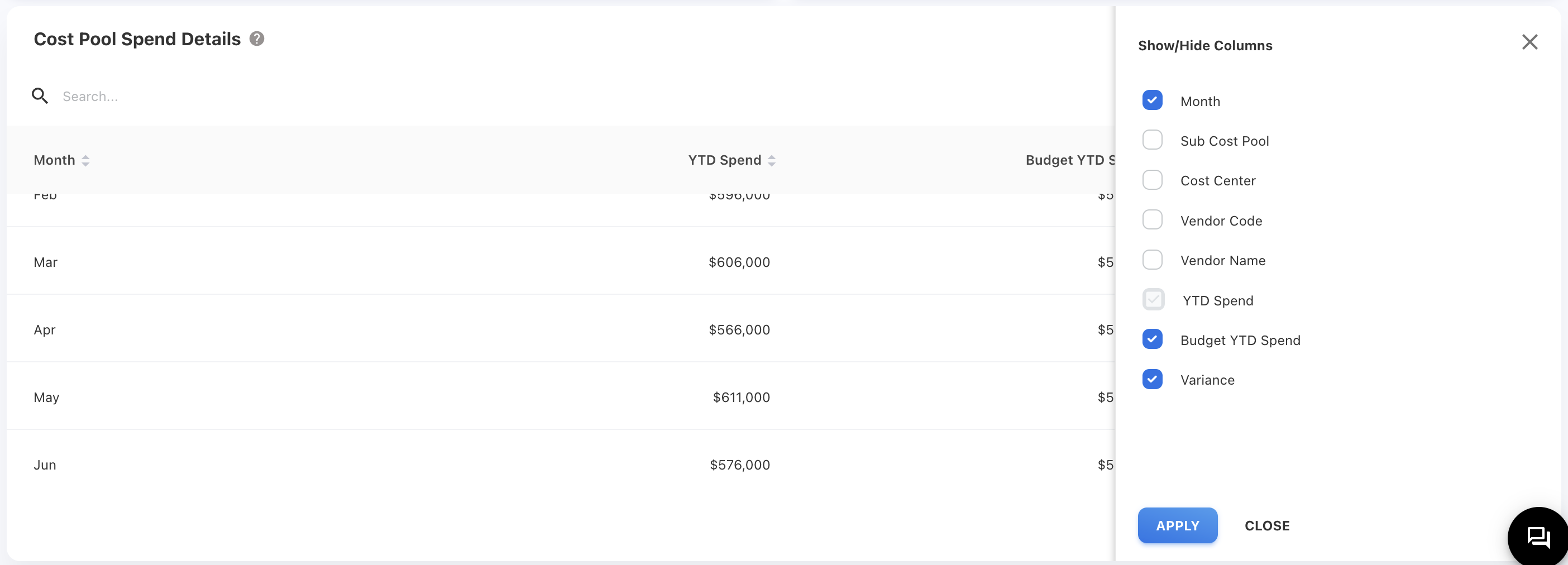
Figure 26
If you find that a column's content is not fully visible, you can drag the column to adjust its width and see the full content in the table. In Figure 27 content in the "Billing Account Name" column is not fully visible. In Figure 28, we have increased the width of the column so that you can see the full content.
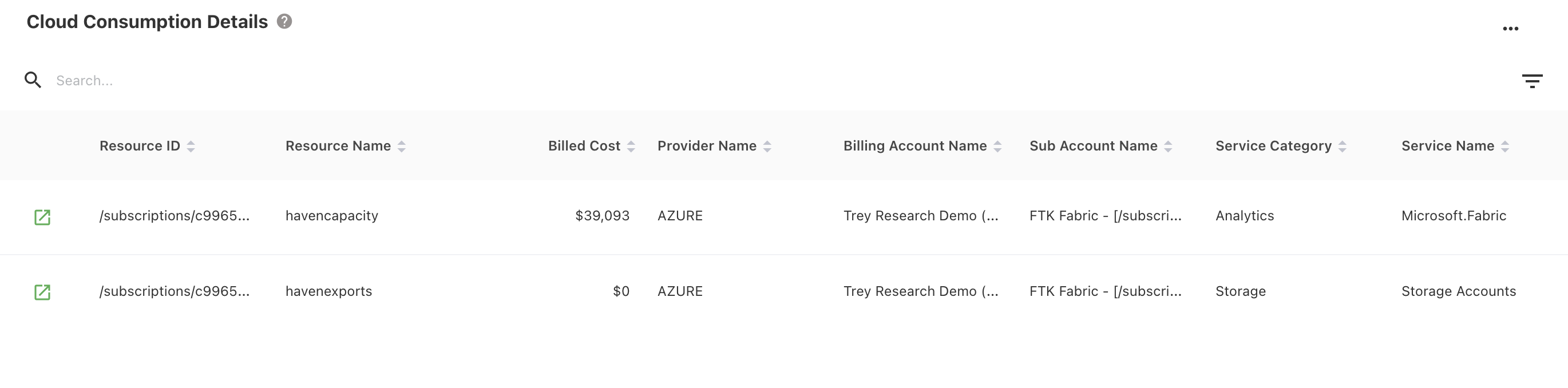
Figure 27
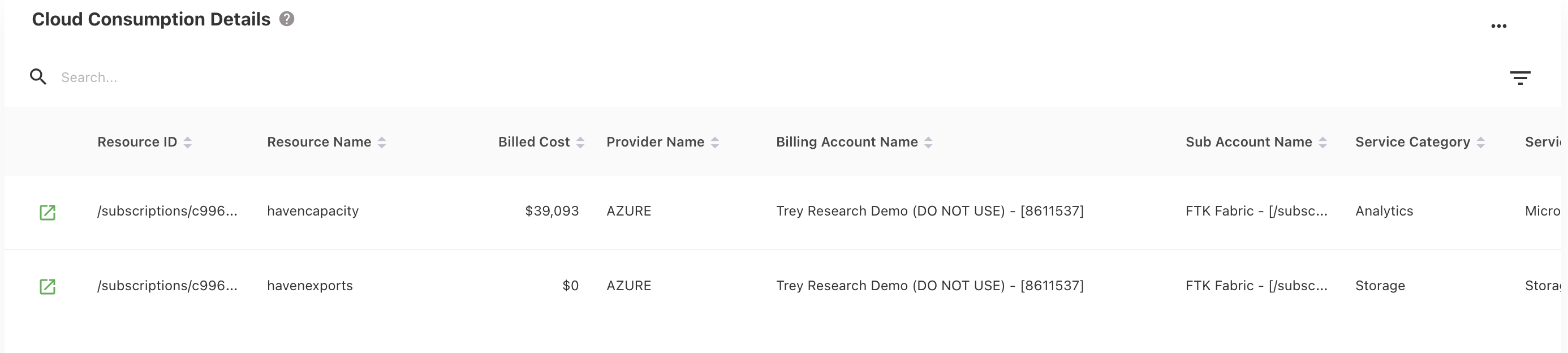
Figure 28
Report Dashboards:
When the user clicks the chart or table, they will be taken to the report page for more insights about the chart or table.
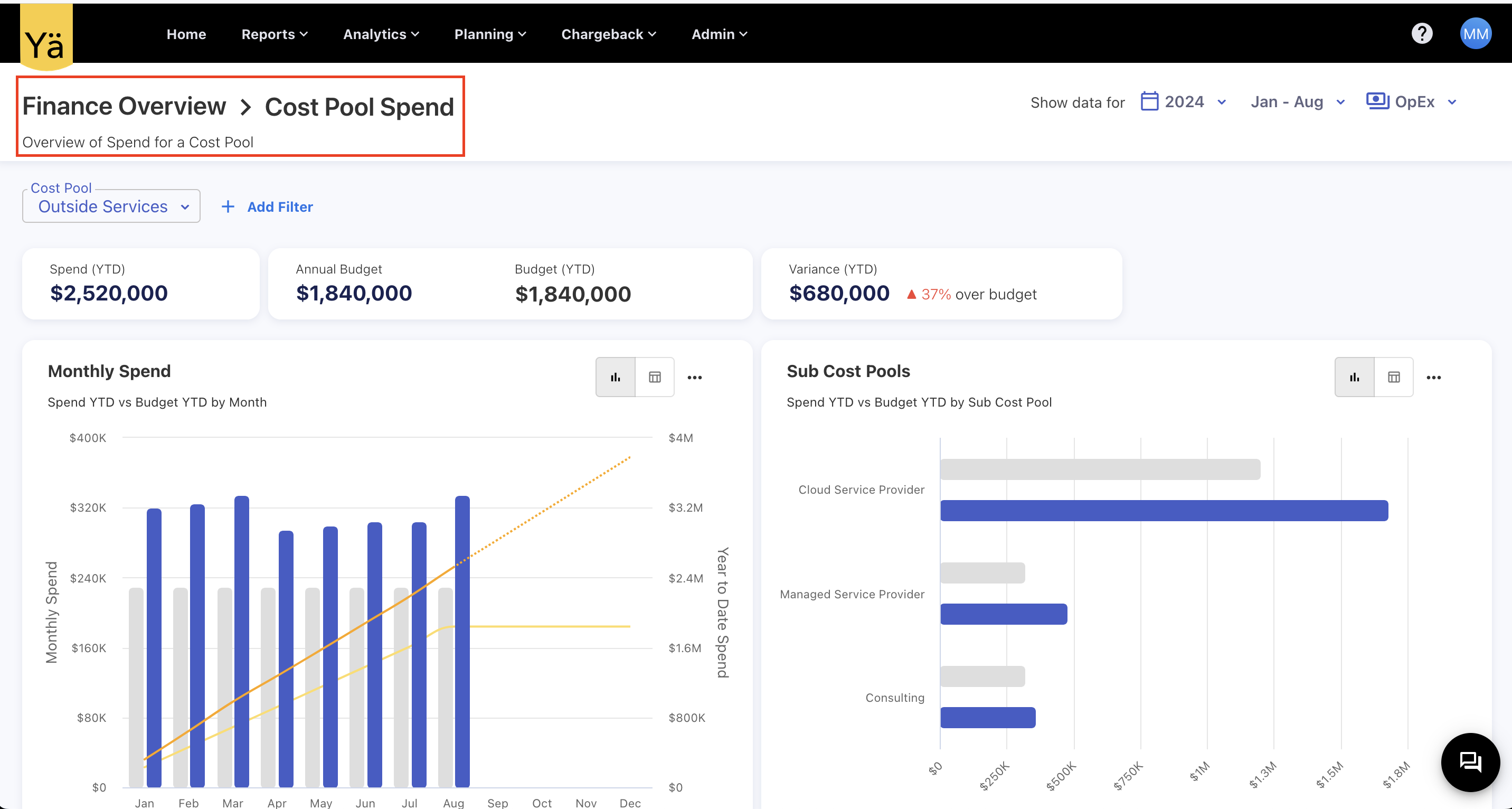
Figure 29
In Figure 29 shows the basic view of a dashboard report. In the image, the red color box highlights the dashboard name, "Finance Overview," and the report name, "Cost Pool Spend." By clicking on "Finance Overview," you can navigate to the dashboard page.
You can’t access the report page directly by copying the URL because you need to select filters from the dashboard page. If you try to access it by copying the URL, you will receive an alert like shown in Figure 30.
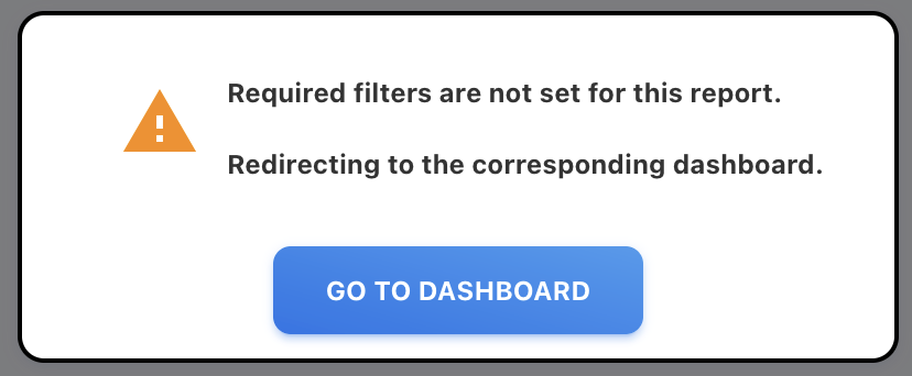
Figure 30
By clicking "Go To Dashboard," you can navigate to the appropriate dashboard.
You can reach the popup by clicking on any report’s chart or table to see the details at the Journal ID level. In Figure 31 shows an overview of the popup, which contains all the information about the table or chart.
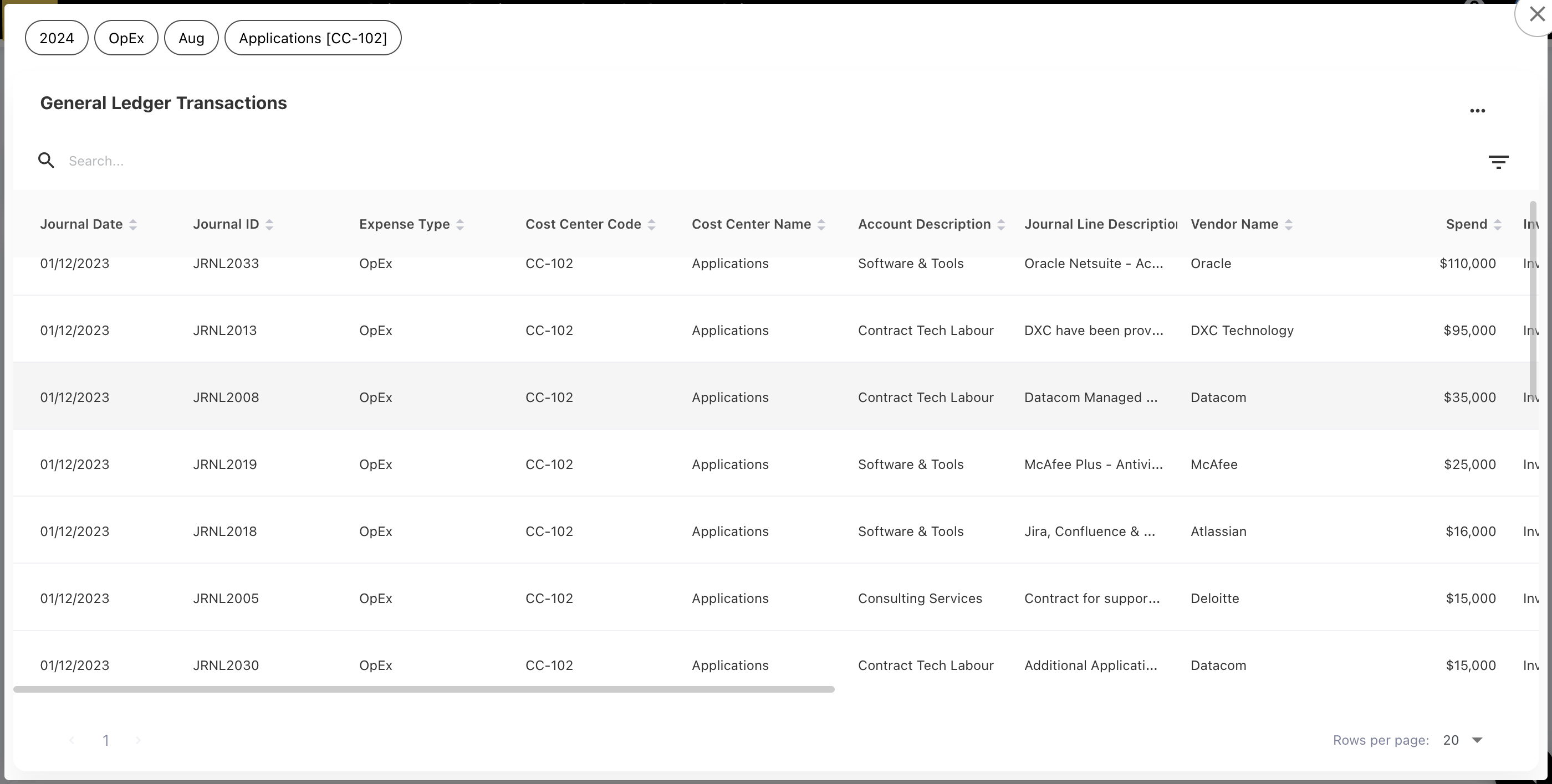
Figure 31